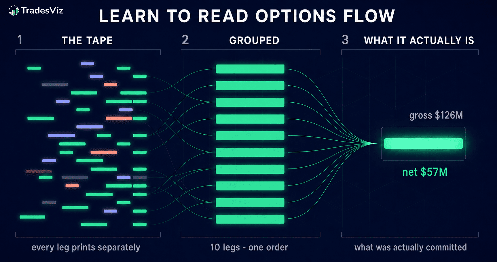
Open any options flow feed, sort it by premium, and the top of the list looks decisive: a $126M call buy, a $97M call sell, the same ticker over and over. It reads like a list of the day's biggest bets.
It usually is not. Most of what sits at the top of a premium-sorted flow feed is one leg of a bet, printed separately from the legs that give it meaning and ranked as though it stood alone. The $126M order below carries a signed net of $57M once its bought and sold legs offset. The $97M one is a ten-leg structure, not a directional call sale.
This guide is about reading options flow so that distinction is obvious rather than hidden: what each screen means, which numbers actually matter, and the traps that make most flow feeds misleading. Every example is a real session.
One thing to say before anything else, because it decides whether the rest is useful to you: this is not a stock list. It is not a set of positions to copy every morning. It is a research surface built on every options print in the US market, hundreds of millions of data points, organised so that you can form your own view and then check it. The edge is not in the feed. The edge is in what you do with it.
What options flow actually is
Every options trade in the US is reported by OPRA, the Options Price Reporting Authority. Options flow is what you get when you take that entire tape and organise it: which contracts traded, how much premium moved, which side was the aggressor, whether the print was a sweep, a block or a split.
The popular use of that data is to look for "smart money" and follow it. We said this in 2022 and it has only become more true: nobody can identify smart money from the tape. There are no account IDs in OPRA. A large trade can be a hedge, a roll, a market maker laying off risk, or a fund closing something it opened last year. Copying it is not a strategy.
What the tape is genuinely good for is context. Which names are behaving unusually for themselves. Where in strike and expiry space the money is going. Whether a big number represents one conviction or two sides of the same spread. That context is what the rest of this guide is about.
What each number can and cannot tell you
Almost every mistake in reading options flow comes from asking a number for something it does not contain. This is the short version; the rest of the guide works through each one with a real example.
| Metric | What it shows | What it does not prove |
|---|---|---|
| Gross premium | Total premium printed across all legs | Capital at risk, or direction |
| Net premium | Signed cash debit or credit of the package | Maximum risk, margin, or conviction |
| Volume | Contracts traded during the session | How many positions remain open |
| Open interest | Contracts still outstanding after clearing | Whether a specific print opened a position |
| Bid/ask location | The likely aggressor side | The full strategy, or its direction |
| Sweep | Rapid routing across multiple venues | Informed or correct trading |
| Block or cross | Large negotiated or crossed execution | Weak or strong conviction |
| Call or put | The contract type traded | Whether the package is bullish or bearish |
| Cumulative premium | When premium turnover arrived | That a position was accumulated |
The trap that makes most flow feeds misleading
Start with the single most important thing to understand, because it affects every screen you will ever look at.
A multi-leg order does not print as one trade. Each leg prints separately, all stamped with the same timestamp. Sort a flow table by premium and you do not get the biggest bets - you get the biggest legs, each looking like its own conviction trade.
Here is a real session, sorted by premium, one row per print:
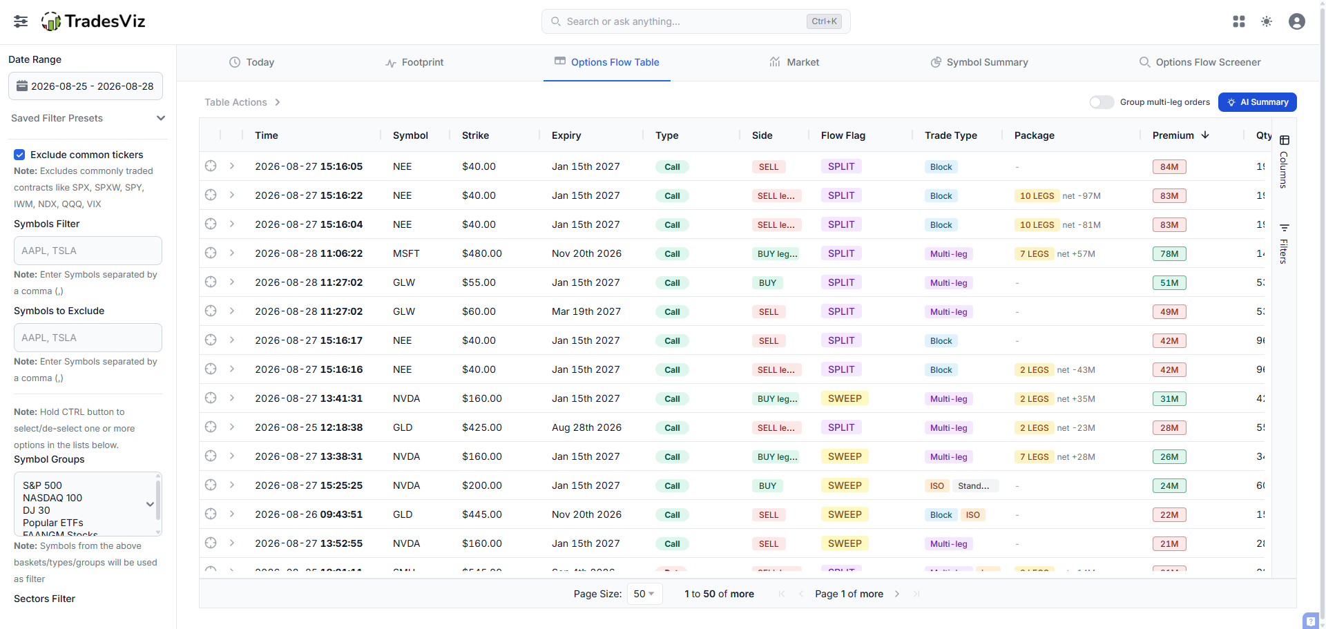
Look at the top. NEE $40 calls expiring January 2027 appear at 15:16:04, 15:16:05, 15:16:16 and 15:16:17, at $84M, $83M, $42M and more. Four rows. MSFT is scattered across the list too. It reads like a wave of separate decisions.
Now the same session with Group multi-leg orders turned on:
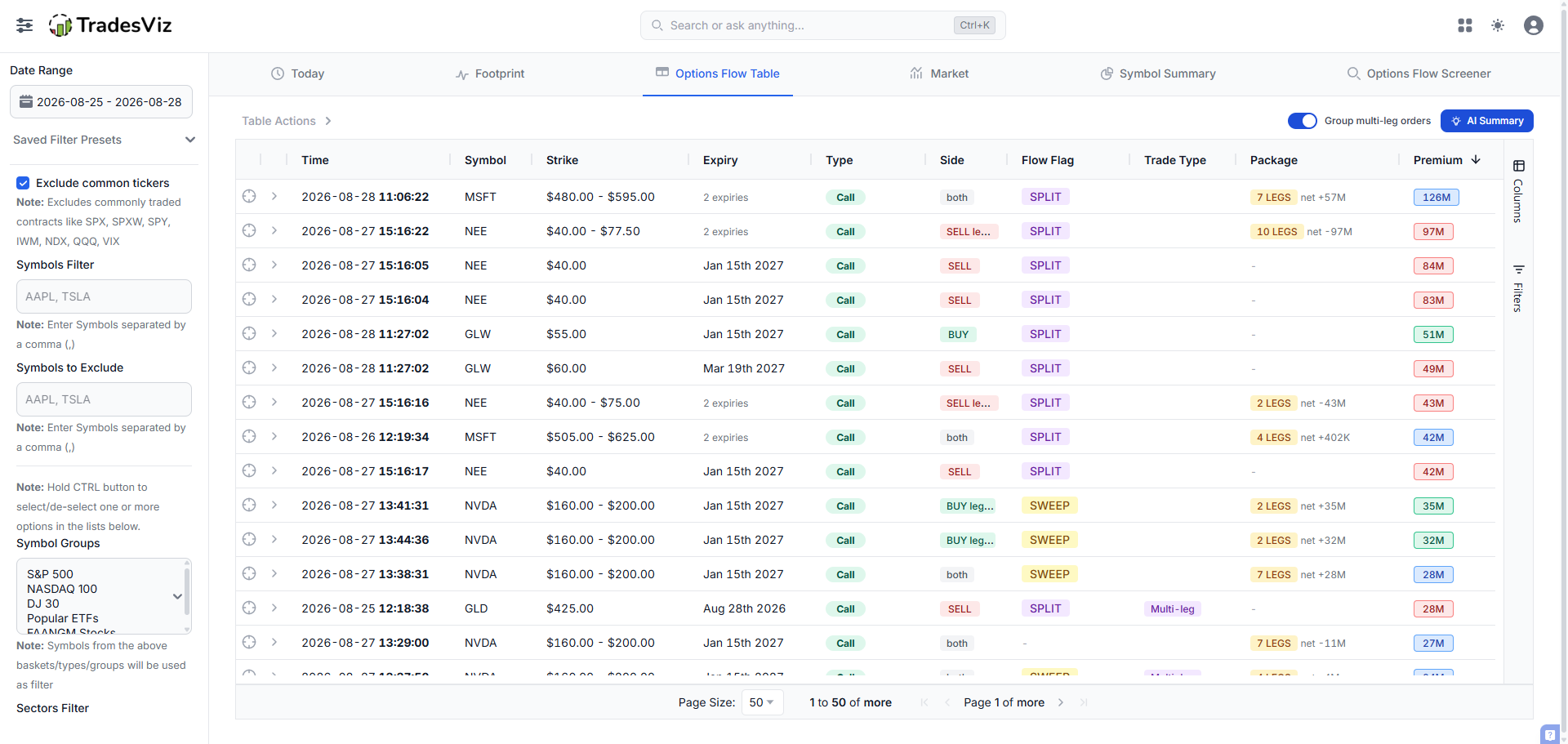
The NEE rows collapse into one line: 10 legs, $97M gross, net -$97M. MSFT becomes 7 legs, $126M gross, net +$57M across a $480 to $595 strike range and two expiries. The Side column stops saying BUY or SELL and starts saying "both", because an order with legs on both sides does not have a side.
Two numbers matter here and they are easy to miss:
- Gross versus net. MSFT printed $126M in gross premium across its legs, and a signed net of $57M once the bought and sold legs offset one another. Net premium is the package's cash debit or credit. It is far more meaningful than the headline, but it is not by itself the position's risk, margin or directional exposure - a package can be a vertical, a calendar, a roll or a volatility trade. When the grouped table is sorted it sorts on net, because sorting on gross would rebuild the exact distortion grouping removes.
- Leg count. A 10-leg order is a structure. Whatever view you take of it, "someone bought calls" is not it.
Expanding a grouped row shows the individual legs, so the summary is checkable against the contracts rather than taken on trust. That is the rule for this whole dashboard: every aggregate can be opened.
Start with the market, not with a symbol
The Market tab answers one question before you look at any name: what kind of session was this?
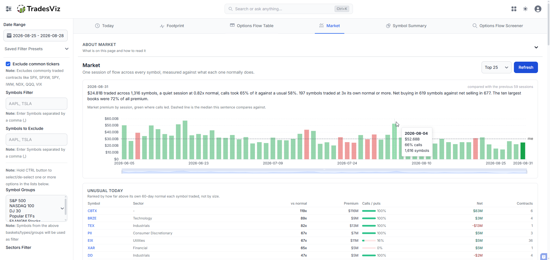
The sentence at the top does the work:
$24.81B traded across 1,316 symbols, a quiet session at 0.82x normal, calls took 65% of it against a usual 58%. 197 symbols traded at 3x its own normal or more. Net buying in 619 symbols against net selling in 677. The ten largest books were 72% of all premium.
Read that carefully and you already know four things. Volume was below average despite the size of the number. Calls were more dominant than usual, which is a positioning skew, not a price prediction. Nearly 200 names were doing something unusual for themselves. And breadth was almost perfectly split - 619 net buying against 677 net selling - so there was no market-wide direction to lean on that day.
That last point is the sort of thing a premium leaderboard will never tell you, and it changes how much weight any single name deserves.
Unusual is not the same as large
Unusual options activity is the phrase every flow product uses, and almost none of them define it. Here it means one thing: how far above its own recent normal a symbol traded.
This is the distinction that separates a useful flow screen from a mega-cap turnover list. Compare the two tables on this tab.
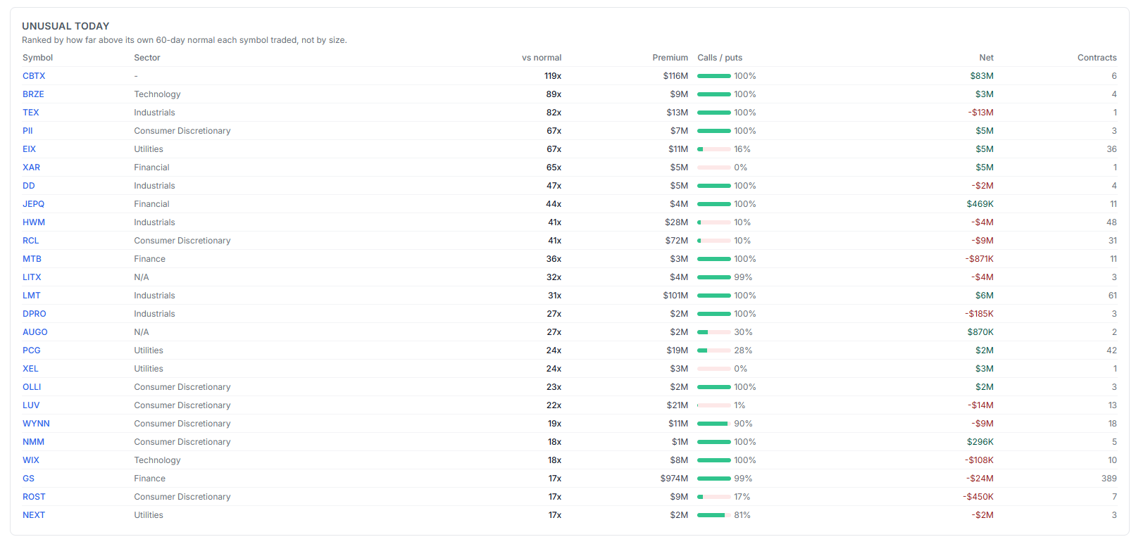
CBTX is at the top at 119x its own 60-day normal: $116M of premium, $83M of it net, in six contracts. Six. That is a concentrated, one-sided, wildly out-of-character position and it is the kind of thing worth a look.
Further down, GS shows $974M of premium - by far the largest number on the page - at 17x normal, spread across 389 contracts, netting minus $24M. Huge gross, no direction, wide distribution. On a size-ranked feed GS is the headline. Here it sits fifteenth, which is where it belongs.
Now look at what a size ranking actually produces:
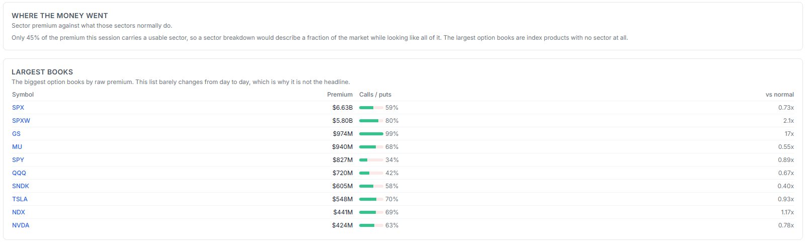
SPX, SPXW, GS, MU, SPY, QQQ. This list barely changes from one day to the next, which is precisely why it is not the headline on this page. Note the vs-normal column though: SPX at 0.73x, SPY at 0.89x, QQQ at 0.67x - the index complex was quiet. SPXW at 2.1x is the one that was not. That is the only genuinely interesting number in the block.
Where the money is aimed
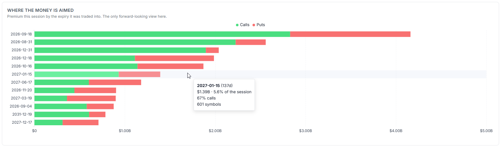
This is the only forward-looking view on the page: premium grouped by the expiry it was traded into. The nearest weekly dominates, as it almost always does. But look at 2027-01-15, 137 days out, carrying $1.39B - 5.6% of the entire session - at 67% calls across 601 symbols.
Hold that date. It comes back.
Was there conviction, or just size?
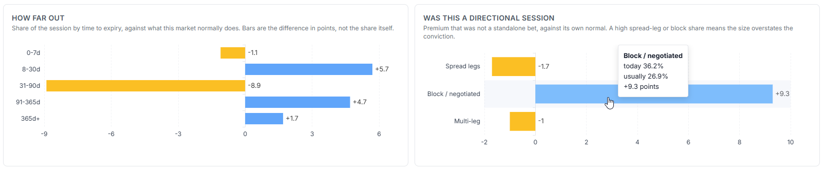
Both charts show the difference from what this market normally does, in percentage points, not the raw share.
How far out: 31-90 day expiries were 8.9 points light, while 8-30 day was 5.7 points heavy and 91-365 day was 4.7 heavy. Money skipped the middle of the curve and went to both ends.
Was this a directional session: block and negotiated premium ran at 36.2% against a usual 26.9%, a 9.3 point excess. Blocks are negotiated or crossed rather than worked in the open market, so on a block-heavy session the headline premium should not be read as aggressive open-market demand. Spread legs and multi-leg were both slightly light, which tempers that slightly.
So: a quiet session, split breadth, unusually negotiated, avoiding the middle of the curve. That is a genuine read on the day, and none of it required looking at a single ticker.
The same name can lead both sides
Top by symbol switches between inflow, outflow, calls and puts. Watch what happens to one name across two of those views:
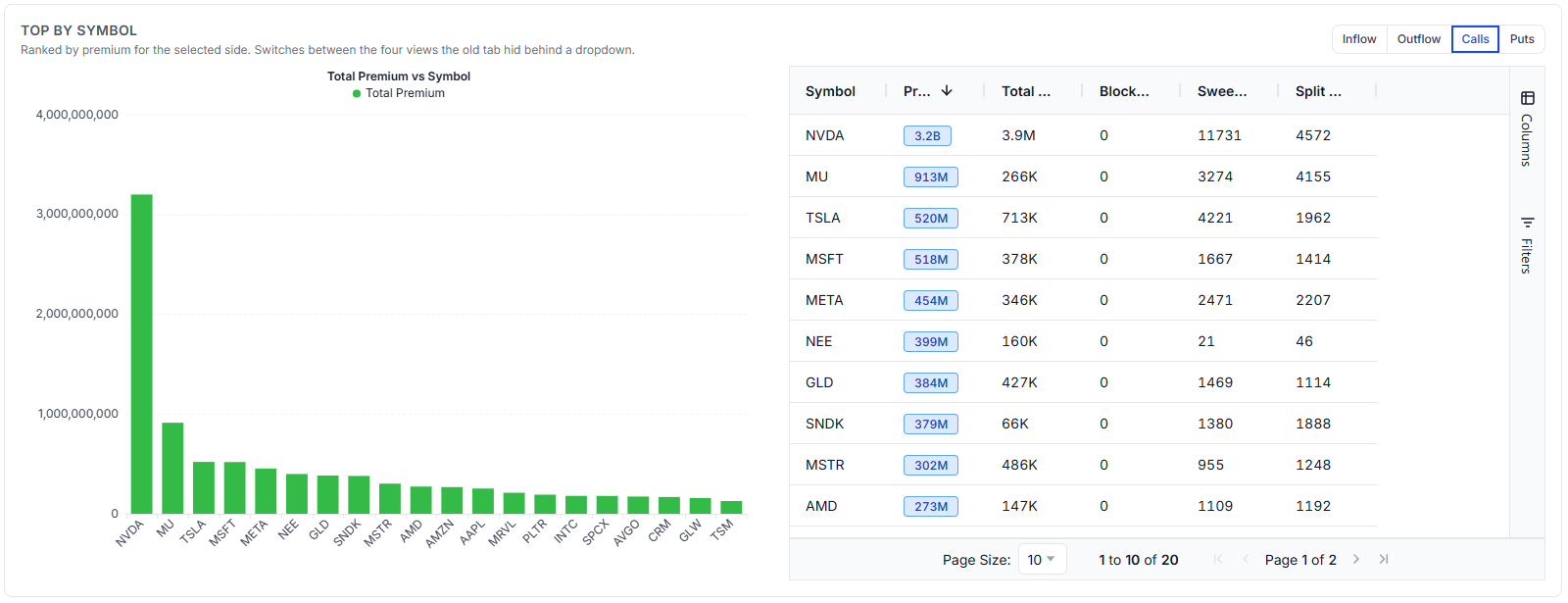
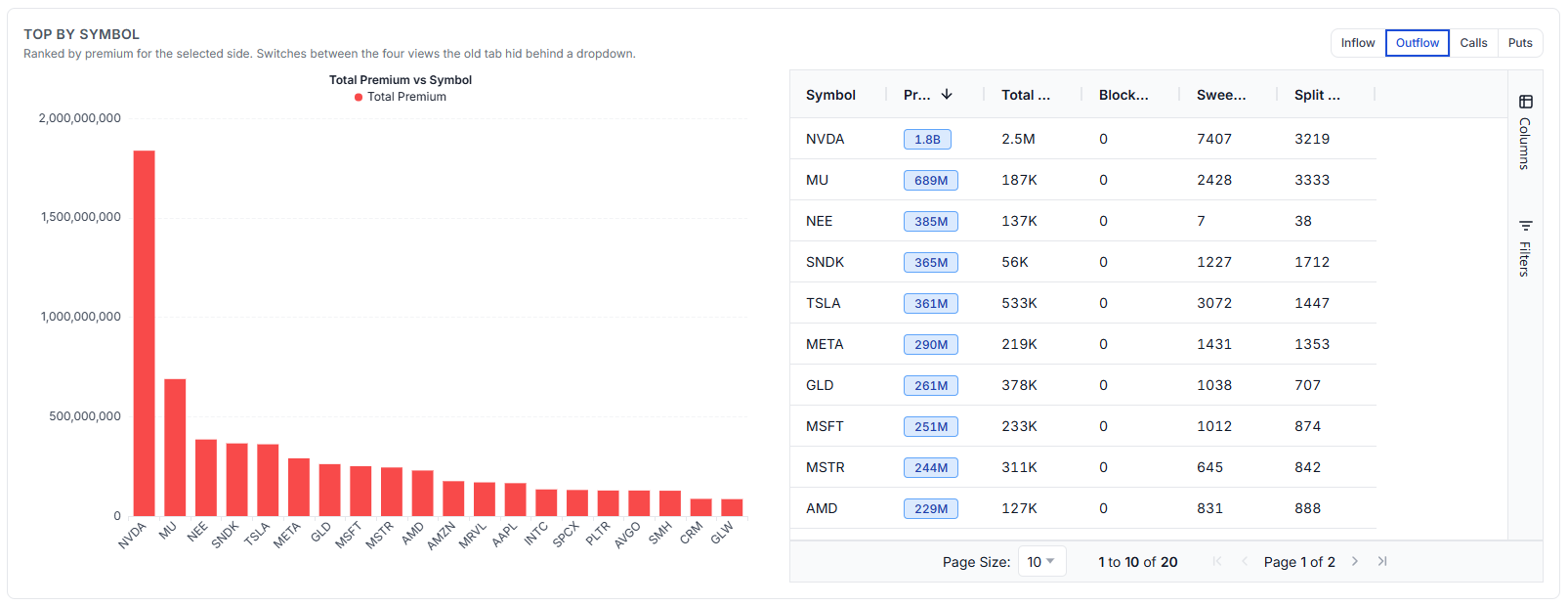
NEE is fifth on calls at $399M and third on outflow at $385M. Nearly the same money on both lists, which is what a large two-sided structure looks like when you rank it twice.
Now look at the sweep and split counts beside it: NEE shows 21 sweeps and 46 splits on the call side, against NVDA's 11,731 and 4,572. NEE reached three-hundred-odd million dollars in a handful of prints; NVDA got there across thousands. Same column, completely different behaviour, and the premium figure alone hides it.
Concentration, which a ranked list cannot show
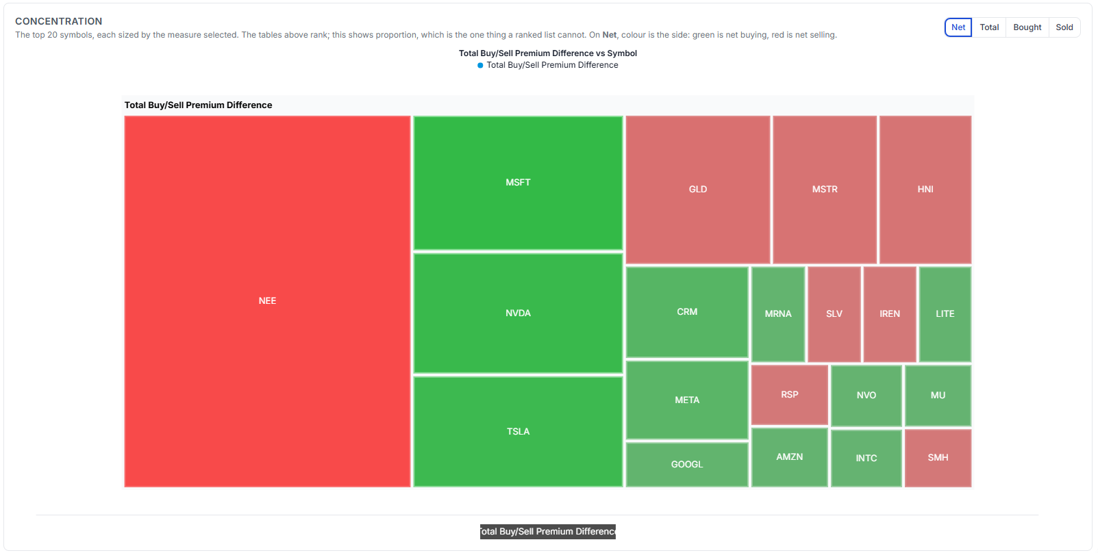
Tables rank. This shows proportion. On Net, green is net buying and red is net selling, and one block dominates everything: NEE, red, larger than MSFT, NVDA and TSLA combined.
Which brings us back to those four NEE rows from the beginning.
Following one order across four screens
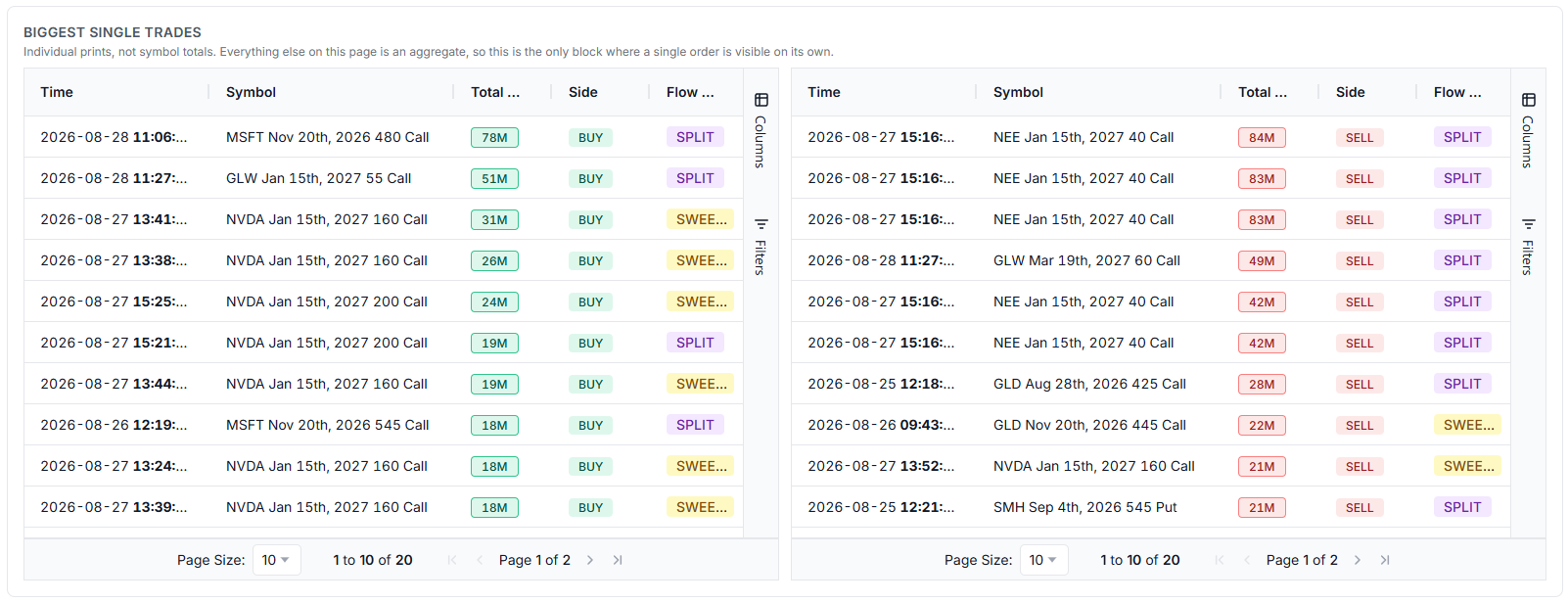
This block is the only place on the Market tab where a single order is visible on its own; everything else is an aggregate. On the sell side: NEE Jan 15th 2027 $40 calls at $84M, $83M, $83M, $42M, $42M - all within the same few seconds.
Put the four views together and the story is complete:
- The treemap says NEE was the session's largest net seller.
- Biggest single trades says it arrived as several enormous prints seconds apart.
- The grouped flow table says those prints were one 10-leg order, net -$97M.
- Premium by expiry says January 2027 was already the heavy long-dated expiry that session.
Four screens, one multi-leg package. The grouping explains why those prints belong together without pretending the public tape tells you who placed them or why. That is the difference between reading flow and being impressed by it.
The AI summary: a reading aid, not a conclusion
Every tab has an AI Summary button. On the flow table it reads the rows you are actually looking at, with your filters applied, and describes what is in them.
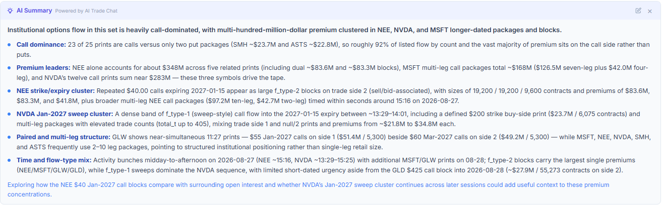
It is genuinely useful. It counted 23 of 25 prints as calls, totalled NEE at roughly $348M across five related prints, MSFT at ~$168M, NVDA at ~$283M, and identified the NEE $40 January-2027 blocks at 19,200 / 19,200 / 9,600 contracts. That is several minutes of reading compressed into a paragraph, and it ends by suggesting what to check next rather than what to trade.
Now the important part. Do not outsource the thinking.
A summary tells you what is in the data. It cannot tell you whether it matters to your strategy, your timeframe, or your risk. We built our State of Journaling 2026 report on how traders actually use their data, and the clearest finding was that the traders who improve are the ones who write down a reason and then check it. The ones who plateau are the ones who collect signals.
Use the summary to read faster. Then go and look at the contracts yourself.
Reading one symbol properly
Once the market has pointed you somewhere, the Symbol Summary tab is where the work happens. This is NVDA.
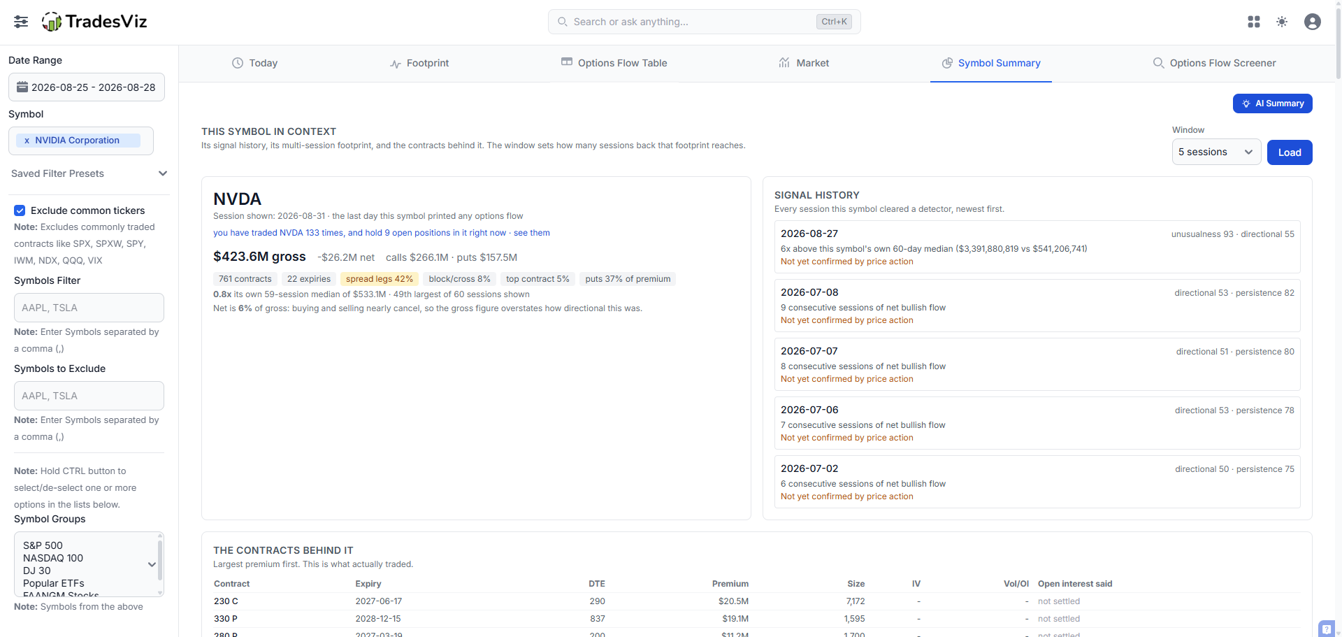
The header states the session and then immediately puts it in context:
$423.6M gross, -$26.2M net, calls $266.1M, puts $157.5M. 761 contracts, 22 expiries, spread legs 42%, block/cross 8%, top contract 5%, puts 37% of premium. 0.8x its own 59-session median of $533.1M, 49th largest of 60 sessions shown. Net is 6% of gross: buying and selling nearly cancel, so the gross figure overstates how directional this was.
$423.6M sounds enormous. Against NVDA's own history it is a below average day - 49th out of 60. And 6% net means it was almost perfectly two-sided. A feed that showed you "NVDA $423M" and nothing else would have actively misled you.
Spread legs at 42% reinforces it: nearly half the premium was part of a structure.
On the right, Signal history lists every session this symbol cleared a detector. On 2026-08-27 it hit unusualness 93, at 6x its own 60-day median ($3.39B against $541M). Each entry carries its own caveat - "not yet confirmed by price action" - because a flow signal is a hypothesis until the underlying agrees with it.
The contracts behind the aggregate
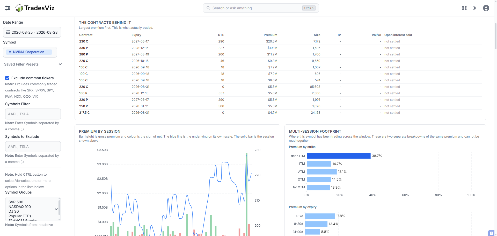
This is the most important table on the page, because every other number is an aggregate and this is what those aggregates are made of. Largest premium first, with days to expiry, size, and what open interest said.
The 220 call expiring the same day: 85,603 contracts for $5.8M. Compare it to the 230 call 290 days out: 7,172 contracts for $20.5M. Twelve times the size for a quarter of the premium. Same-day options are cheap lottery tickets; the long-dated one is where actual capital was committed. Ranking on contracts traded would have inverted that completely.
Premium against price
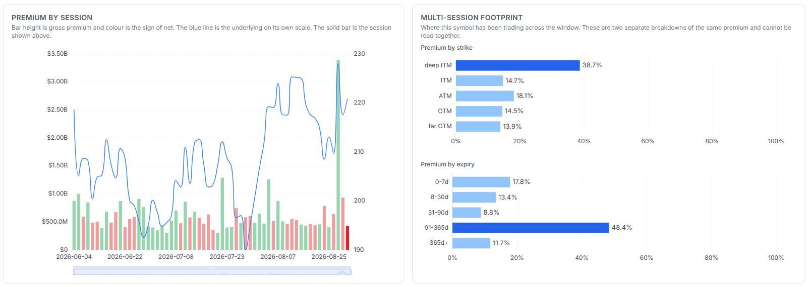
Bar height is gross premium, colour is the sign of net, and the blue line is the underlying on its own scale. What you are looking for is divergence: flow building while price does nothing, or flow leaning one way while price goes the other.
The footprint beside it says where the money has been sitting across the window: 38.7% deep ITM and 48.4% in 91-365 day expiries. Deep in-the-money and long-dated is not lottery-ticket behaviour. It is expensive, high-delta, slow-decay positioning.
Read the caption on that panel carefully: the two breakdowns are separate views of the same premium and cannot be read together. A symbol showing far-OTM and 365d+ is not necessarily trading far-OTM LEAPS. The contract list is what settles it.
Which contracts, and on which side
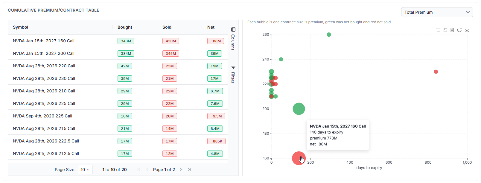
The table ranks; the map shows shape. Each bubble is one contract, placed by days to expiry and strike, sized by premium, green where it was net bought and red where it was net sold.
The two largest bubbles sit at the same expiry, 140 days out: the Jan 2027 $160 call, $773M of premium, net -$88M (red) and the Jan 2027 $200 call, net +$39M (green). Lower strike sold, higher strike bought, same expiry.
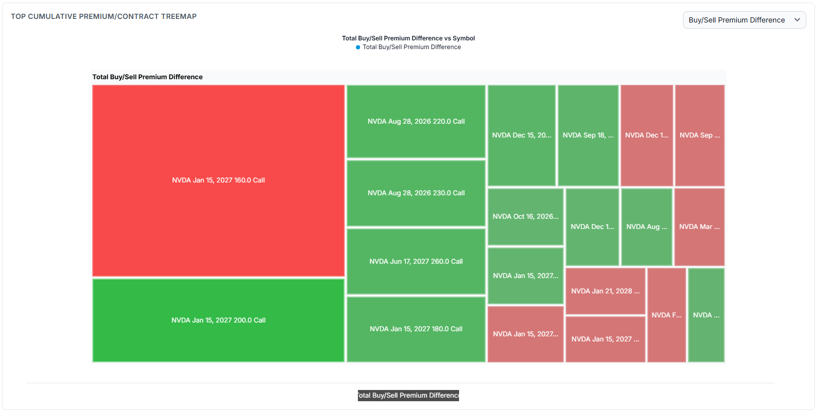
A ranked list would show you two large rows. The map shows you they are almost certainly two legs of the same structure. The treemap says the same thing in proportion:
Where the flow lands on the existing book
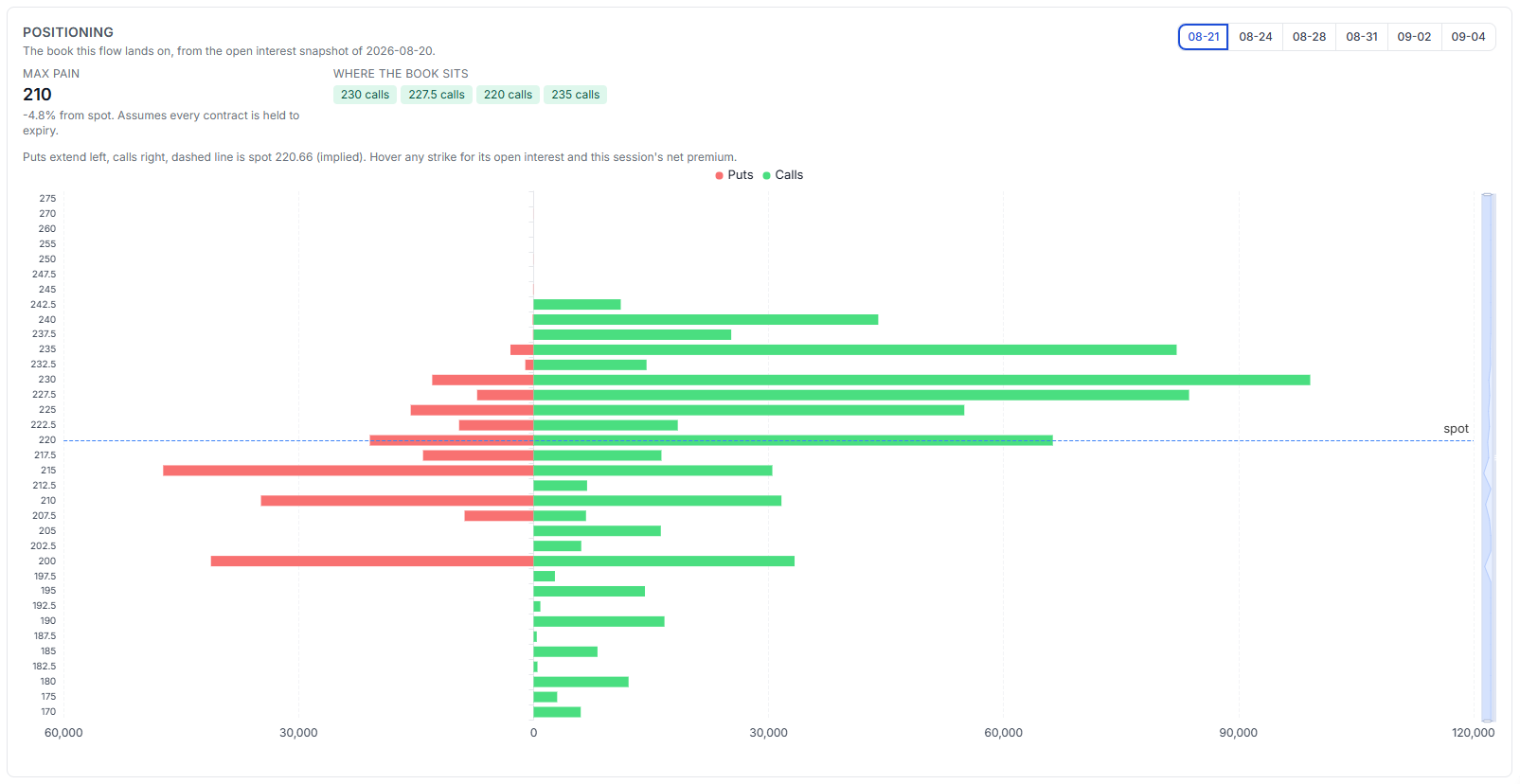
Flow is what traded. This is what is already there - the open interest the flow landed on, from the settlement snapshot, with puts extending left and calls right, and a dashed line at spot.
Max pain sits at 210, 4.8% below spot at 220.66, and the book is stacked at 230, 227.5, 220 and 235 calls. Heavy call open interest just above spot is the kind of structure that shapes how a name moves into expiry, and it is context you cannot get from the day's prints alone.
Strike and expiry heatmaps
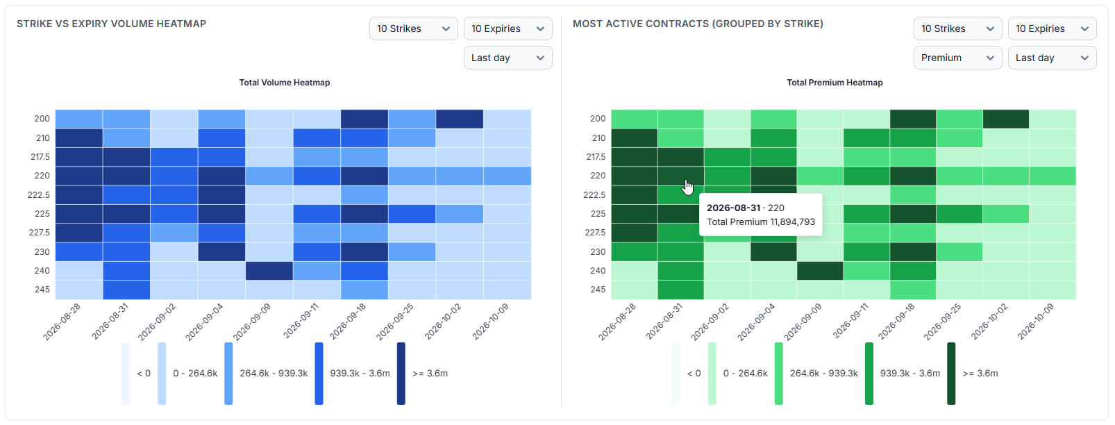
Volume on the left, premium on the right, strike against expiry. The colour scale is banded by quantile with the real ranges in the legend, so a single enormous contract cannot wash the rest of the grid out - which is what a plain linear scale does to options data every time.
Reading the two together is the point. A cell that is dark on volume but pale on premium is cheap, short-dated activity. Dark on both, like the 220 strike into 2026-08-31 at $11.9M, is where real money and real size agree.
One contract, day by day
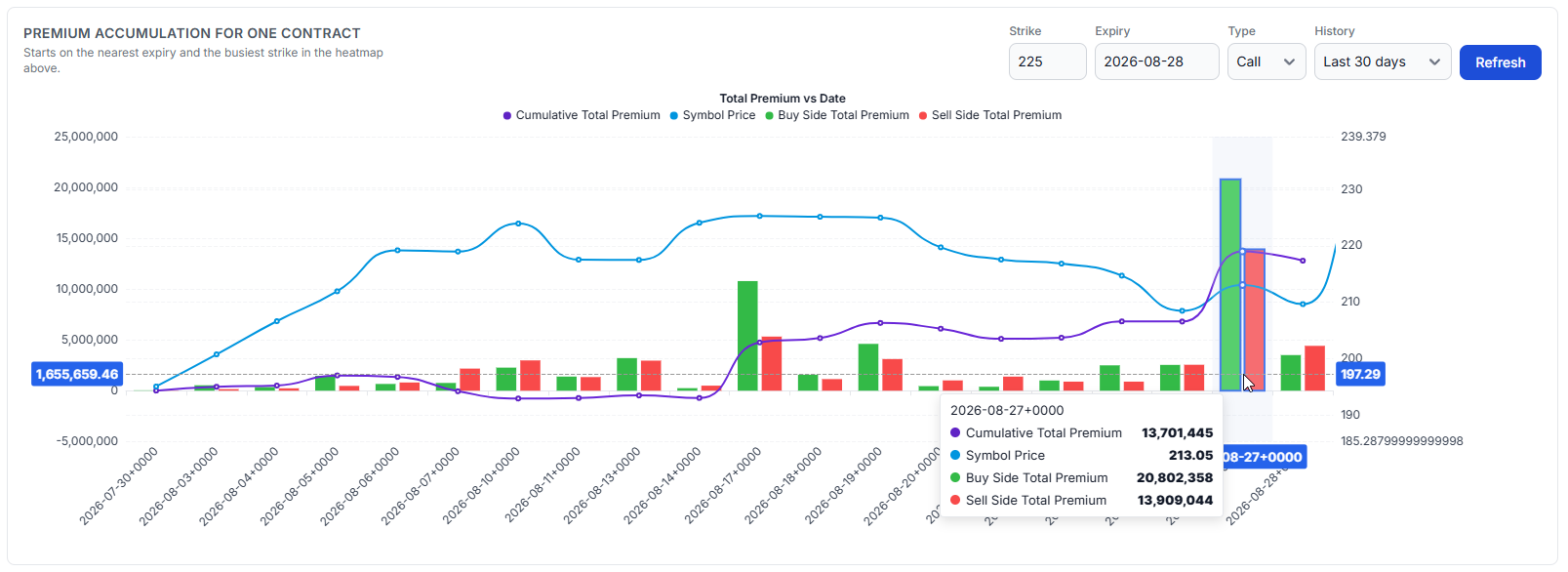
Pick one contract and watch it accumulate. Purple is cumulative premium, blue is the underlying, green and red bars are the buy and sell side each day.
And here is the trap, stated plainly: a rising cumulative premium line is not a position. Summed daily premium is turnover. A participant opening and closing the same lot every day produces exactly that smooth climb while holding nothing at all. On 2026-08-27 this contract shows $20.8M bought against $13.9M sold - both sides were enormous. A next-day rise in open interest is evidence that net new contracts remained open in that series. Even then it cannot prove that this particular print opened the position, or say who holds it: one participant can open while another closes and leave open interest unchanged.
The same caution applies to the intraday version, which plots cumulative premium against the price candles:
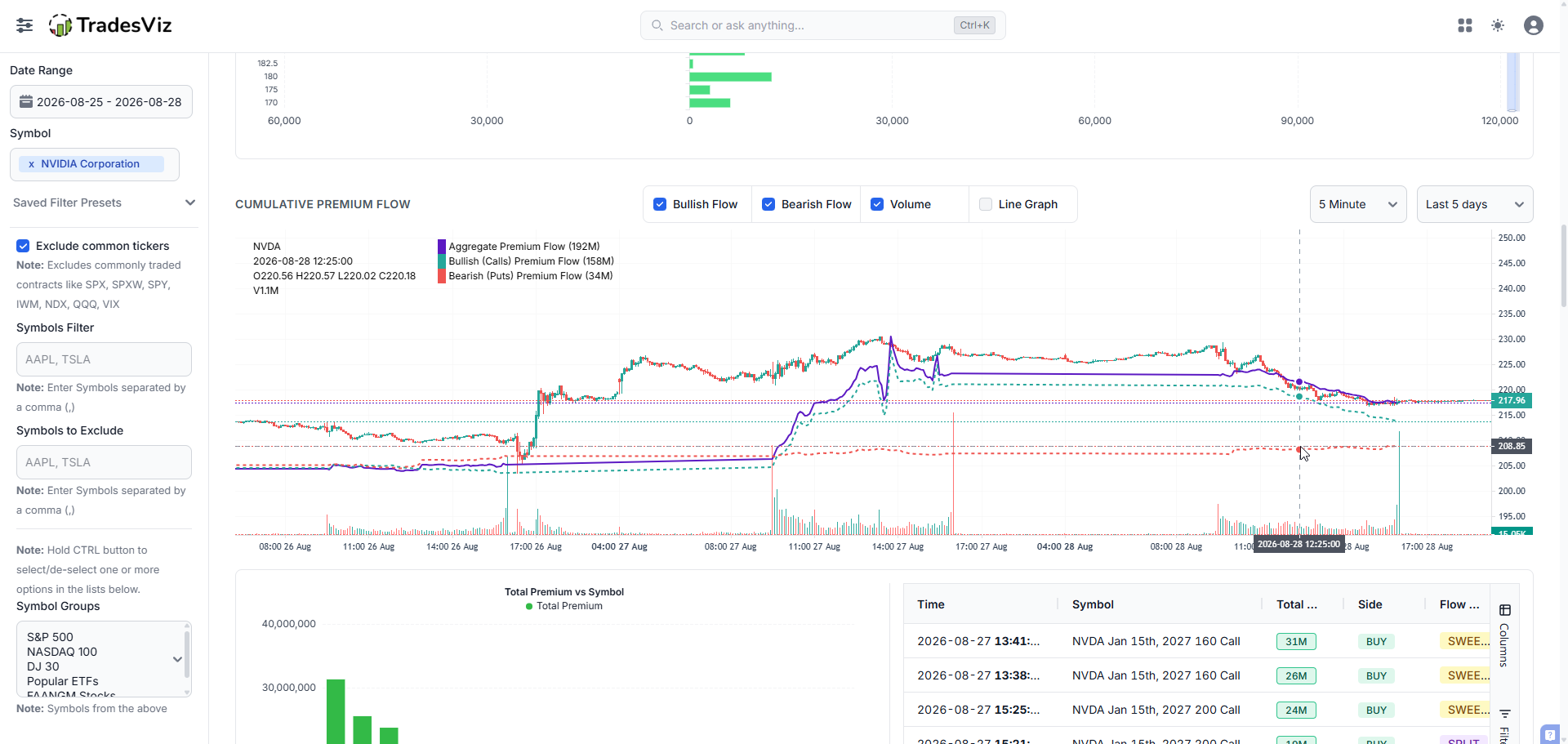
Aggregate flow of $192M splits into $158M bullish and $34M bearish here, and you can toggle each series to see how much of the shape is one side. It is a good chart for spotting where in the day the money arrived. It is a bad chart for concluding that someone is building a position, and our original post leaned on it harder than we would today.
This is the single most over-read chart in retail options flow, and we would rather tell you than let the line flatter you.
How the flow arrived
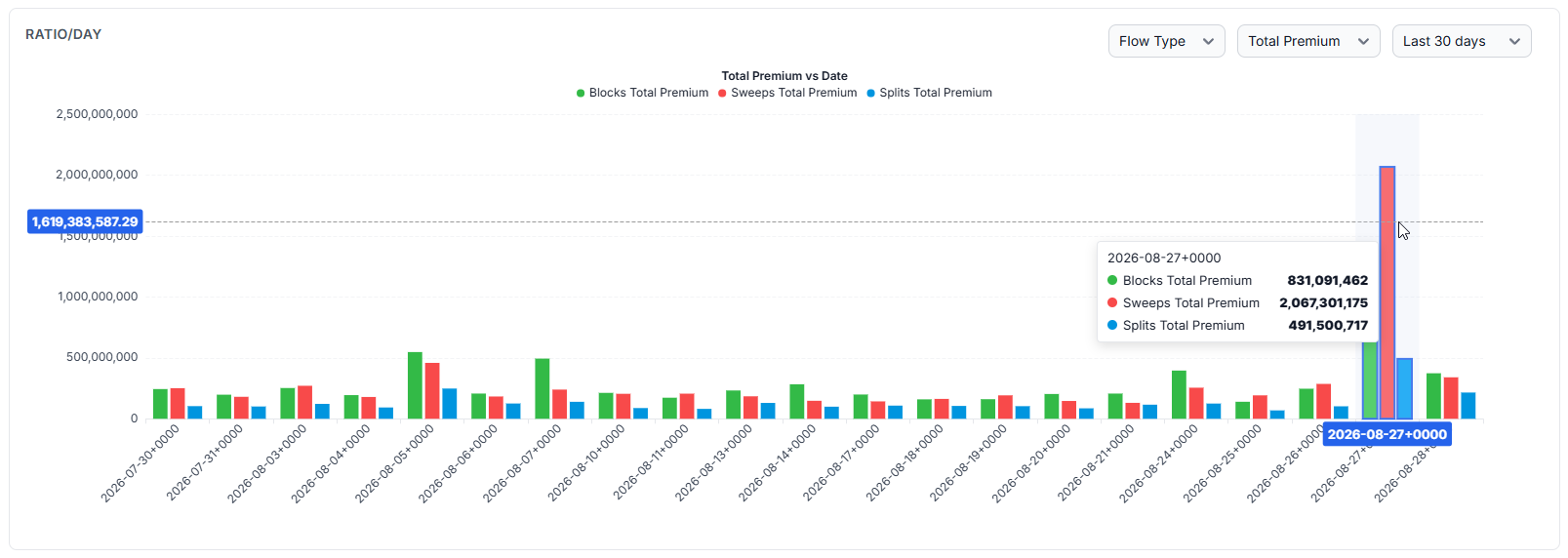
Blocks, sweeps and splits, per day. Most days here are unremarkable and roughly balanced. Then 2026-08-27: sweeps at $2.07B against blocks at $831M and splits at $491M, several times any other day in the window.
A sweep is routed rapidly across several venues to take displayed liquidity, so a sweep-dominated spike says something about execution urgency that a block spike does not. Neither says anything about whether the trader was informed or right. This is the same 08-27 that showed up as unusualness 93 in the signal history and as the NVDA sweep cluster in the AI summary. Three screens, one event.
Finding names you were not already watching
Everything so far assumed you knew which symbol to look at. The Footprint tab is for when you do not.
It looks across a multi-session window and sorts names into behaviours, each with a count so you can see how common it is: volume without open interest, open interest confirms the build, rolled rather than accumulated, rotating out in time, rotating into the front, concentrated in one contract.
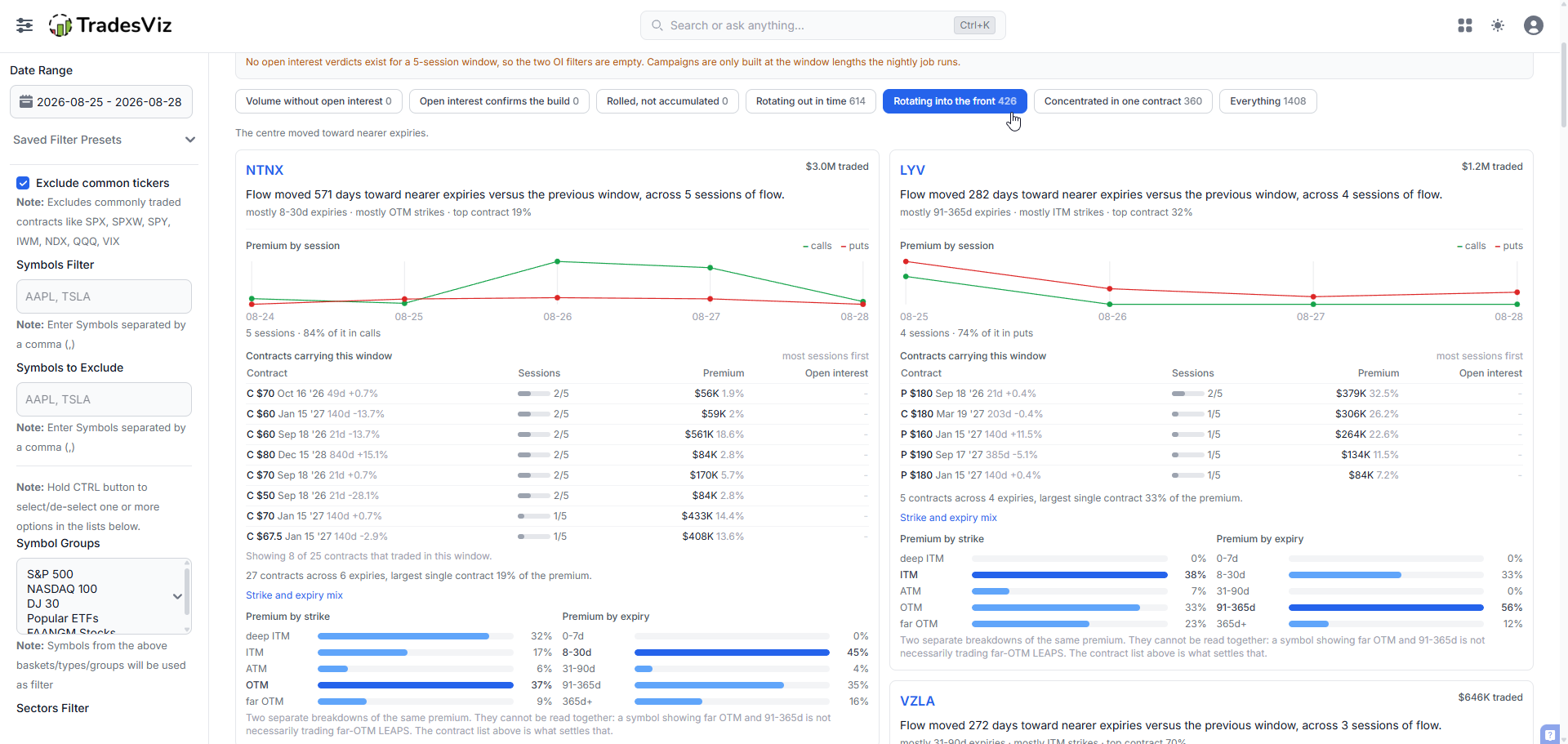
Rotating into the front means the premium-weighted centre of a symbol's flow moved toward nearer expiries. NTNX moved 571 days nearer across 5 sessions, 84% of it in calls. A tenor shift that sharp is worth investigating as a roll, a hedge adjustment or a shorter-horizon view - the shift is the observation, the reason is not.
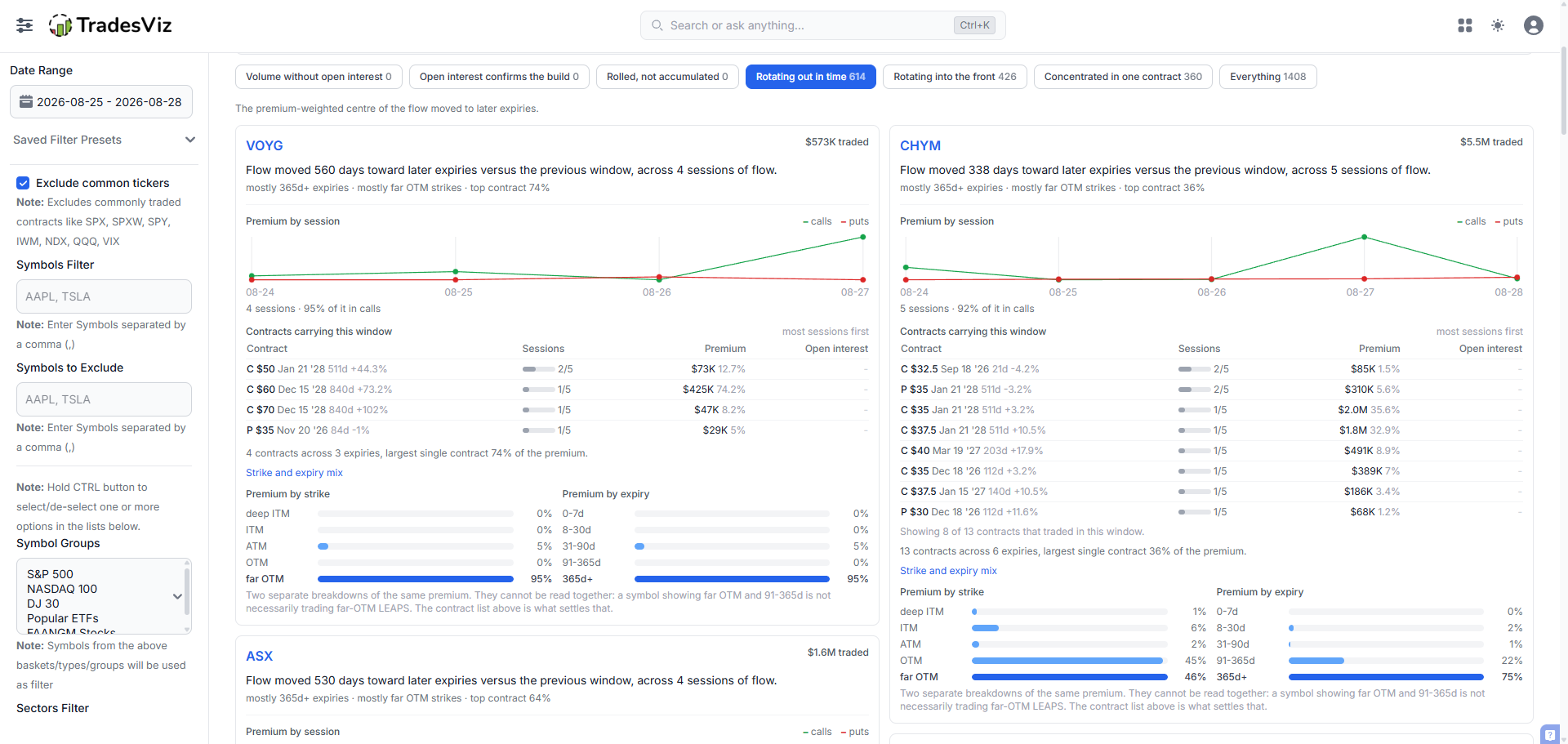
The opposite behaviour is just as informative. VOYG moved 560 days later, 95% calls, with 95% of the premium in far-OTM strikes and 95% in 365d+ expiries and a single contract carrying 74% of it. That is one concentrated long-dated bet, not a broad accumulation.
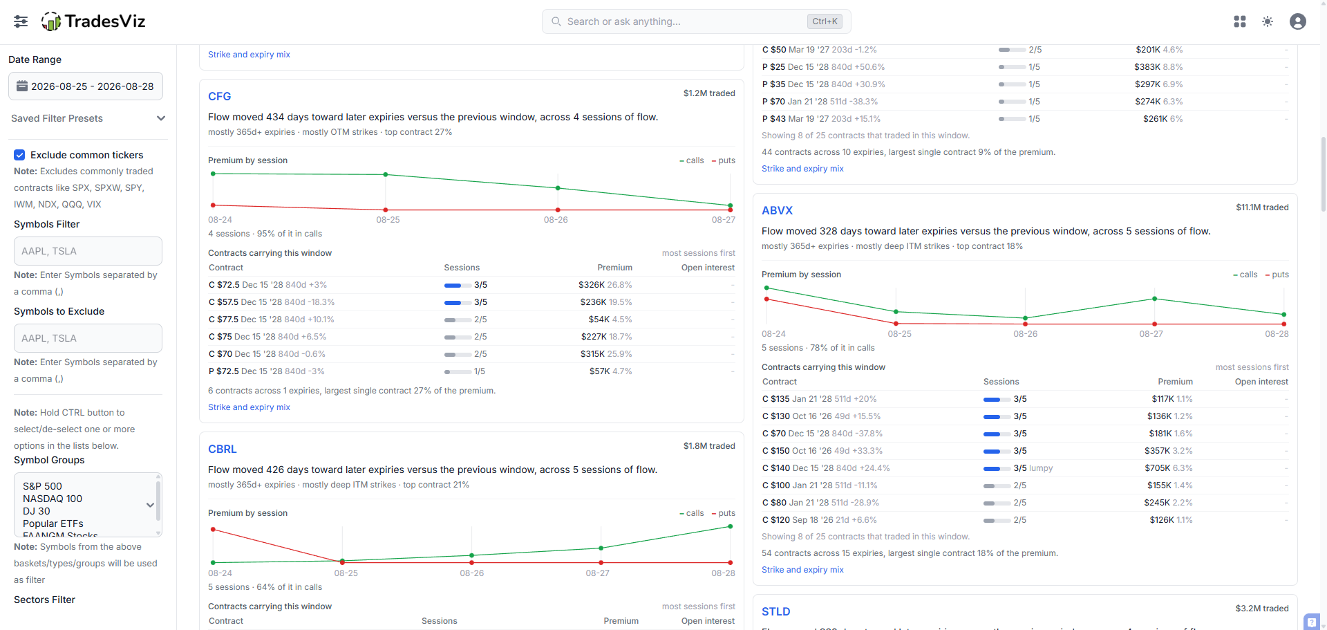
Each card opens into the contracts that carried the window, with how many sessions each appeared in. A contract in 3 of 5 sessions is persistent. One in 1 of 5 carrying most of the premium is a single event, and it gets tagged "lumpy" so you do not mistake one print for a campaign.
Note the banner on that tab: the two open-interest presets read zero at a 5-session window because those verdicts are only built at the window lengths the nightly job runs. We would rather show you an empty filter and explain why than quietly show you a half-populated one.
The filters are the actual power tool
Everything above is a starting view. The filters are what turn this from a dashboard into a research tool, and they apply to every tab at once.
You can cut by date range, symbol, symbol group, sector and industry; by premium, quantity, strike and option price; by spot price, underlying share volume and market cap; by bid-ask spread, days to expiry, open interest and implied volatility; by option type, moneyness, trade price type, side and flow type.
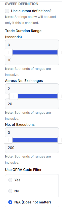
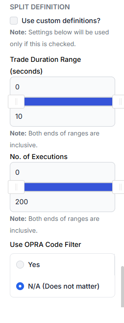
And then the part almost nobody else offers: you can redefine what a sweep or a split even is. Trade duration in seconds, number of exchanges, number of executions, and whether to trust the OPRA condition code. If you think a sweep needs three exchanges rather than two, change it and every screen updates. You are not stuck with our definition.
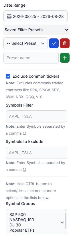
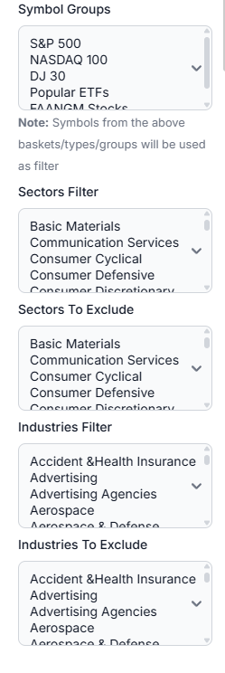
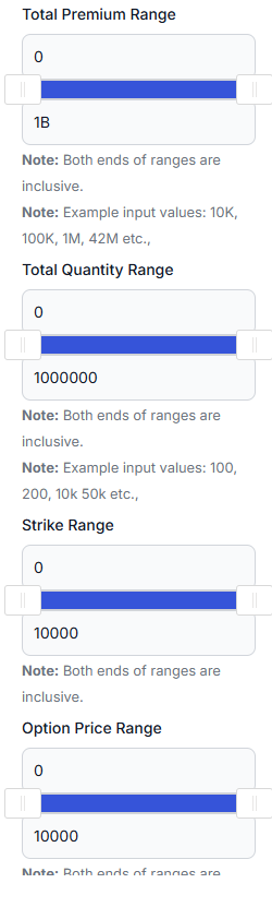
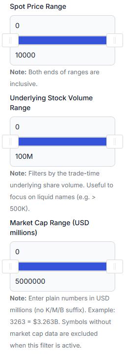
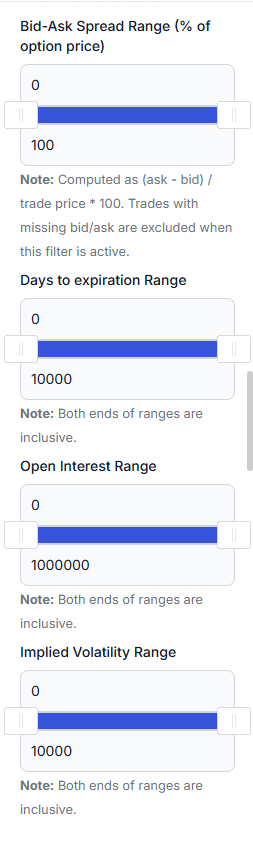
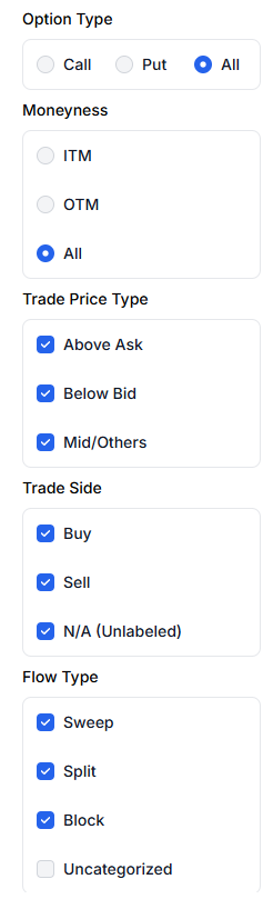
Save any combination as a preset and it comes back next session. Most people end up with three or four: one for their watchlist, one for size above a floor, one for a single sector.
Turning flow into a trade you can review later
Reading flow is only half of it. If you act on something you saw here, the trade needs to carry that reasoning with it, or you will never learn whether reading flow works for you.
This is where being inside a journal matters rather than being a standalone feed. When you take a trade on the back of something on these screens:
- Tag it. Something like
flow:unusual,flow:sweep-clusterorflow:oi-confirmed. After thirty trades you can filter your own journal by that tag and see the real win rate and expectancy of trades you took for flow reasons. That number is the only one that matters, and it is yours, not a vendor's backtest. - Write the hypothesis in the trade plan before you enter, including what would prove you wrong. "Long calls because NEE showed a 10-leg net seller" is a reason you can grade later. "Saw unusual activity" is not.
- Check it against price. Signal history already flags entries as not yet confirmed by price action. Your journal closes that loop with your own fills.
We go into the tagging and plan workflow properly in our trade plans guide, and the reason it matters is the subject of State of Journaling 2026.
Why this feature matters to us
We shipped the first version of this dashboard four years ago and wrote about it at the time in our original options flow post. It was the first analytics feature TradesViz ever shipped. There are a dozen now - simulators, backtesting, AI coaching, broker sync - but this is the one that defined what we were building: take a firehose of raw market data, and turn it into something a trader can actually reason with.
For options traders specifically, we do not know of another platform where the full OPRA tape, your own journal, your trade plans and your performance statistics live in the same place. Flow feeds exist. Journals exist. Having the flow that gave you the idea sitting next to the trade it produced and the statistics that tell you whether it worked - that is the part nobody else does.
The screens in this post are the second complete rebuild. The original 2022 version is still worth reading for the fundamentals of what OPRA data is. Everything about how it is presented has changed since.
We have deliberately not covered the Options Flow Screener here. It is being rebuilt, and it will get a post of its own once that lands.
Five rules to take away
- Group multi-leg orders before you rank anything. Otherwise you are reading the biggest legs, not the biggest bets.
- Read net against gross. Net at 6% of gross means a two-sided session however large the headline is.
- Compare a symbol to itself, not to the market. 119x its own normal in six contracts beats $974M spread across 389.
- Cumulative premium is turnover, not accumulation. Use a next-day open-interest change as confirmation that net new exposure remained in the series, not as proof about any single print.
- Write down why. The data is the same for everyone who has it. What you conclude from it, and whether you check that conclusion afterwards, is the edge.
None of this is a list of trades. It is a guidebook to a market, built on hundreds of millions of data points, and it works exactly as well as the thinking you bring to it.
There is no free lunch, and there never has been. What has changed is where the shortcut used to be. Data this good was once the edge on its own; now anyone can buy it, and an AI will summarise it for you in four seconds. So the edge moved. It is now the willingness to sit with something complicated instead of asking it for an answer.
The market does not become simpler by being reduced to a green arrow. The practical edge is in checking the structure, writing down the hypothesis, and going back afterwards to see whether it held. The data is available to everyone who wants it. The discipline to test what you concluded from it is not.