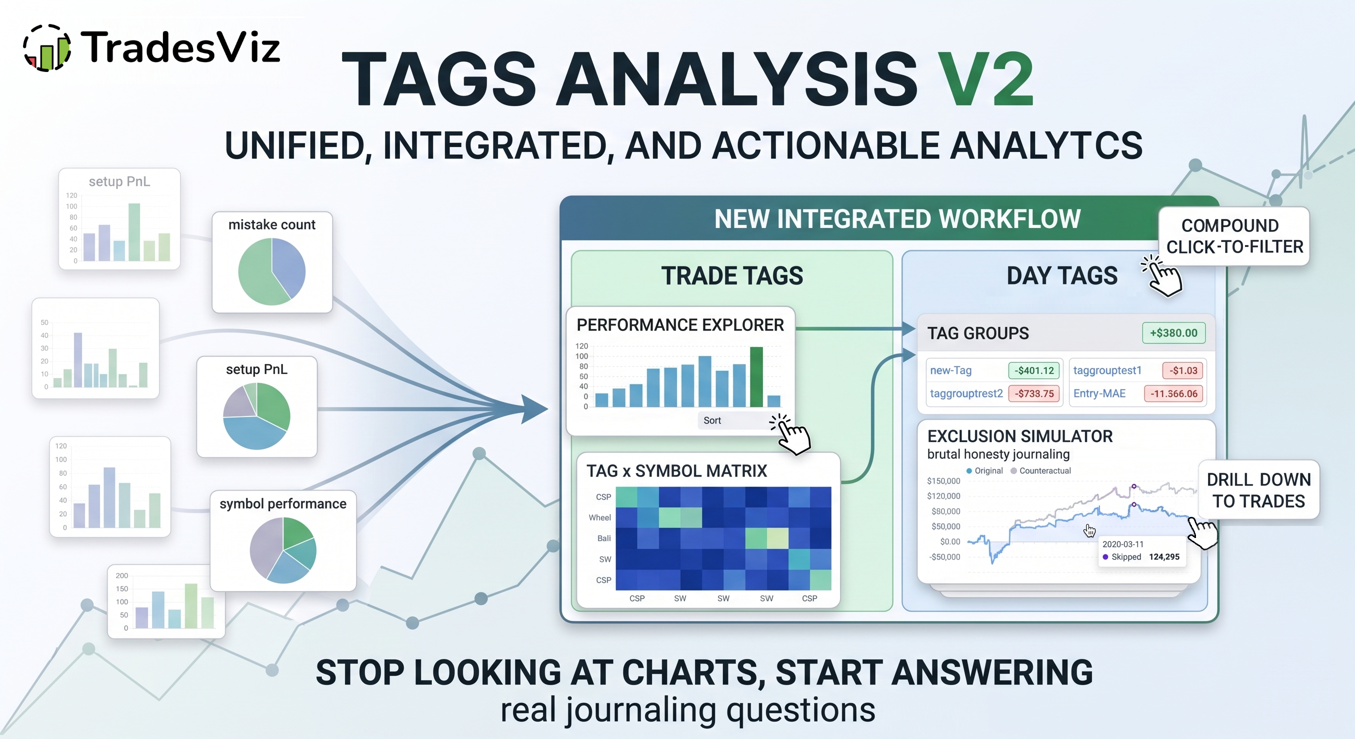
Tags are the single most underused thing in most trading journals. Not because traders don't add them - many do - but because once they're added, the analysis usually stops at "here's a bar chart of PnL by tag". That's it. No drill-down. No interaction between tags. No way to ask "what would my equity curve look like if I just stopped taking these setups?"
We just launched Tags Analysis v2 - a complete rebuild of the entire tag analytics section in TradesViz. It's designed around one idea: your tags should answer real journaling questions, not just show you bar charts.
This post walks through what's new, why each piece exists, and how to actually use it to improve your trading. If you're new to tags in TradesViz, start with the Tags complete guide and the Day tags complete guide first - this post assumes you already use tags.
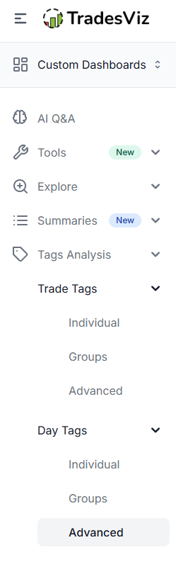
The new structure
Tags Analysis v2 is now organized into two parallel halves, each with three sections:
- Trade Tags - tags attached to individual trades
- Individual
- Groups
- Advanced
- Day Tags - tags attached to whole trading days
- Individual
- Groups
- Advanced
This is intentional.
Trade tags answer "what kind of trade was this?" (setup, mistake, strategy, market regime at entry, etc.).
Day tags answer "what kind of day was this?" (mood, sleep, news day, market state, focus level).
Both are first-class citizens now, with the exact same analytics treatment. If you've only been using trade tags, take a look at our day tags guide - the day side often holds your biggest qualitative findings, and the biggest insights often lie in the intersection of both of these types of tags.
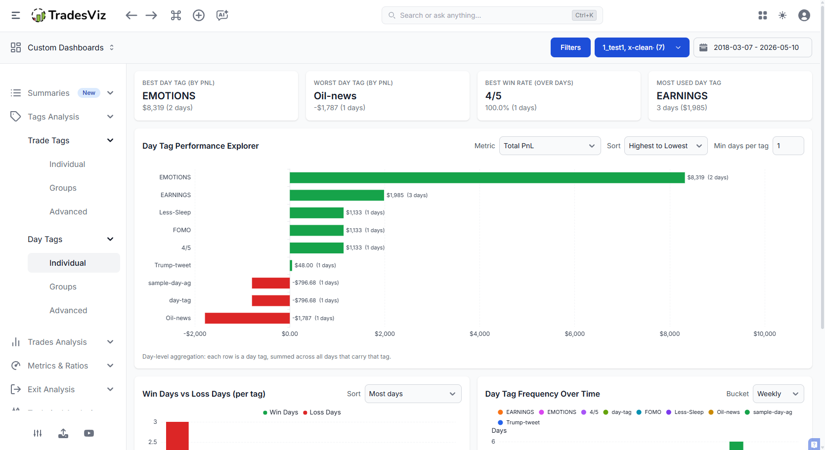
1. Tag Performance Explorer (Individual)
This is the heart of the new section. One master chart with everything you need to see how each tag is actually performing - and a sidebar of controls to slice it your way.
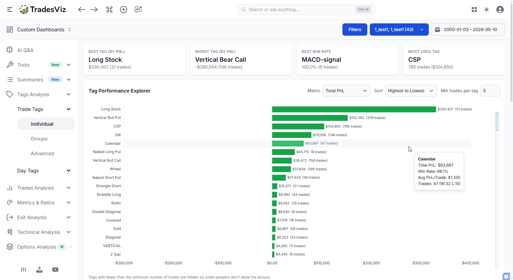
What it does:
- Sort tags by Net PnL, win rate, trade count, average PnL, expectancy, profit factor - whatever metric matters to you right now.
- Switch the bar metric independently of the sort. Sort by win rate, but bar by Net PnL. Find tags that "feel" like they win but actually lose money.
- Compact, scrollable layout. If you have 80 tags, the chart no longer stretches your screen to infinity. The chart itself has a vertical scrollbar - the page stays clean.
- Click any bar to drill straight into the trades behind it.
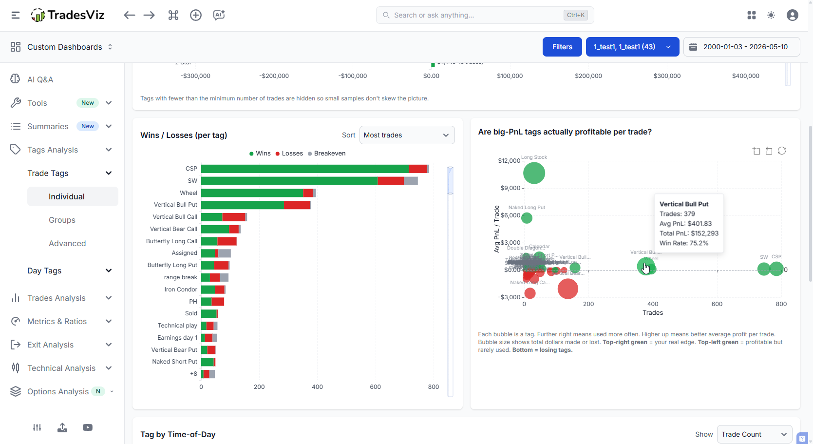
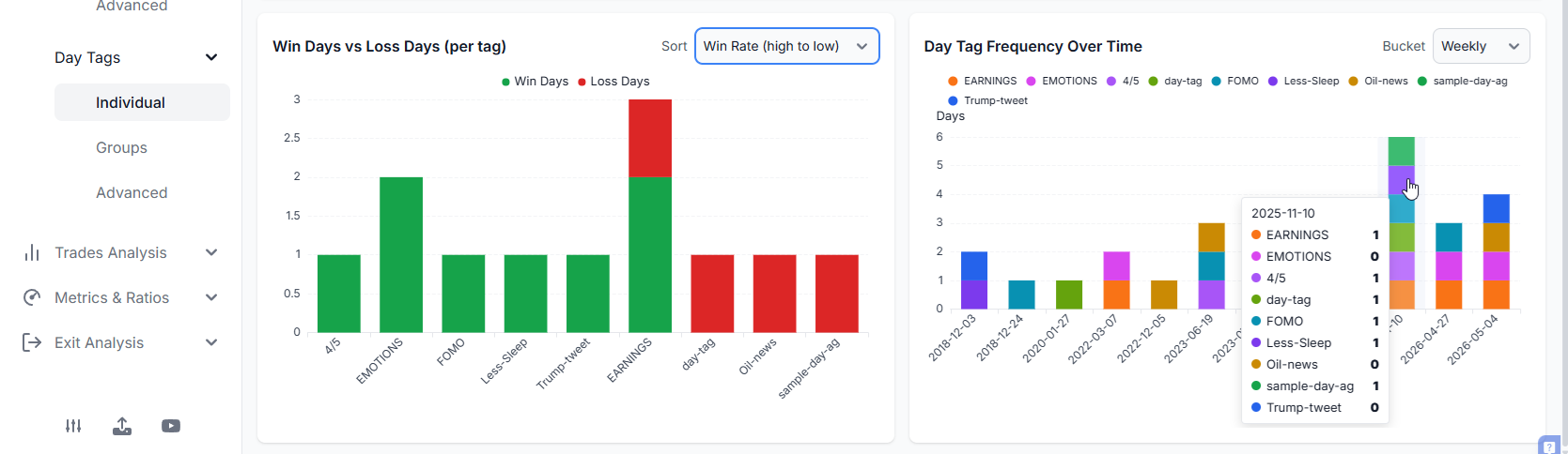
Wins / Losses per tag
A dedicated split chart that shows, for each tag, how the wins and losses break down. This is where you find tags with great win rates but terrible average loss - the classic "death by a thousand cuts" setup.
All of this requires you to spend a few minutes every day after trading, tagging your trades. That's a small effort, but only when you have a decent amount of data points can you make sense of the charts you see. That's specifically why we've added an option to limit or filter stats by occurrences (Min trades per tag).
Next is the Tag vs time of day matrix. This tells you at a glance what tags have been used grouped by time of day. By default, the count of tags is shown (notice the dropdown at the top right corner), but it can be changed to win rate or pnl per trade. Click on any of the images below to maximize them.
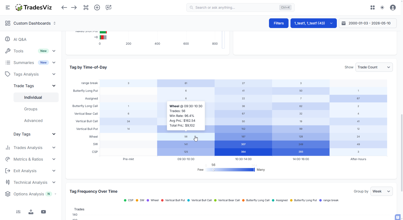 |
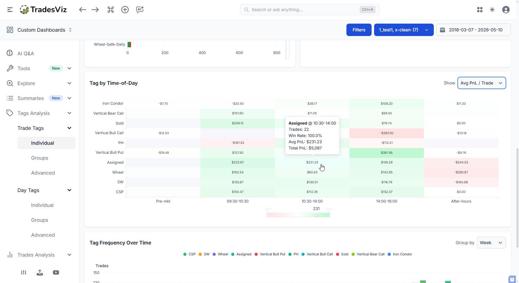 |
Finally, we have a tag frequency over time chart. This shows you what tags you have used over time (data is the X-axis) and how the trend of the usage of your tags has changed. By the time you have reviewed the first few charts, you will have an idea of what tags matter to you the most. Naturally, when you see this trend, you can easily identify if you've been fighitng against a trend or if the strategy you've been executing lately has been in line with your historically profitable ones or not.
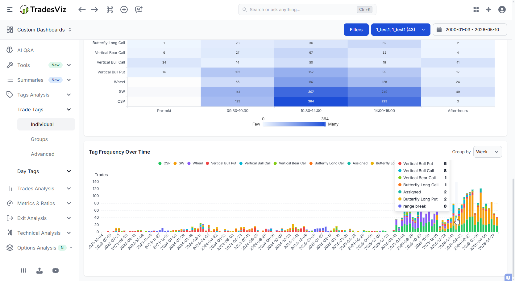
For all of the charts you see here, you can click, zoom, expand, explore etc., They are fully interactive. You can click on ANY data point to drill into the specific data point to see what trades make up that stat. Looking at the charts is only a small fraction of the process. The remaining process is slicing and dicing the data to understand where you lack, where you are doing well, and what can be improved. 90% of traders don't do the anlaysis part and call journaling/analysis useless.
We've unified the multiple charts you saw in the original tabs into a few structured tabs that help you understand your trades a lot better. We've looked at the most effective ways to visualize, and what you see here is a presentation after dozens of internal iterations.
2. Tag Groups view
If you've set up tag groups - things like "Setups", "Mistakes", "Market Regime" - the Groups view rolls all your tags up by group and surfaces the top and bottom performers per group. Each group gets its own card with PnL pill, win rate, trade count, and a clean drill-down list. This replaces the Tag groups summary you might have seen in the Summaries section with a few improvements in UI and utility.
This is usually the fastest way to find your single most-impactful qualitative finding of the month. Something like: "in my Mistakes group, 'chased' tags are -42% of my net PnL." That's a sentence you can act on tomorrow.
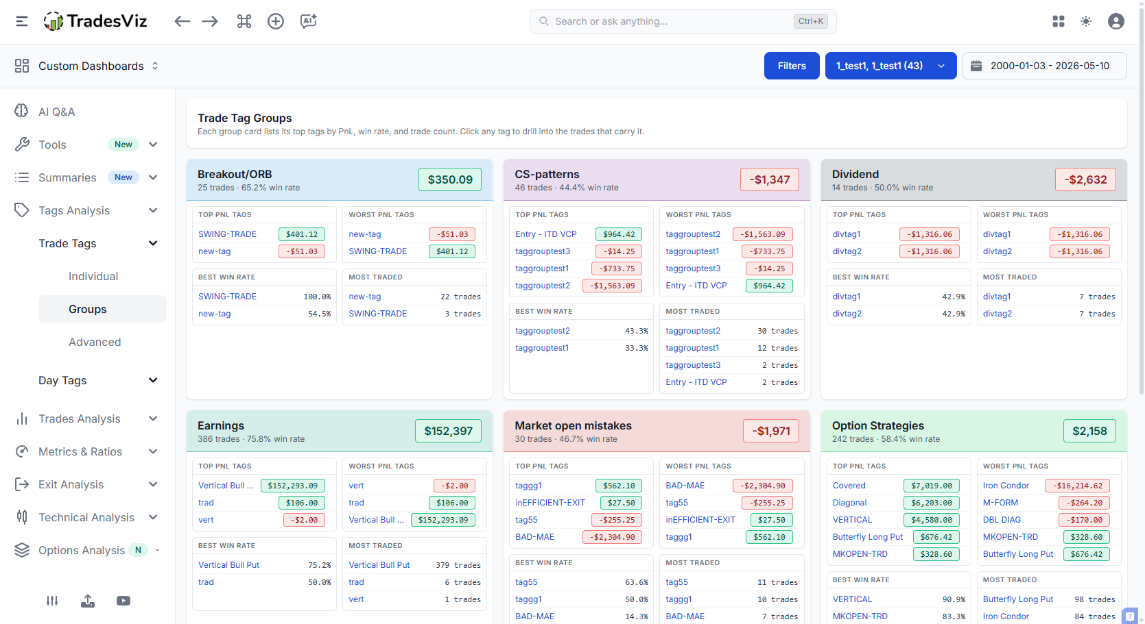
You can now click on any of the tags inside any tag group card to see what trades contributed to the pnl. From this section, you can directly explore into the trade if you want to dig in further.
If you haven't set up tag groups yet, the tag groups charts and summary guide is the fastest way to get started. And here's the part that actually matters: tag groups in TradesViz are a generic, free-form layer - not a hard-coded silo of "Strategy" vs "Mistakes" like every other platform forces on you. Want a group called "Market Regime"? "Time of Day"? "Conviction Level"? "Whatever Helps Me Trade Better"? Make it. That's it.
This isn't a small detail. It's the entire reason features like the Combo Leaderboard, Tag x Symbol matrix, and the exclusion simulator even exist in v2 - they were possible because the underlying data model was designed properly from day one to treat tags and groups as a flexible, queryable hierarchy. Our backend was planned and built by engineers who actually trade, not bolted on top of a templated SaaS starter kit.
Compare that to most competing journals: rigid "Setup / Mistake" categories, no real grouping, no compound queries, and no way to add a new dimension without waiting for the vendor to ship a feature. The reason they look the way they look isn't a UX choice - it's an architectural ceiling. When the foundation is shallow, every analytics feature on top stays shallow too. That's why so many journals are 95% marketing copy and 5% substance: there's no engineering depth underneath to build the substance from.
You shouldn't have to bend your trading process to fit a journal's limitations. Use a tool that bends to you.
3. Tag Advanced - the new analytics layer
This is the most important addition in v2. Five new analyses that answer questions no other trading journal can answer:
Tag x Symbol matrix
A heatmap showing which symbols each tag performs best (and worst) on. Your "breakout" setup might be a hero on NVDA and a disaster on SPY. You won't see this in any normal "PnL by tag" chart.
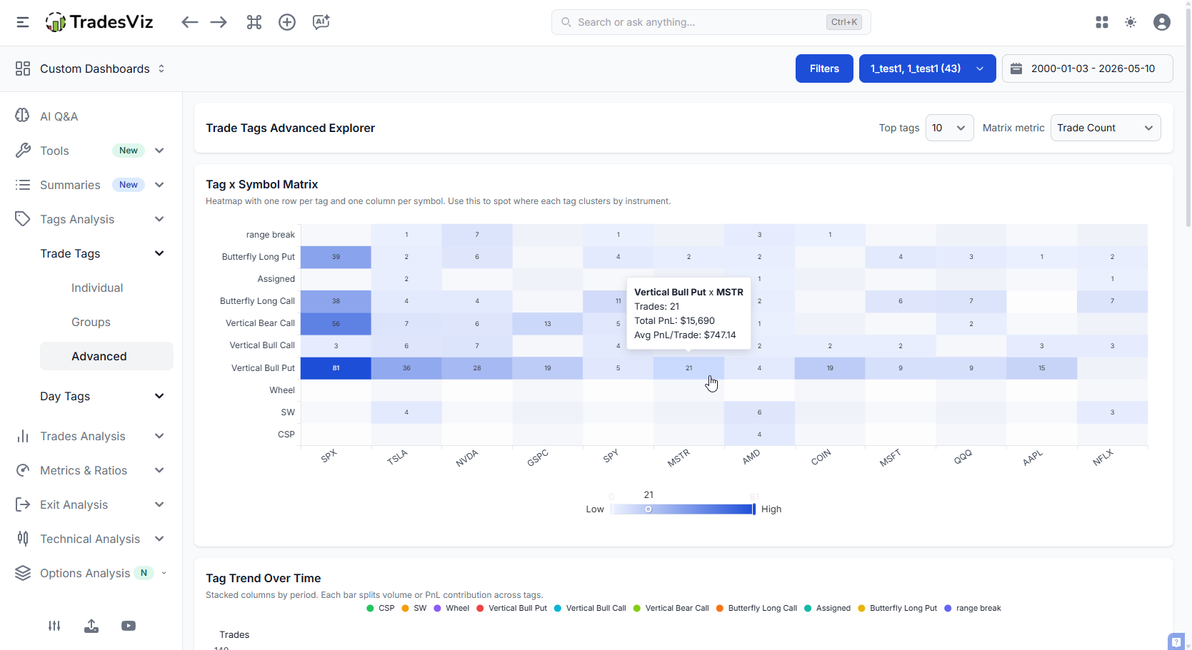
Click any cell and the trades table filters to that exact tag AND that exact symbol. This is what we're calling compound filtering - one click, two filters, straight to the trades.
Tag Trend Over Time
A stacked bar chart of tag activity (count or PnL) over weeks/months/quarters. New colour palette - up to ~30 distinct, well-spaced colours, with a deterministic fallback hash for anything beyond that. No more "why are these three tags all the same shade of blue?".
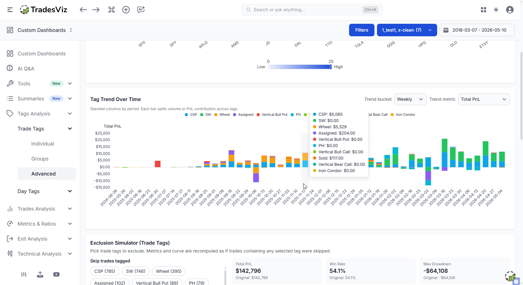
Click any segment and you drill into that tag for that specific period. Find the week your "FOMO" tag spiked? One click and you're looking at the actual trades.
"Tag Frequency Over Time" (Individual tab) and "Tag Trend Over Time" (Advanced tab) look similar, but they are built for different decisions.
Tag Frequency Over Time answers: How often did each tag show up?
It is a pure count view, meant for quick pattern spotting in the Individual workflow.
Tag Trend Over Time answers: How did each tag evolve over time in either usage or performance?
In the Advanced workflow, you can switch the metric from usage count to total PnL, so the same period bars can be read as activity or impact.
| Chart | Primary question | Metric options | Best use case |
|---|---|---|---|
| Tag Frequency Over Time | Which tags appear most often over time? | Count only | Discovering behavioral consistency and routine tag usage |
| Tag Trend Over Time | Are tags gaining/losing influence over time? | Count or Total PnL | Evaluating whether a tag is not only frequent, but also profitable or costly |
Important nuance: when Tag Trend Over Time is set to Count, it can resemble the Frequency chart. The difference is context. Trend is part of the Advanced analysis flow and is designed to be interpreted alongside deeper diagnostics.
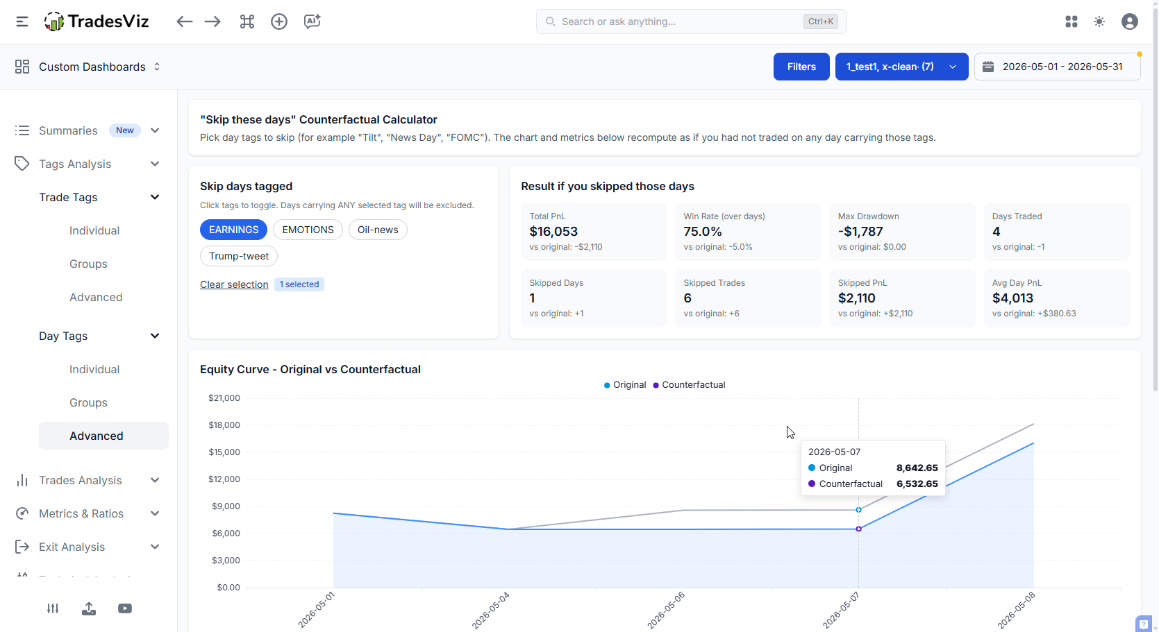
"Skip these tags" - the Exclusion Simulator
This one is our favourite. Pick any combination of tags. The simulator removes those trades from your history and replots your equity curve as if those trades never happened. Overlayed: your real curve vs. your hypothetical "skipped" curve.
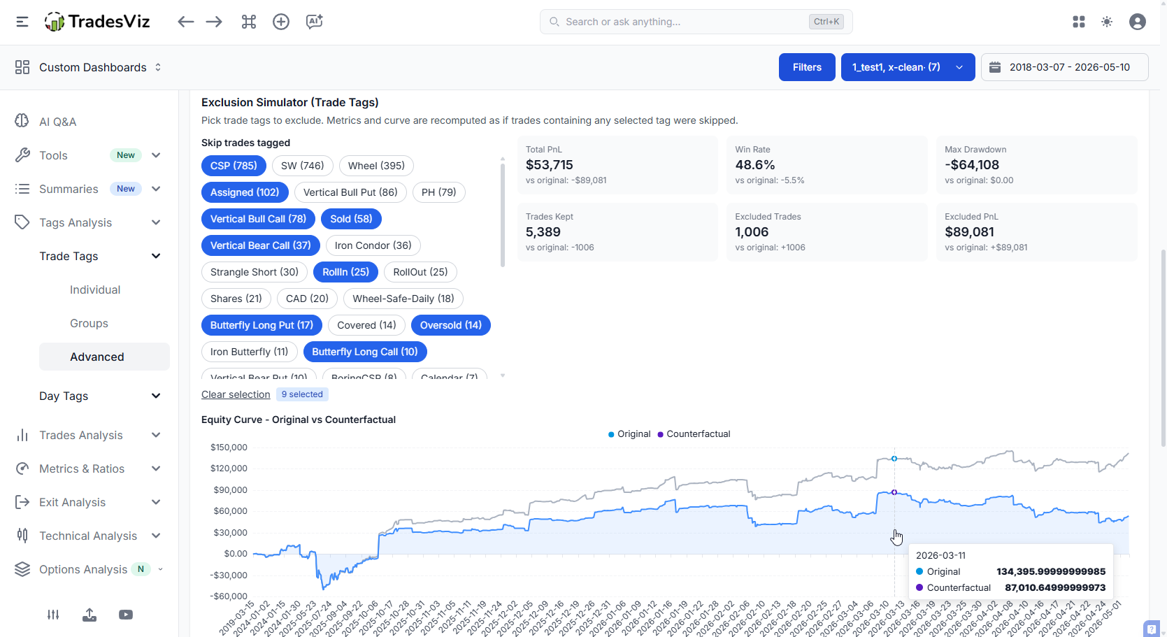
Above the chart chart you get the deltas - what changes in net PnL, win rate, max drawdown, profit factor, expectancy when those tags are removed.
This is brutally honest journaling. If skipping your three worst tags would have added 35% to your year, you now have a number to point at when you're tempted to take that setup again. Numbers beat willpower. At the same time, this should not be mistaken for exploring cases where you just exclude all tags that result in losses! That's akin to sweeping the problem under the rug. We talk about a lot in our psychology guide. You can't have wins without losses. You can't have a 100% win-rate in a realistic real-world scenario across a longer horizon. This visualization exists to give you a glimpse into what you should look into fixing - not what you should look into avoiding.
Tag Co-occurrence & Combo Leaderboard
Two related tables that look at how your tags combine:
- Co-occurrence: Which pairs of tags appear on the same trade most often? And what's the PnL of those pairs?
- Combo Leaderboard: Full multi-tag combinations ranked by PnL, win rate, count.
Both tables show Total PnL with the same coloured PnL pill used in tag groups, so values are instantly readable. Click any row to drill into the trades that match that exact combination.
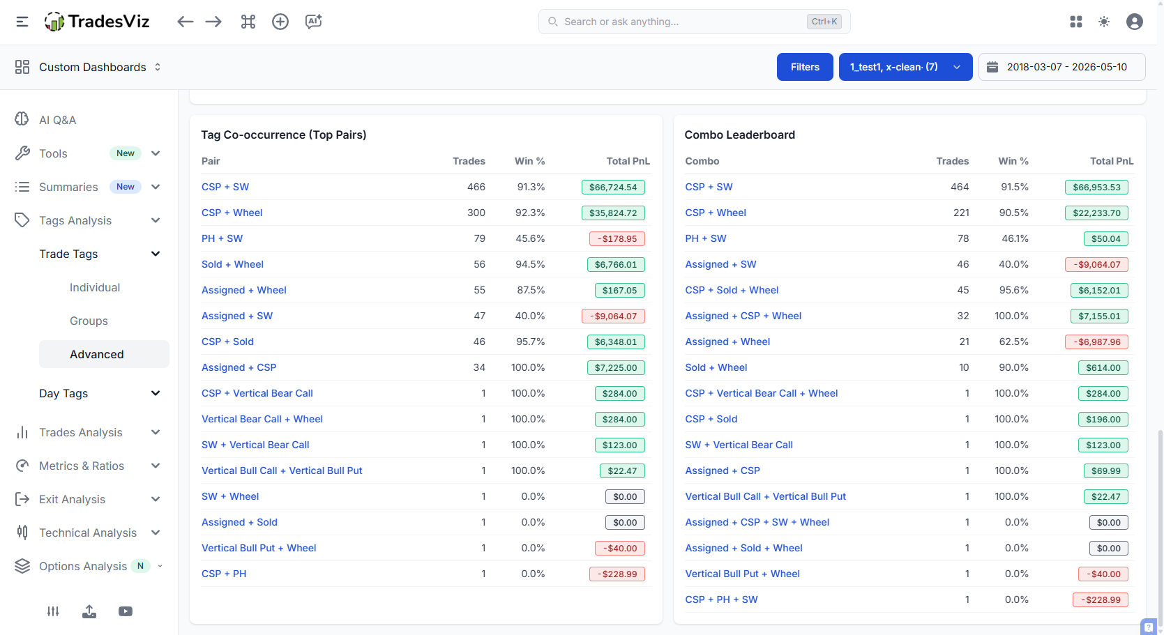
This is the kind of analysis that surfaces things like: "every time I tag a trade with both 'earnings' and 'late entry' I'm -$4,200 over 11 trades." Not a tag problem. A combination problem. You wouldn't catch this in a flat tag chart.
4. Day Tags get the same treatment
Everything above also exists on the Day Tags side - Individual, Groups, and Advanced. Same Performance Explorer, same colour palette, same compound click-to-filter, same exclusion simulator ("skip these days").
If you've been tagging your days with things like tired, news_day, chop, trend, over-traded - this is where those tags pay you back. The day-level "skip these days" simulator is one of the fastest ways to find rules like "I should not trade tired days" or "chop days are killing my month".
Not tagging your days yet? Start here: Day tags complete guide.
Similar to the tags individual scection, day tags also provides you with a simple overview of the best day tags with the option to choose the metric you want to visualize.
The connecting thread: compound filtering
If you take one thing away from this post, take this:
Every chart in Tags Analysis v2 supports compound click-to-filter. One click on a bar / cell / segment filters your trades by multiple things at once - tag + symbol, tag + period, tag + time-of-day, tag combinations, etc.
You see something interesting, you click it, you're looking at the actual trades, you can pull them up in trade explore, read your notes, look at the charts. Insight into evidence in two clicks.
None of the above is available in any other journaling solution. No other team has the experience or the expertise that TradesViz has in creating useful visualizations. We let our features and insights speak for themselves.
This should also make it clear that if you are really looking into using journaling for effective, efficient tracking, and if you intend to learn from your data, TradesViz is the best choice.
Why this matters for journaling
We've said it before in the State of Trade Journaling 2025 report and the effective journaling post: most trading journals stagnate at "here are some bar charts". The reason traders churn through journals is they hit a ceiling - they can see their tags but they can't do anything with them.
Tags Analysis v2 is built on a different premise: a journal should help you find specific, actionable findings that change how you trade next week. Not generic stats. Not vanity dashboards. Findings like:
- "My 'reversal' tag has a 62% win rate - but my expectancy is -$23 because my losers are 3x my winners."
- "My 'breakout' tag is +$8k on QQQ and -$3k on small caps. Stop trading small-cap breakouts."
- "Skipping every 'tired' day adds 28% to my year and cuts max drawdown by 41%."
- "Trades tagged with both 'FOMO' and 'late' are -$4,200 over 11 trades. Hard rule: don't take this combo."
That's what tag analytics should produce. A short list of rules you can actually follow.
Getting started
- If you don't use tags yet → Tags complete guide
- If you don't tag your days yet → Day tags complete guide
- Set up tag groups for at least 2 categories (e.g. Setups, Mistakes)
- Open Trades Analysis > Tags Analysis (New) in your dashboard and start with Trade Tags > Advanced
- Run the "Skip these tags" simulator on your worst 3 tags. Look at the delta. Make a rule.
If you want a wider perspective on how all of these features fit together with notes, plans, and charts, our how to journal and analyze trades post and the trades vs notes vs tags vs plans guide are good starting points.
Related reading
- Tags complete guide
- Day tags complete guide
- Tag groups - how to set them up
- Tag group charts & summary
- Tags table - the grouped view
- Bulk add tags to your account
- Pivot grid - cross-cut tags with anything
One last note: if there's a tag analytic you wish existed, email us at [email protected]. Almost every chart in Tags Analysis v2 came directly from user requests. Keep them coming.