The next big thing in TradesViz: A single tab to rule them all.
One tab that has a single table that can visualize ANY statistic, or chart you want. There has NEVER been a more flexible, and intuitive way to interact with your trading data. This feature is exclusive to TradesViz and one that massively improves the value of your account.
If you previously used Excel because you thought it was easy to search, filter, and chart - then this feature WILL replace your sheets.
This is going to be a very detailed guide on how to use this feature. Let's get to it.
Why? There are already 4 types of tables
A natural first question if you are already a user of TradesViz. Being the only trading journal to offer multiple tabular column views, we've found that among all the elements and tabs we have, tables are the most used and liked features among traders.
This grid offers way more flexibility and advancements over the existing tables we have. It is entirely possible for you to ONLY use this pivot table as a replacement for ALL charts, and tables - it's that powerful in visualizing data. We improved our tables and features related to them over the last 3 years, but this new table beats all of that. We will be improving this also along with the other tables, but expect these types of grids to replace all tables in TradesViz in the future to offer a seamless tabular analysis experience.
Moreover, a PIVOT table is something totally new to TradesViz. For those who are not familiar with it, a pivot table is a statistics tool that summarizes and reorganizes selected columns and rows of data in a spreadsheet or database table to obtain a desired report. The tool does not actually change the spreadsheet or database itself, it simply “pivots” or turns the data to view it from different perspectives. We have nearly 70 columns or data points for EACH trade. Imagine the amount of analysis you can do with this. None of this will ever be possible with the normal tables we have.
What does this solve?
Easier accessibility: Charts and tables are unified in this tab. Click on a chart's data point and you instantly see the filtered rows on the table - Filter the table and you instantly see the charts change. It's all happening right there in front of you. No tab switching, no redirections. Choose any data point you want, chart them, and analyze them.
Better advanced analysis: Pivot tables bring in a whole new level of analysis that was not possible at all in TradesViz before. Almost every chart in TradesViz can be reduced to a pivot operation. With nearly 70 columns and multiple aggregation functions, this expands to 1000s of potentially very useful and insightful charts.
Zero-lag data interaction: No lag when you turn pages, 100 rows or 1000000 rows? No problem. Charting, filtering, and pivoting all take mere seconds.
Updates from TradesViz v2.0:
From TradesViz v2.0, all tables of TradesViz are now grids similar to the pivot grid. This means, you now get nearly the same functionality as the most powerful grid in an online trading journal in EVERY SINGLE TABLE in TradesViz. Here's a video about how the new tables of TradesViz work. We have made the overall grid experience smoother, faster, and easy to save and reload with the newer updates.
How to use this?
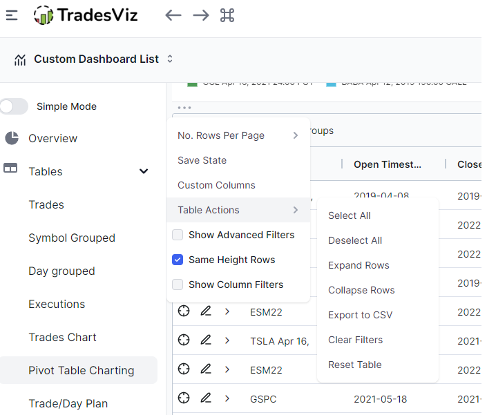
We will split this into 3 parts: grid mode, pivot mode, and charting features. Even though charting is intertwined and integrated deeply into the grid and pivot, we will still explore it as a separate section to go in-depth into all the features you can use. To access the pivot grid, click on "Pivot table charting" under the "Tables" section in your dashboard. The pivot grid always opens in the default grid mode. The normal
Grid mode features
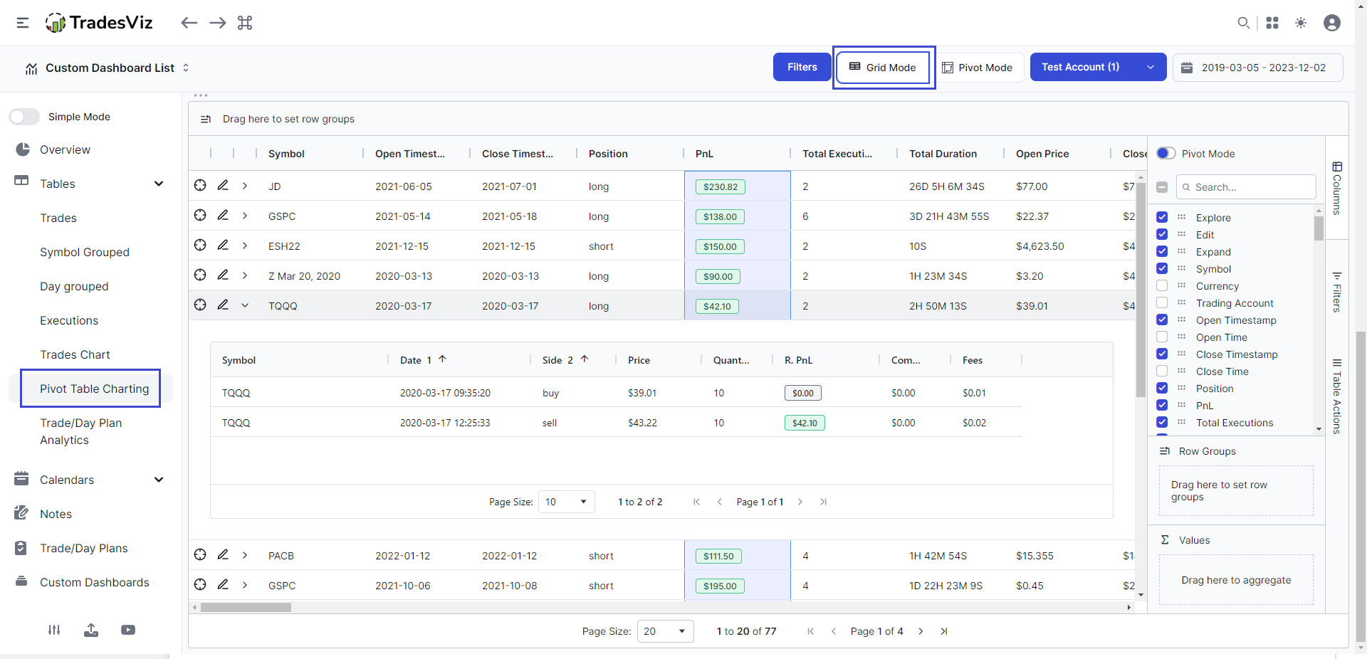
The first question you may ask is - other than the charts, what is the primary difference between the table here and the normal trades table?
The answer can be split into short points:
- Grid is fast - zero loading, refreshing, etc., - no matter how much data you have
- Everything can be filtered and sorted
- A lot more columns for better analysis
- Row grouping is possible with custom aggregates to create quick summaries
Filtering/Column arrangements/Sorting
Video (click to play):
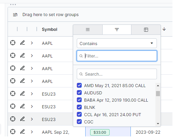
Filtering is the most important feature when it comes to tabular data analysis. You need to be able to find trades quickly. TradesViz has the most efficient filtering system among ANY online or offline trading journal due to our unique global + table-level logical expression filters. Again, this grid takes that and makes it more intuitive. You can click on the filters button on the right side to open the filter table and easily apply multiple filters based on your preferences.
You can also filter by hovering over any column and clicking on the filter icon.
Hiding and making columns visible is super easy with this new grid - just check/uncheck the columns you want on the right side. To rearrange, just drag the column name on the tab on the left.
The no. of clicks and actions you need to do to achieve these actions in our normal tables has been drastically reduced using the grid whilst greatly improving the overall utility.
To sort, just click on any column header. The additional feature compared to the other tables is that you can multi-sort by holding down the shift key.
Grouping
Here is where things start to get interesting. You can create any groups by dragging a column header to the top empty area or the row group empty area on the right side. This essentially turns this single table into one group-by-symbol or group-by-day table that we already have in the trades table tab. Not only that, but you can also sort any column/group by simply clicking on the column label in the groups area. This is NOT available in the main trades tables - this is only possible in the pivot grid.
Video (click to play):
The other interesting feature is that you can set any type of aggregation - for example:
- Group by symbol and find the total of pnl
- Group by time duration and find the max pnl and total volume etc.,
- Group by underlying and find the average MFE/MAE etc.,
The possibilities are endless with grouping. You can group ANY category-based rows like symbol, underlying, price range etc., and ANY numeric-based rows can be applied as the aggregate like sum/avg/min/max/last/first of PnL, volume, duration, MFE/MAE return, etc.,
Charting
This is in our opinion, the best feature of this grid. You can plot/chart anything you see on the table. This is in addition to the already available charts at the top of the grid (which are connected to the grid - this, we will explore in a dedicated charting section below). For now, here's an example of the grouped table example shown above plotted in a chart:
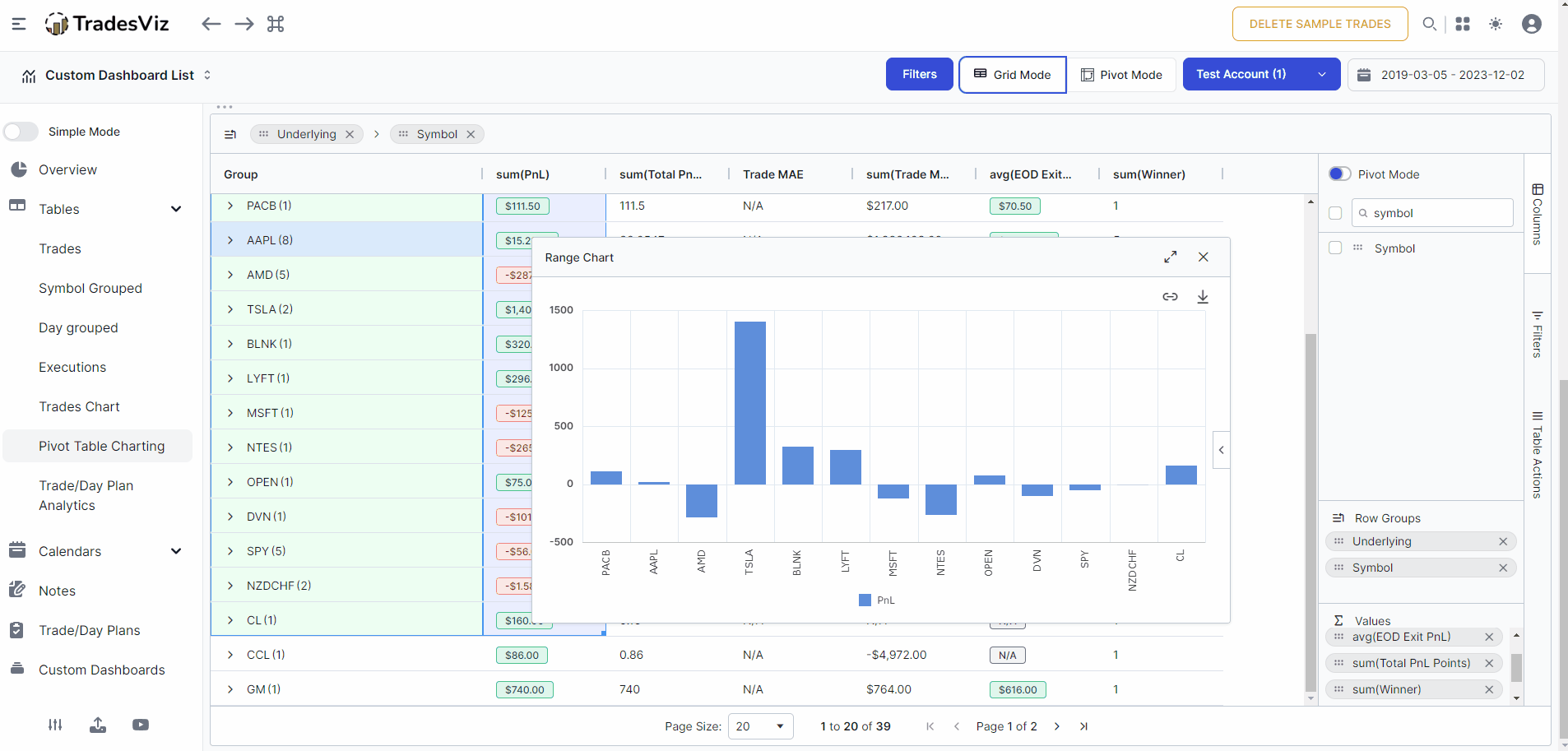
You can not only plot single series but plot multiple series AND on different chart types. All from within the grid - no tab change, no need to visible different pages - filter, sort, group, chart, visualize - all in a single view.
All you have to do is click and drag a section of the grid, right-click and click on chart range, and choose the type of chart you want to visualize your data on.
Video (click to play):
Once again, the possibilities of what you want to visualize and how you want to visualize are endless.
Just remember: You have 90 columns in this grid. You can group, chart, and visualize *every* aspect of your trading.
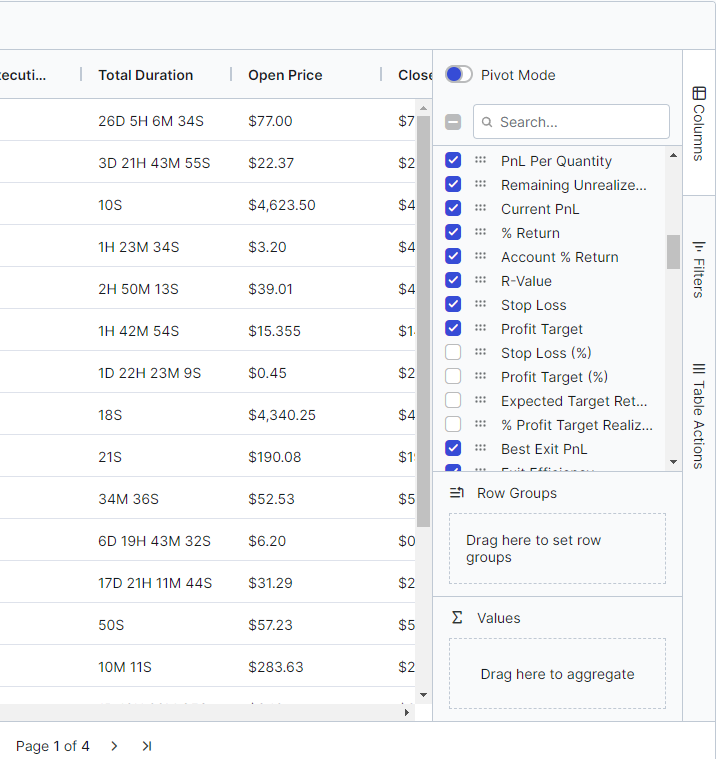
Pivot mode features
This is something completely new to TradesViz. Traders who have extensively used excel sheets before, that this is one of the *best* analytics features out there. To reiterate, a pivot table is a statistics tool that summarizes and reorganizes selected columns and rows of data in a spreadsheet or database table to obtain a desired report.
Why is this important or useful? Do you see all of those tags that you have? You can now analyze them in FAR greater detail than before. The analytical value of your tags, and group tags go up exponentially with the pivot table. This is why we recently posted and emphasized the importance of qualitative analysis on our social medial channels.
To enable this, all you need to do is, click on the pivot mode toggle on the top right side of the grid. The feature related to filtering, sorting, and charting are very similar to the grid features that we just explored. We will focus on a few examples of using the pivot table effectively.
Grouping/Pivot/Charting
Similar to the grid, you can drag and drop columns on the row group areas to see the aggregate values. On top of that, the highlight feature is the column labels - i.e the "pivot". Try dragging any categorical column into that field and you will see the table change a lot. You will now see all the aggregates for EACH individual pivot group column. Take a look at the example below.
Video (click to play):
In the above example, we saw how the tag's performance was correlated with different months of the year and similarly, the symbol's performance. Now, have you ever wondered if your trading duration/hold time changes throughout the year? Of course, the markets are not going to be the same throughout the year and it is because of that, it's useful to analyze the seasonality of your trades with respect to various metrics like pnl, duration, volume, tags used, and more. This is again, one small example of what is possible with the pivot table.
Here's another simple example with charting to visualize pnl and other factors with respect to the date - month, year, week, etc., The short analysis shown below would take minutes and is not even possible in most trading journals. With TradesViz, it's effortlessly possible to view summaries of your trading in mere seconds visualized effectively.
Video (click to play):
Now, a natural question occurs: what's the difference between pivot and grid when it comes to charting? You can use grid charts in pivot mode also, but using pivot charts is much more effective because you don't necessarily need to select a range. Charting in the grid is very useful if you want to visualize subsets of your data. Whereas, the pivot is better if you want to visualize the entire dataset.
Also, selecting numeric values in pivot will instantly add it as a column you can analyze - basically, it reduces the "clutter" of the grid and lets you focus on just the columns you want. Doing the date-based analysis as shown above using the grid-based charting would have taken a lot more interactions.
Charting features
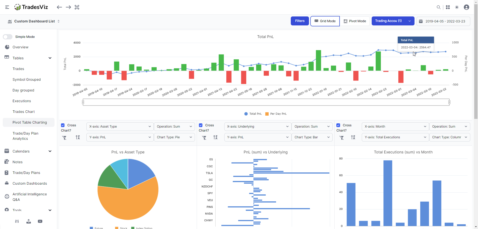
We have explored all the features of the grid and the pivot table and charting *within* these tables. But we have also included charting outside of these tables that automatically update based on your interactions - this makes overall analyses effortless and pretty much cuts down on the number of actions/interactions you would need to get the type of analysis you want.
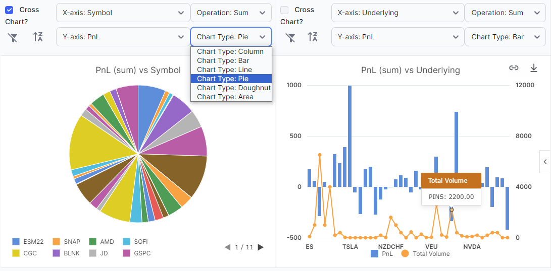
Cross Filtering
As the name implies - the filtering that happens on the chart (by clicking) also happens on the table and vice-versa. This is similar to a feature that is extensively used in TradesViz - the chart explore where we introduce the click to explore for ANY chart on TradesViz including multiple selections. This is very similar to that, but the difference is that the data loading is instant, and you also see visualizations on multiple charts differentiating the data that is filtered and the data that is filtered out. The video below perfectly describes this by filtering multiple data points.
Video (click to play):
Note that the overall PnL chart at the top also changes based on your selections. This is very useful to visualize, say, how you would have performed if you only traded a certain asset type or a price range or if you had your MFE/MAE within certain ranges (filtered via a table).
Remember that filtering on the table also filters the charts and changes the way you see the data. The whole theme here is that the number of ways you can visualize data is potentially infinite because of the no. of filters and charts you can create.
You will notice that there are 3 charts below the main pnl chart. You have full freedom to choose what data you want to be visualized on these charts - all of it is saved as part of the grid and will be restored the next time you visible your pivot tab. Just make sure to click on the 3 dots icon above the table (top left corner) and click on Save state.
Each of the 4 charts has the following customizations:
| Chart type |
Data grouping |
X-axis |
Y-axis |
| Column | Sum | Symbol | PnL |
| Bar | Average | Trade | Total Executions |
| Line | Count | Win/Loss | Total Duration |
| Pie | First | Position | Open Price |
| Doughnut | Last | Open Date | Close Price |
| Area | Min | Close Date | Total Volume |
| Max | Underlying | Total Buy Quantity | |
| Asset Type | Total Sell Quantity | ||
| Day | Open Position | ||
| Week | Total Commission | ||
| Month | Total Fees | ||
| Year | Total PnL Ticks | ||
| Price Range | PnL Per Quantity | ||
| Volume Range | Remaining Unrealized PnL | ||
| Time Range | Current PnL | ||
| Duration Range | % Return | ||
| PnL Range | Account % Return | ||
| Account % Return Range | R-Value | ||
| % Return Range | Stop Loss | ||
| R-value Range | Profit Target | ||
| Price MFE Range | Stop Loss (%) | ||
| Price MAE Range | Profit Target (%) | ||
| Trade MFE Range | Expected Target Return | ||
| Trade MAE Range | % Profit Target Realized | ||
| Best Exit PnL | |||
| Exit Efficiency | |||
| Best Exit R-value | |||
| Trade MAE | |||
| Trade MFE | |||
| Price MAE | |||
| Price MFE | |||
| MFE/MAE Ratio | |||
| EOD Exit PnL | |||
| EOD Exit Efficiency | |||
| EOD Exit R-value | |||
| Last EOD Price (Underlying) | |||
| Last EOD Price | |||
| Unrealized R-Value | |||
| Total Remaining Position Value | |||
| Sell Cost Basis | |||
| Buy Cost Basis | |||
| Total Cost | |||
| Stop Distance | |||
| Profit Distance | |||
| Open Stop PnL | |||
| Open Profit PnL | |||
| DTE | |||
| Winner | |||
| Loser | |||
| Max Running PnL | |||
| Min Running PnL | |||
| Positive PnL Time | |||
| Negative PnL Time | |||
| Multi-timeframe PnL (All variants) | |||
| Days Since Open | |||
| Total Credit/Debit |
The two buttons are for removing the filter and for sorting the X-axis - again, even sorting affects the charts! These charts are in complete sync with the table and vice-versa.
Another interesting feature is that these charts also support multi-filter - meaning, you hold down the Ctrl key (or cmd) and click to select multiple data points - it works on all three charts and on all types of charts.
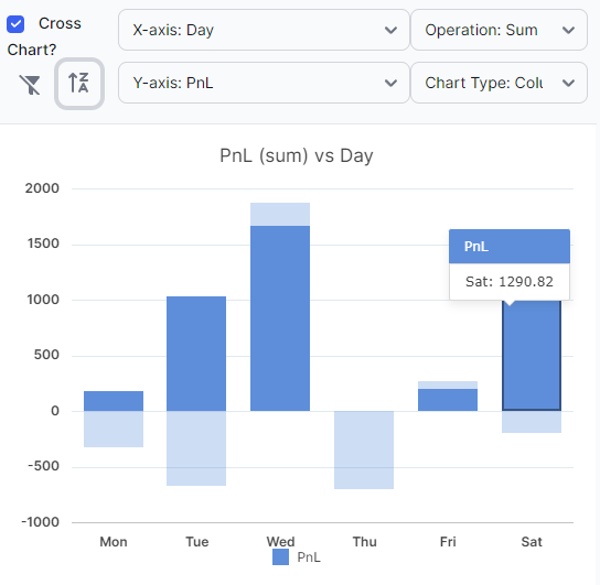
Cross vs Dynamic charts
Finally, you might have noticed that there is a checkbox that says "Cross chart". Notice how the chart on the far left and right shows the filtered data, but also shows the filtered-out data in a faded color? This is extremely important in analysis. As an example, you might not realize where a large % of your profits or losses come from in any particular group - these types of filters can be eye-opening in such analysis.
 |
 |
The cross chart of the week vs pnl is a perfect example. The cross chart above chart (left) visualizes pnl that is filtered only to show stock and stock options trades. This clearly says that the profits are coming mostly from another asset type.
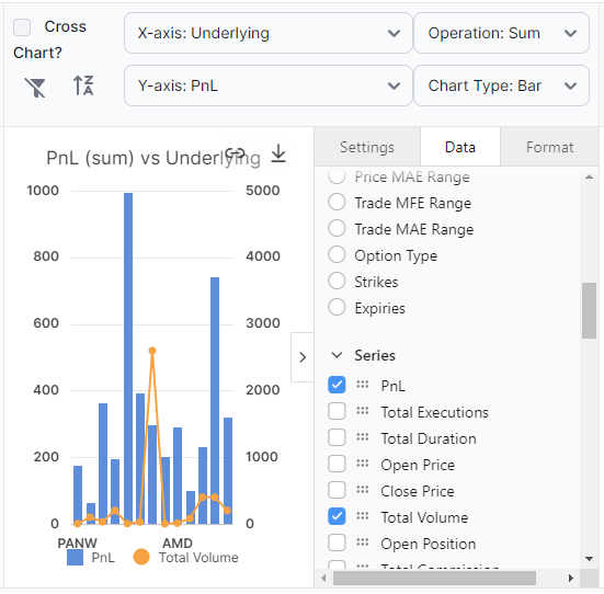
This type of negative/positive visualizing is not possible with a grid chart (right), but by losing that, you gain another feature: the ability to completely customize exactly how you want the chart to look directly via the chat interface. You can choose multiple series, change the format, and more. ONLY filtered data will appear in the grid chart (this is exactly the same type of chart we saw when we explored the grid features at the beginning of this post).
The most powerful singular analytics feature/tab
This is the most detailed guide we have ever written for a single feature on TradesViz. But to be honest, this tab in itself is a complete analytics powerhouse. This tab and its features ALONE have more features, visualizations, and analyzing than ENTIRE journaling products available online.
That said, to any user, this feature might be a bit complex at first. But we keep reiterating the same: focus only on what you need.
The entire TradesViz platform is a cohesive, completely all-in-one trading analytics platform like no other. Every tab, feature, chart, and widget has a reason for its existence and it's all tied together.
With the pivot+grid, we're bringing that tight-knit analysis of trading often thought to be hard to use or even get access to - available generally for everyone with a focus on usability.
If you ever thought it would be nice to have an analysis of a particular set of stats or want to track something very specific, with very high probability, we can say it would be possible to do with this grid+pivot+chrting combo tab.
Feedback & Future
To the users who have used the analytics features of TradesViz, this is going to be an absolutely essential feature to improve the depth of your analysis and not be limited to just the charts that we have. For all new users, if you are looking for a way to visualize your trading data, your search ends here. There is no better solution. This is easier and more efficient than your Excel sheets, and 100% of the data is automated if you use any of our fully auto-sync brokers - even if you don't, just think about the many useful insights and analysis you are getting with just a few clicks.
TradesViz has continued to be the leader in terms of trade journaling analytics for the full spectrum of traders: from novices to all the way to professionals who have been in the field for decades. Our new grid+pivot charting feature takes the value we provide as a trading journal to new heights. We are very open about our progress, features, and the value we provide. We strongly believe there is absolutely no better solution than TradesViz if you are truly dedicated to continually improving your trading skills.
Update March 2023:
It is now possible to save the state of your grid, pivot, and charts into multiple profiles. We understand that there are multiple types of analysis you may want to do and it's not easy to setup it up every time. So we have introduced a way to save the state of the pivot gid and the charts. All you have to do is:
- Click on Actions > New state and create a new state with a name
- Select that state by clicking on the state's name in the last dropdown
- Set the grid/pivot to your preference (change columns, do custom grouping, etc.,)
- Now click on Actions > Save and your state will be saved to this profile
Once saved, you can restore the pivot's state to exactly how you saved it whenever you want.
Apr 24th, 2023: If you are interested in learning more about the different use cases you can solve with the pivot grid, please check our new detailed blog with examples of pivot grid usage: https://www.tradesviz.com/blog/pivot-grid-examples/
Update July 2023:
You can now create custom columns by clicking on Actions > Create Custom Column in the pivot grid.
Once the column creation popup opens up, you can type in any column name and you will see a list of suggestions which you can select from. This of this as exactly how the Excel formula builder works. You can construct any formula using any columns and numbers. Available operations are +, -, *, and / (addition, subtraction, multiplication, and division).
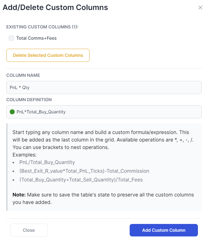
Note that the green dot in the column definition input box will turn red if your expression is incorrect which may be due to incorrect column names (you don't need to type in the full column - instead, select the column from the dropdown) or incorrect expression format.
After clicking on save, you will see this as a dedicated column in the pivot grid (as the last column):
This opens up infinite possibilities for analysis. You no longer need an external Excel sheet to create your favorite metrics columns we don't have. Using the 50+ base numeric columns, you can create any expressions you want.
This custom column is also saved when you click on "Save state" under the actions dropdown. We hope this encourages new ideas and ways to explore data among TradesViz users!
Update July 2024:
- Updated all image/media content on the blog to reflect the v2.0 version
- For all tabs where pivot mode is available, the state of the table is now separately saved for pivot and normal grid mode. So you now need to individually save the state for each mode and this state will automatically be restored when you switch between the two modes!
Update Jan 2025
It is now possible to save multiple states for the pivot grid (up to 20) for both normal grid mode and also in pivot mode. Here's a short video showing the creation and saving of new states. You can save, delete, and rename any state you create. This is only available for the pivot grid at the moment. All other grids in TradesViz have only one internally managed state.
This should allow you to have customized reports for your trading ready to be viewed whenever you want. Note that the default state cannot be renamed or removed and it will be the state that is loaded when you first visit the tab.
As always, with every new feature, we are expecting your feedback, feature requests, and opinions (please us an email at [email protected])! Without the combination of feedback we have received from 1000s traders from all over the world, this feature would have not been possible nor would we have even thought about it. We hope to be your preferred trading journal and would be grateful for your support and feedback!