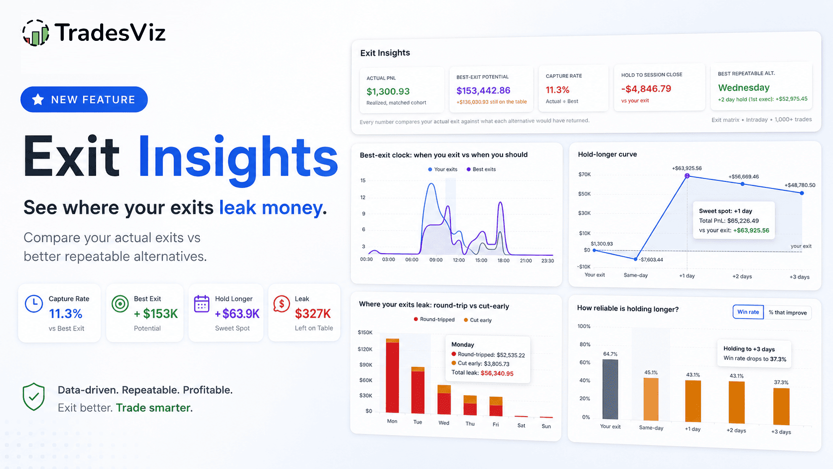
New for 2026: Everyone obsesses over entries. But your entry does not decide your PnL, your exit does. Exit Insights is a new tab in TradesViz that stops the vague advice ("let winners run", "cut your losers") and turns your exits into concrete, testable decisions, measured against the best your trades could realistically have done.
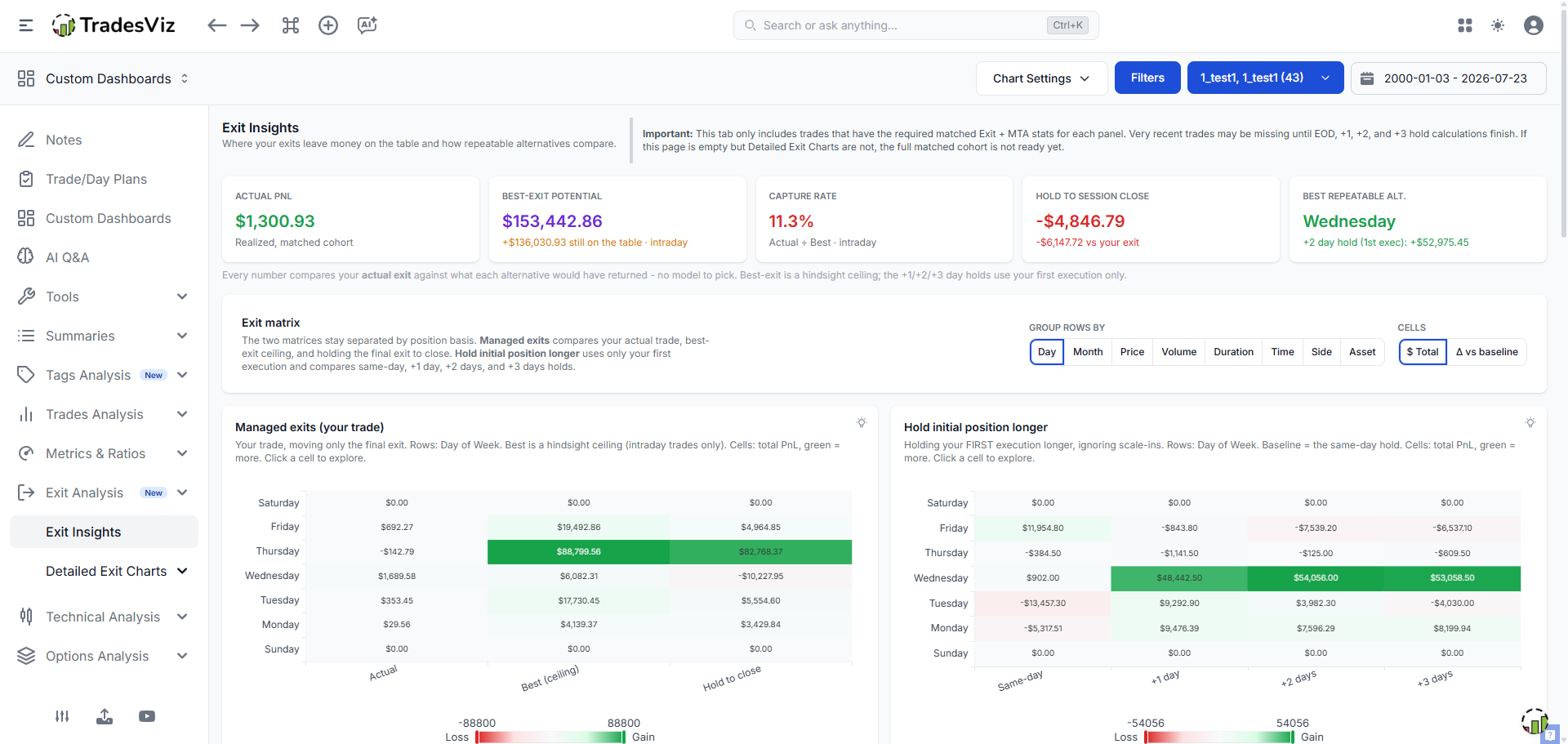
The Exit Insights tab: one screen that answers "how good are my exits, where do they leak, and what should I change?"
Most trading education, and frankly most trading journals, still measure exits with a backward-looking "PnL vs time held" chart or a generic "cut losers, ride winners" mantra. That tells you almost nothing you can act on. It does not tell you how much better you could have done, which mistake you are making, or whether a change is a real edge or one lucky trade.
TradesViz takes a different approach. For every trade, we simulate the best possible exit (respecting your actual risk), holding to the end of the day, and holding for fixed multi-day periods. Exit Insights takes all of that and answers the only questions that matter: how much money are your exits leaving on the table, why, and what should you do about it?
Exit Insights vs Detailed Exit Charts
If you are an existing TradesViz user, you will notice the Exit Analysis section now has two tabs:
- Exit Insights (the focus of this guide): the new synthesis. A scorecard, two exit matrices, a ranked "biggest leaks" table, and a set of decision charts. This is where you start.
- Detailed Exit Charts: the classic per-model breakdowns you may already know, one model at a time (Best Exit, EOD Exit, Multi-Timeframe) across every dimension (price, volume, time of day, duration, day, month, side, asset). This is where you drill in.
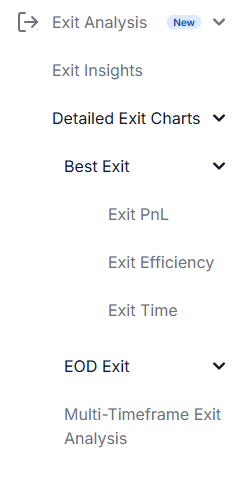
Exit Insights is the "so what should I do" layer; Detailed Exit Charts is the deep-dive per model.
The one idea that makes this work: potential, not just PnL
Here is the thesis that separates Exit Insights from every "PnL vs time" chart you have seen. A raw PnL number tells you what you booked. It cannot tell you if that was good, because it has nothing to compare against. Exit Insights always compares your actual exit against what each alternative would have returned:
- Best Exit - the risk-constrained optimal exit inside your trade window. This is a hindsight ceiling, not a rule you can follow, but it tells you the maximum that was realistically on the table.
- Hold to session close (EOD) - a simple, repeatable rule: what if you had just held to the closing bell?
- Multi-timeframe holds (+1/+2/+3 days) - what if you had held your first execution longer?
Every number on the Exit Insights page is a comparison against one of these. There is no "which model am I looking at?" confusion, because the whole point is to compare them side by side.
Panel 1: The scorecard - your exits in five numbers

The scorecard is the headline answer. Read it left to right.
What it shows. Five cards that summarize your exit quality across the filtered trades:
- Actual PnL - what you actually realized.
- Best-Exit Potential - the risk-constrained ceiling, with the amount "still on the table" underneath. This is intraday-only and it is a ceiling, not a target.
- Capture Rate - your exit efficiency: actual divided by best. A single "how much of the available move did I keep?" percentage.
- Hold to Session Close - total PnL if you had held to close, with the difference versus your actual exit.
- Best Repeatable Alternative - the single biggest opportunity in the current grouping (for example "Wednesday: +2 day hold, +$52,975"). This is the most actionable card: it points you straight at a segment to investigate.
How to act. If your Capture Rate is high and Hold-to-close is negative, your exits are already sharp and holding longer would hurt, do not fix what is not broken. If Capture Rate is low and a repeatable alternative shows a big gain, that is your lead. Click into it (every number drills down to the trades behind it) before you conclude anything.
Panel 2: The two exit matrices (split by position basis)
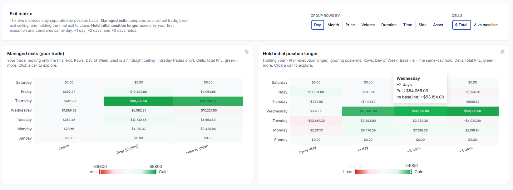
Two matrices, deliberately kept separate: managed exits (left) and holding your initial position longer (right).
What it shows. Two heatmaps that let you compare exit scenarios across any grouping (day, month, price, volume, duration, time of day, side, asset) using the "Group rows by" control:
- Managed exits (your trade) - Actual vs Best (ceiling) vs Hold to close. Because Best exit is intraday-only, this matrix covers intraday trades.
- Hold initial position longer - Same-day vs +1 vs +2 vs +3 days, baselined against the same-day hold so the comparison stays same-basis.
The "$ Total / Δ vs baseline" toggle switches cells between raw PnL and the difference versus the baseline column. Green means more captured, red means less. Every cell is clickable to explore the exact trades.
How to act. Scan for the darkest green cells, those are conditions where a different exit would have helped the most. A row that is green across the +1/+2/+3 columns is a setup that historically kept running after you got out. A row that is red everywhere past your exit is one where you exited well.
Panel 3: Biggest exit leaks - a ranked, clickable table
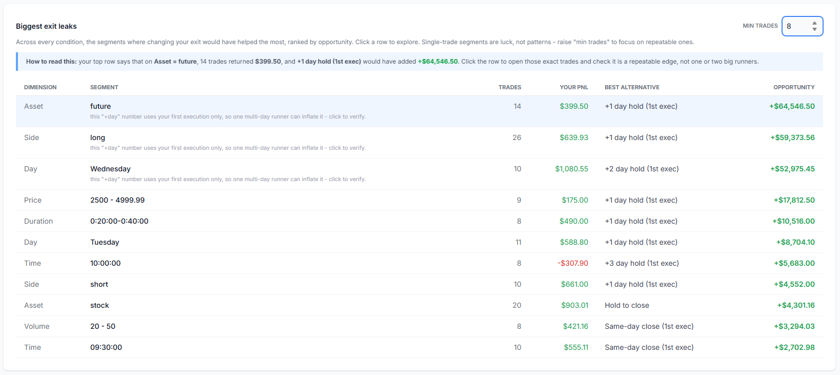
This replaces a wall of bar charts with one ranked list: where changing your exit would have helped most.
What it shows. Instead of making you eyeball dozens of charts, this table scans every dimension at once and ranks the segments where an exit change would have added the most, with the trade count, your realized PnL, the best alternative, and the dollar opportunity. Click any row to open those exact trades.
How to read it (with the built-in example). The blue callout above the table walks you through your own top row in plain English. The important discipline is the Min trades control. A "+$52,000 opportunity" from a single trade is luck, not a pattern. Raise Min trades to filter out small-sample noise, and note the per-row hints, initial-position "+day" numbers can be inflated by one multi-day runner, so verify by clicking.
Panel 4: The hold-longer curve - is there a sweet spot?
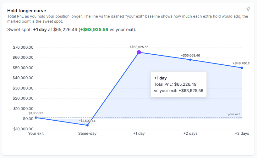
Total PnL as you hold longer. The peak (marked) is the sweet spot; the dashed line is your actual exit.
What it shows. A single curve of total PnL as you extend the hold: your exit, then same-day, +1, +2, +3 days. The dashed baseline is where you actually got out, and the marked point is the "sweet spot" (the hold with the highest total). A curve that rises then falls means there was an optimal hold length past your exit. A curve still rising at +3 days means those trades may have run even further.
How to act. This is the magnitude view: how much more (or less) money holding longer would have produced. But magnitude alone can be a trap, which is exactly what the next panel exists to check.
Panel 5: Where your exits leak - round-trip vs cut-early (a stat no one else shows)
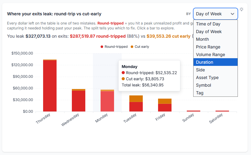
Every dollar left on the table is one of two very different mistakes. This chart splits them.
What it shows. This is the panel we are proudest of, because we have not seen it anywhere else. "Money left on the table" is not one mistake, it is two, and they have opposite fixes:
- Round-tripped (giveback) - you had the profit. Your open position hit a running-PnL peak and you gave it back before exiting. That is a profit-taking and discipline problem.
- Cut early - you never had it. Capturing it would have required holding past your peak, within risk. That is a "let winners run" problem.
The headline tells you the split in dollars and percent (for example, "You leak $327,073 on exits: $287,519 round-tripped (88%) vs $39,553 cut early (12%)"). Use the "By" dropdown to break the leak down by time of day, price, side, symbol, and more.
How to act. This single split tells you which lever to pull. Mostly round-tripped? You are giving back gains, tighten profit-taking, use trailing stops, or take partials (see MFE/MAE analysis and the Targets Simulator). Mostly cut early? You are exiting winners too soon, the fix is wider targets or a time-based hold, tested on your own data first.
Panel 6: How reliable is holding longer? (the antidote to "a few big runners")
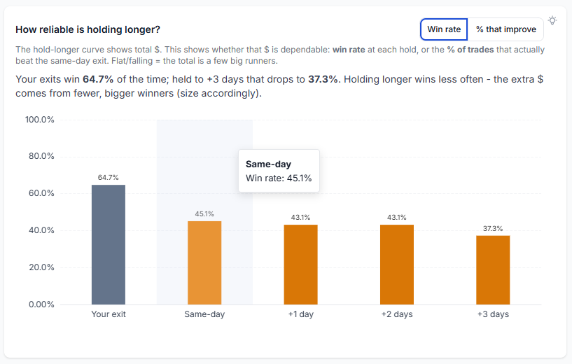
The hold-longer curve shows the dollars; this shows whether those dollars are dependable.
What it shows. A big total on the hold-longer curve is meaningless if it comes from one or two monster trades. This panel is the consistency check the magnitude view cannot give you:
- Win rate - the percentage of trades that end positive at each hold horizon (your exit, same-day, +1, +2, +3 days). Because it is a rate, it sidesteps the position-size issues that muddy dollar comparisons.
- % that improve - the share of trades that actually beat the same-day exit at each hold.
How to act. Read this next to the hold-longer curve. If +1 day shows a big dollar gain but win rate falls and only 40% of trades improve, the edge is outlier-driven, hold longer only when you can size for it. If both the dollars and the win rate rise, that is a broad, dependable effect worth turning into a rule. This is the direct, quantified answer to the question every honest trader asks: "is this real, or a few lucky trades?"
Panel 7: The best-exit clock - what time should you tighten up?
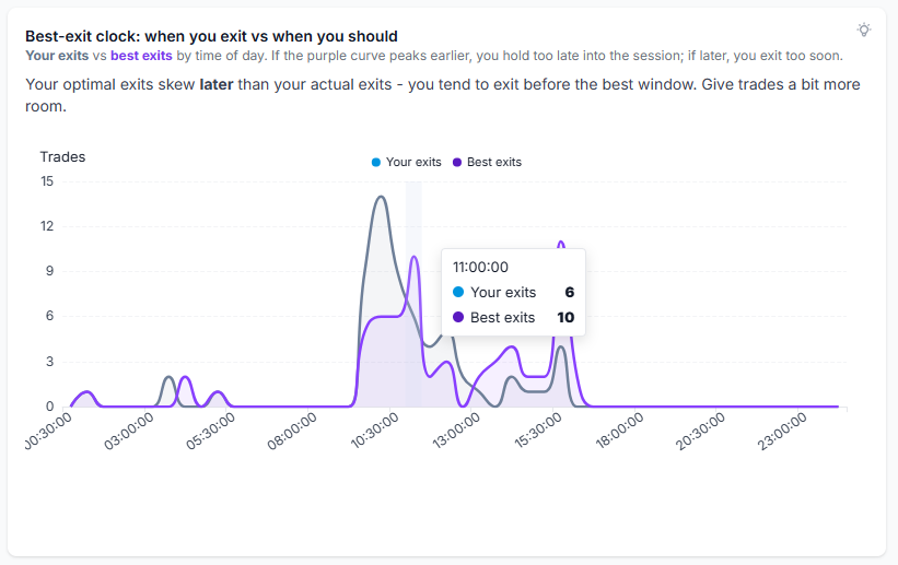
When you actually close (grey) vs when your optimal exits occur (purple), by time of day.
What it shows. Two distributions across the trading session: when you actually close your trades, and when the best exit would have occurred. Both are computed over the same set of trades, just grouped by different times.
How to act. If your optimal-exit curve peaks earlier than your actual-exit curve, you tend to hold too late into the session, tighten up sooner. If it peaks later, you exit before the best window and could give trades more room. The headline states the verdict for you. Pair this with MFE/MAE duration if you want to turn it into a concrete time-stop.
Why this beats "PnL vs time held"
The classic exit chart plots average PnL against how long you held. It looks scientific, but it is a backward-looking average of unrelated trades, and it cannot tell you what to change. Worse, it silently blends the two exit mistakes (giving back gains and cutting winners) into one meaningless line, and it hides whether a pattern is a real edge or a couple of outliers.
Exit Insights fixes all three problems:
- It compares against potential (best exit, EOD, multi-timeframe), so every number has a meaningful benchmark.
- It decomposes the leak into round-trip vs cut-early, so you know which behavior to fix.
- It measures reliability (win rate, % that improve), so you never mistake a few big runners for a repeatable edge.
These are all backtests of your own trading. That is the whole point of a serious trading journal: not to store screenshots, but to turn your history into decisions.
The workflow: from insight to a tested rule
- Find the pattern. Start at the scorecard and the Biggest exit leaks table. Note the biggest, highest-sample opportunity.
- Diagnose the behavior. Use the round-trip vs cut-early panel to see which mistake it is, and the reliability panel to confirm it is broad, not a few outliers.
- Inspect the trades. Click the leak row or matrix cell to open the exact trades on the trade explore page. Confirm it is a real, repeatable setup.
- Test one change. Use the Targets Simulator for a stop or target change, or the exit charts for a hold-length change. Change one thing.
- Apply and re-measure. Apply it to future trades, then come back next month and check the scorecard again. Combine with R-value and profit factor to make sure the change helped the whole account, not just one metric.
Notes, availability, and why a panel might be empty
- Matched cohort: Exit Insights only includes trades that have the required matched Exit + Multi-Timeframe stats for each panel. Very recent trades may be missing until the EOD, +1, +2, and +3 day calculations finish. If Exit Insights is empty but Detailed Exit Charts are not, the full matched cohort is simply not ready yet.
- Recalculation: If stats are missing on older trades, recalculate from the trade explore page or use Group Apply for bulk recalculation.
- Assets: exit simulations are supported for stocks, futures, forex, CFD, and crypto, and for single-leg options via manual recalculation.
- Plan: the exit analysis suite is a Platinum feature. See the pricing page for the current list.
Entries get the glory, but exits get the money. Stop grading your exits against a vague feeling or a flat PnL-vs-time line. Grade them against what your trades could realistically have done, find out whether you round-trip or cut early, and prove a change is real before you trade it. That is Exit Insights.
As always, this is not trading advice and TradesViz is not judging your trading. We give you the simulations, stats, and visualizations so you can judge your own process with real data. Questions or ideas? Email us at [email protected].
Frequently Asked Questions
What is the Exit Insights tab in TradesViz?
Exit Insights is a data-driven exit management dashboard that compares your actual trade exits against simulated alternatives (best exit, hold to close, and multi-day holds). It shows how much money your exits leave on the table, whether you give back gains or cut winners early, whether holding longer is dependable, and what time of day to tighten up.
How is Exit Insights different from the Detailed Exit Charts?
Exit Insights is the synthesis layer: a scorecard, two exit matrices, a ranked leaks table, and decision charts that tell you what to change. Detailed Exit Charts are the classic per-model breakdowns (Best Exit, EOD Exit, Multi-Timeframe) across every dimension, for drilling into a single model in depth.
What is "money left on the table" and how is it calculated?
It is the gap between your actual PnL and the best-exit potential, the risk-constrained optimal exit inside your trade window. Best exit respects your realized risk (it assumes you would have stopped out at your actual worst point), so it is a realistic ceiling rather than pure hindsight. Best exit is intraday-only.
What is the difference between "round-tripped" and "cut early"?
Round-tripped (giveback) means you reached a peak in open profit and gave it back before exiting, a discipline problem. Cut early means capturing more would have required holding past your peak within risk, a "let winners run" problem. Exit Insights splits your total exit leak into these two so you know which behavior to fix.
Why does a big dollar opportunity not always mean I should hold longer?
Because the dollars can come from a few outlier trades. The "How reliable is holding longer?" panel shows win rate and the percentage of trades that actually improve at each hold horizon. If the dollars rise but win rate falls and few trades improve, the effect is outlier-driven and you should size accordingly rather than change your rule.
What does the best-exit clock tell me?
It overlays when you actually exit against when your optimal exits occurred, by time of day. If your optimal exits skew earlier than your actual exits, you tend to hold too late into the session and should tighten up sooner. If they skew later, you exit before the best window.
Why is my Exit Insights page empty?
Exit Insights only includes trades that have the full matched Exit and Multi-Timeframe stats. Very recent trades are missing until the EOD, +1, +2, and +3 day calculations finish. If Exit Insights is empty but Detailed Exit Charts are not, the matched cohort is not ready yet. You can recalculate older trades from the trade explore page or with Group Apply.
What is the difference between managed and initial-position exits?
Managed scenarios (Best, hold to close) keep your entire trade including scale-ins and move only the final exit. Initial-position scenarios (+1, +2, +3 day holds) use only your first execution and ignore scale-ins. They answer different questions, so Exit Insights keeps them in separate matrices and never compares them on the same axis.
Which plan and assets does Exit Insights support?
Exit analysis is a Platinum feature. Simulations are supported for stocks, futures, forex, CFD, and crypto, and for single-leg options via manual recalculation on the trade explore page.
Can I click into the trades behind any number?
Yes. Every scorecard card, matrix cell, and leaks-table row is explorable. Click it to open the exact trades on the trade explore page and confirm whether a pattern is a repeatable edge or a handful of outliers.