Have you ever heard of the phrase "cut your losers" and "let your winners run"? It's nice to hear that, but impossible to implement in a realistic way when you are trading.
However, you can analyze your historical trades to see if this was the case and let that guide you more realistically so that you can take these insights and apply them when you are trading.
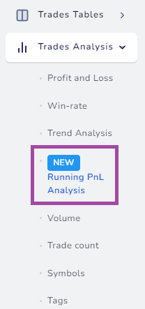
This is why we have created the running pnl analysis charts. It's available under the Trades Analysis section > "Running PnL Analysis" tab.
Inside this tab, you will see 4 charts all of which are based on running PnL:
- PnL vs Positive Running PnL Duration
- PnL vs Negative Running PnL Duration
- PnL vs Peak of Running PnL
- PnL vs Low of Running PnL
Running PnL is the continuous PnL graph that tells you the PnL of your position at any point in time in the duration you were in the trade. You can find this chart on the trade explore page for stocks, futures, forex, cryptocurrency, and single-leg options.
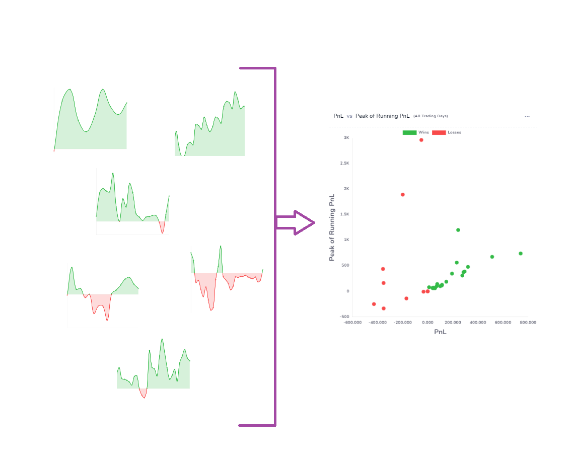
A seemingly simple graph that we often just glance at and ignore can reveal a lot about your trading when you extract the right data points and visualize it for many trades at once.
The first 2 charts: PnL vs Positive Running PnL Duration and PnL vs Negative Running PnL Duration plots the time you were in unrealized loss and the time you were in unrealized profit. Here's an example:
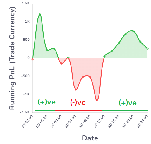
Total positive PnL duration = sum of the total time period you were in profit (if you had exited your positions at any point, your PnL (gross) would be greater than 0)
Total negative PnL duration = sum of the total time period you were in a loss (if you had exited your positions at any point, your PnL (gross) would be lesser than 0)
Why does this matter?
If you do not have proper risk metrics, you would have very unbalanced positive/negative duration times and this can lead to confusion when it comes to answering the following question: if you have really improved in risk management or are you just a lucky bag holder?
Here's an example of these two charts:
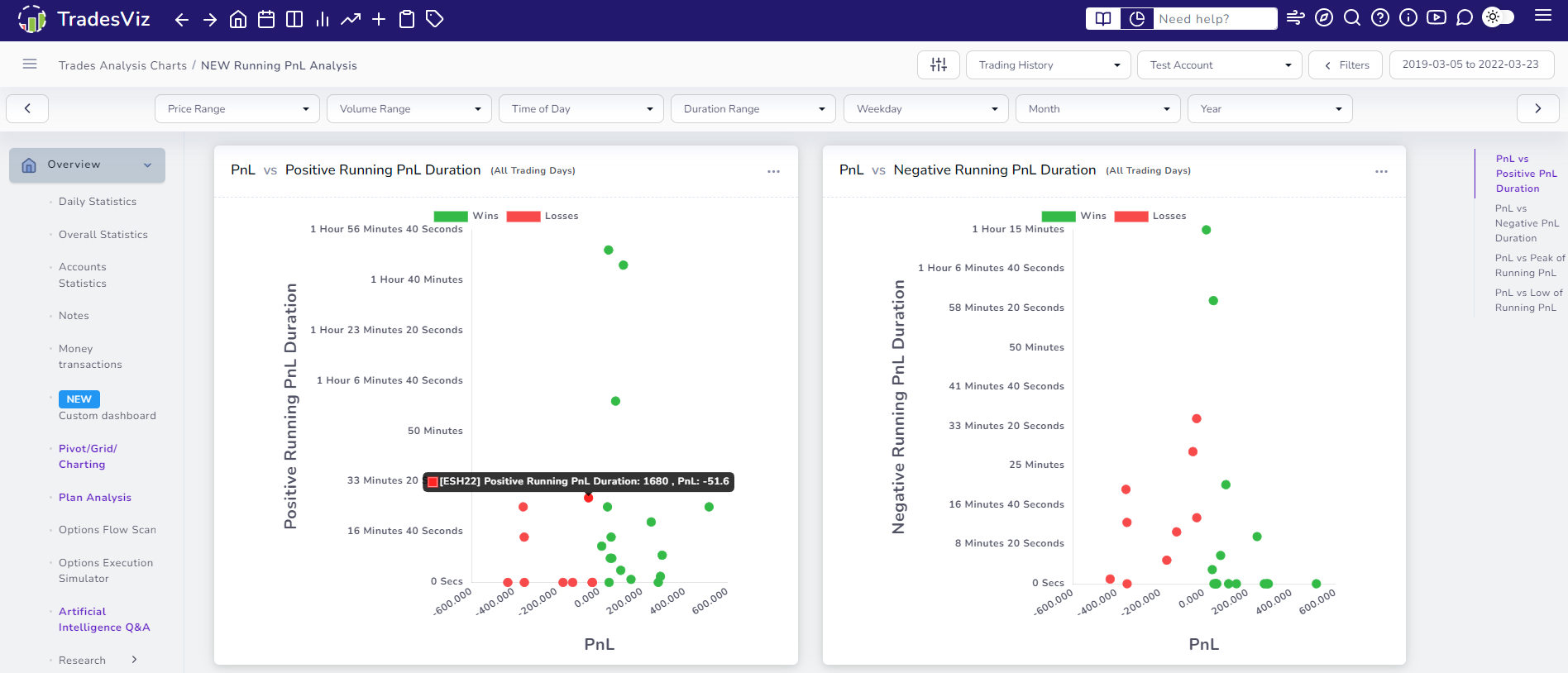
You might notice that these charts are very similar to MFE/MAE charts. These are scatter charts where each point in these charts shows the pnl plotted versus the duration (duration in tooltip info is shown in total seconds).
The chart on the left side is the positive running pnl duration plotted versus pnl. It's easy to understand that ideally, there should not be any points in the top left quadrant as it implies even though you were well in profit for a long period of time, your trade's final outcome was still negative. The question to ask is: why didn't you exit? Explore the trades and learn from the bad trades.
As with every chart on TradesViz, these new charts are also fully explorable and interactive. Meaning, you can click on any data point and click on explore trade to view that trade, and click on the chart to zoom/pan to explore more data points.
Conversely, one might have held a trade through a long period of downturn and finally exited with a profit - this is the top right quadrant of the chart on the right in the image above and we do see a few trades here. The question here is: why were we holding this trade for so long? Were we high on "Hopuim"? Did we add to a losing position? What happened here?...
Duration is not the only statistic we can derive - we can also derive the max/min pnl we let the trade go in and against our intended position. This is what is plotted in the next two charts:
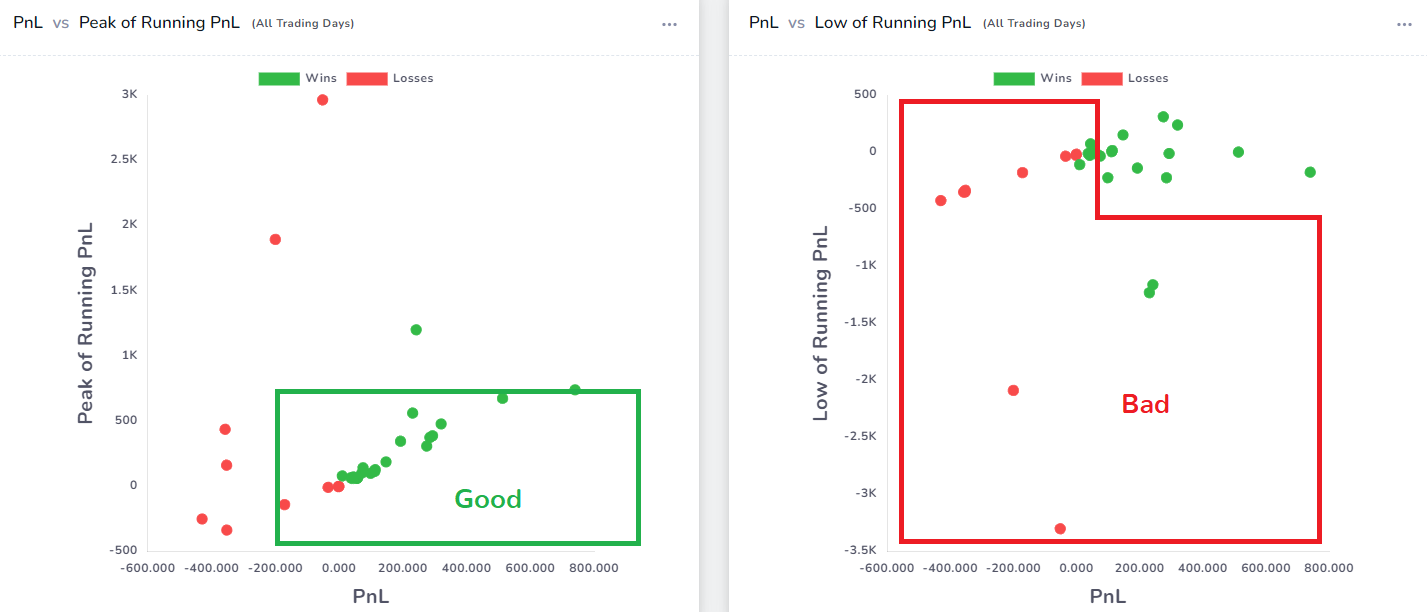
We have clearly shown what parts of the chart are good/bad for easy identification and if you check the X and Y-axis values, it's easily understood. If you had let your winners "run" "correctly", then you would see a vertical spread on the right side of the PnL vs Peak Running PnL chart. This is the only place where a statement like "let your winners run" makes sense - i.e. a lookback at your trading history. Now with this data and the insights you get from this chart (especially exploring the data points), you can make smarter decisions which will lead to better-looking running pnl statistics charts and more consistent PnL distribution.
It is obviously not possible to have our entire trading history just focused on the good quadrants, but the goal is the following:
- Minimize the data points we see in the bad quadrants
- Learn from the data points in the bad quadrants
One of the important features of these charts is that, while you can't view the individual running pnl graph of every trade _easily_ and remind yourself of the big lessons you learned, you can do so with these charts.
Take the example of the -$200 pnl with over -2k unrealized running pnl on the right side of the chart above (PnL vs Low of Running PnL). That's not a good trade at all and one must have definitely done a lot of mistakes and bad practices to get IN and OUT of that pit.
It serves to remind you of your battle scars and how you can utilize the lessons learned from those trades in your everyday trading.
We hope these charts serve as a unique way to gauge your risk-handling capabilities as a trader. While all other trading journals focus on basic stats that are not very useful for current-generation traders, we would like to continually push forward and think about new statistics and data analytics methods that traders of all trading styles can benefit from.
We are always open to hearing your ideas and feedback. These charts, like many of our features, originated as a small idea during a conversation with a trader (and an active user of TradesViz). This prompted our development to get to work and start looking at how we can implement this idea in a useful manner and what you are seeing now is a result of that exploration process. Do you have similar ideas? want us to implement another unique chart? Let us know: [email protected].