Why so much focus on charts?
Let’s be honest... most traders think they'll "remember" why they took a trade, or that a few mental notes after the fact are enough. Until, of course, they repeat the same mistake for the third time in a month. A trading journal is your personal accountability partner. It’s not just a logbook - it’s a mirror that reflects your habits, discipline, and, yes, your blind spots. Whether you’re a rookie or a seasoned pro, consistently journaling your trades is the fastest way to spot what’s working, what’s not, and most importantly, why. THIS is why we have so much focus on visualization and charts. Heck, the very practice is part of our name: TradesViz.
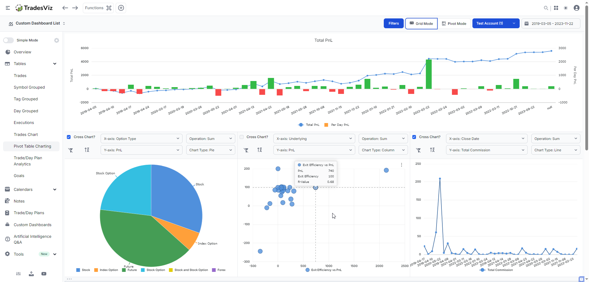
So far, we've mostly used chart types for most of the dashboard's UI: Bar, line, and a few variants and combinations of these two. With the introduction of TradesViz v2.0, we introduced interactive grids that allow you to create charts directly from tables, and this was also applicable to the pivot grid and the AI widgets. This expanded the no. of possible chart types to 10+ (Bar, column, pie, line, area, scatter, and variants of these). Here's an example:
With the most recent update, we are able to offer a total of ~15 unique chart categories:
- Column: Grouped, Stacked, Full height
- Bar: Grouped, Stacked, Full height
- Pie/Donut
- Line/Stacked Line
- Area: Grouped, Stacked, Full height
- Scatter/Bubble
- [NEW] Radial line/area/bar/column
- [NEW] Box plot
- [NEW] Histogram
- [NEW] Range bar/area
- [NEW] Treemap
- [NEW] Heatmap
- [NEW] Waterfall
- [NEW] Funnel/Pyramid
- Combination
Depending on the type of widget/tab/page you are on, opening/editing charts is different:
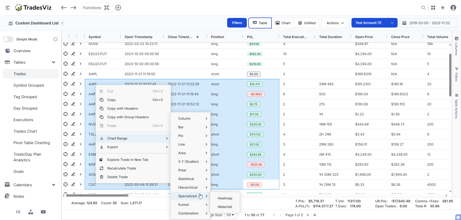
- Tables: To create a chart within any table, click and drag on a bunch of cells/rows (within the table) and right click > Click on Chart Range.
- Pivot grid: You will see the 3 dots icon at the top right corner of any non-cross chart. Click on it and click on "Edit chart".
- AI widgets: You will see the 3 dots icon at the top right corner of any chart. Click on it and click on "Edit chart".
All you need is to import/sync your data, and you can visualize your data in any way you want. We will go through an example for each of the NEW plot types below. We're skipping examples of bar, line, pie etc., as these are common and we assume most traders would have seen/used it.
Radial line/area/bar/column
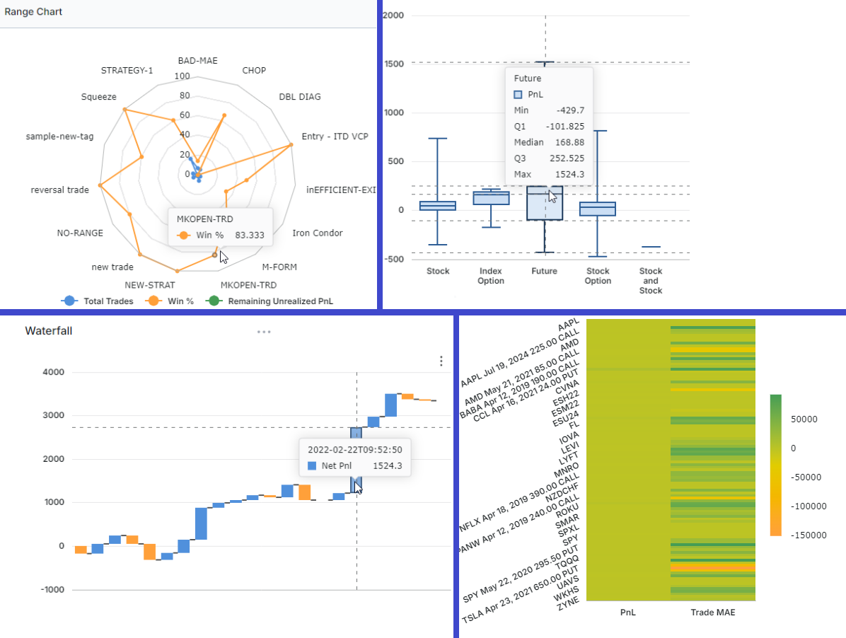
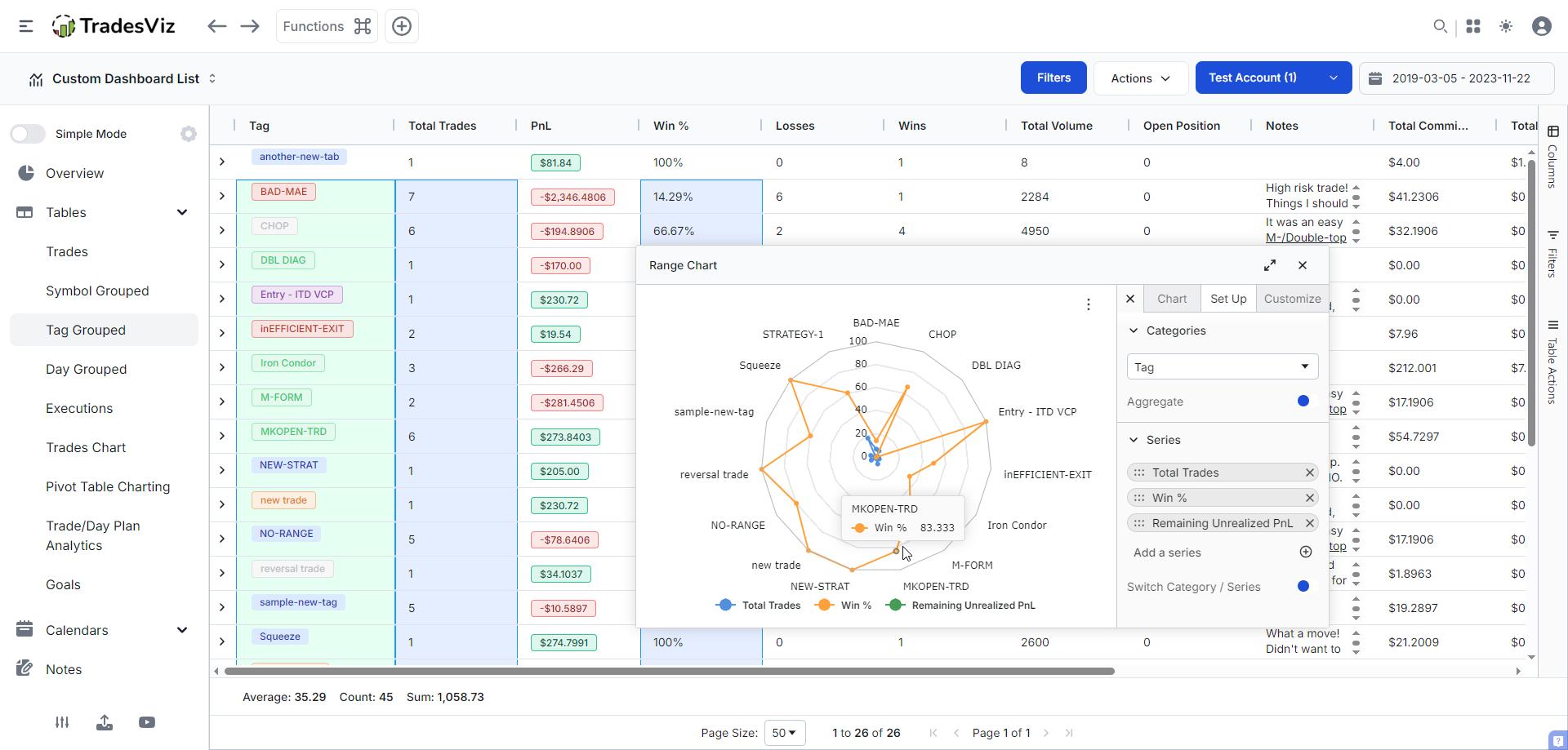
This is an excellent choice for comparing the strengths and weaknesses of multiple categories or classes because all the inputs are scaled between 0 and 100. Here, we are using the tag grouped table to compare multiple statistics of each tag (tag is the category here). This gives you a “spider web” view of strengths and weaknesses—so you can see at a glance which strategies are well-rounded and which are one-trick ponies. It is important to realize that if you are using multiple numeric series/stats, for an ideal visualization, they should all be of similar scale. For example, plotting pnl and volume isn't going to help a lot because the numbers won't be on the same scale. A good example is to compare multiple variants of pnl - like closed, unrealized, or custom stats created via the table's custom columns.
Box plot
A very useful chart type that tells you more than just a single stat per category/stat: Min, max, median, and percentile. This is best used in the pivot grid, as you have access to your full trading data here. For this, because each line in the table corresponds to a single trade, we suggest turning OFF aggregate mode so that the stats are not aggregated across each category (in that case, you will only see 1 stat). Here's an example in the pivot grid (non-cross charts) where we're comparing PnL vs option strategy, PnL vs asset type, and EOD exit PnL vs day of week. Note that you need to click on the 3 lines icon > click on edit chart > choose box plot.
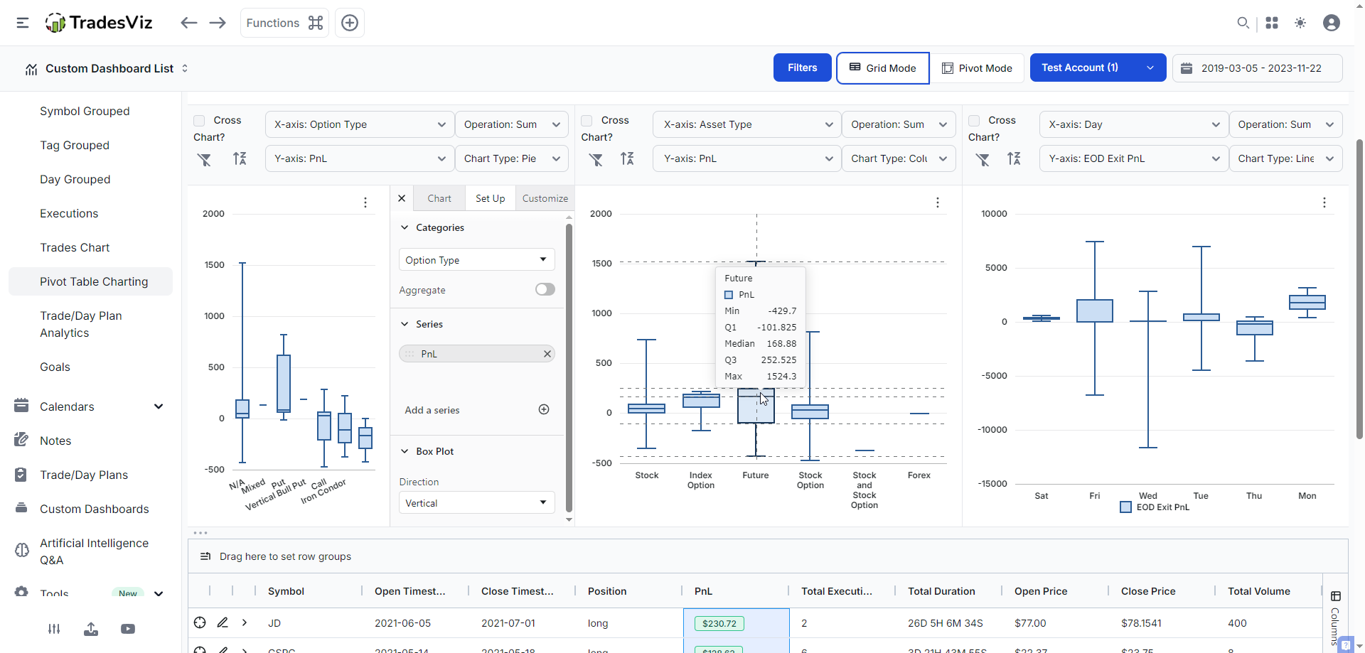
Taking the second example in the middle (PnL vs Asset type), here's how you would interpret a box plot: each category will have a box-like structure that has 5 lines/markers. The lines at the extremes correspond to min and max. The box in the middle has the median (middle value of the series - this is NOT average) and first and third quartiles. There's no single "ideal" box or pattern here - for example, longer lines at the top/bottom of the box means you've had larger extremes. A small box in the middle means your middle number and the 1st/3rd quartile are within a very narrow range. This helps you find outliers in your trading. Comparing Thursday's and Wednesday's EOD exit pnl (3rd chart) is a good example of outlier comparison.
Note: Range bar/area is just the box chart with the entire area covered - i.e, the focus of a range chart is simpler - just mix and max.
Histogram
We hope this is not new to our traders! Histogram/distribution charts are extremely common in finance. In fact, we've had it on TradesViz since 2022! This is used to learn the distribution of numbers over a class/categories. In this example, we are comparing the distribution of PnL, R-value and EOD exit PnL ranges for the option type category.
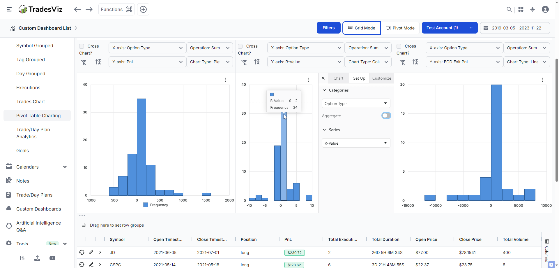
This is helpful in knowing which side of the curve you live on. For example, the curves here for the pnl is towards the left side (first chart) for PnL - meaning, most of our trades have been losers with a tail on the right end, which saved the total sum. Meaning, outlier positive pnl has saved us from having a net negative or total loss. These are examples of when just "average" is not useful for doing stats - avg. pnl is not useful in cases like these and can often be misleading!
Another example - Let’s say you’re convinced you’re a “break-even” trader because your average PnL is close to zero. But averages can lie! Plot a histogram of your trade results. You might discover that you’re actually taking lots of small losses and a few big wins—or vice versa. This insight can spark a rethink of your entry/exit tactics or help you spot if you’re relying too much on rare home runs.
Treemap
One of our favourite chart types - we've had since the launch of TradesViz in 2019 to visualize the magnitude of PnL, volume easily. You can check native TradesViz treemap charts by visiting Trade analysis > Tree map charts. But the point of these grid-based treemap charts is so that you can plot treemap charts on ANY grid to visualize ANYTHING. For example, here, we are selecting a subset of trades from a normal trades table to visualize the pnl grouped by underlying.
The cool part is that you can layer multiple categories. The above video shows this! Imagine using a custom AI query to create a widget to show you just the visualization that you need. All of this is 100% possible on TradesViz now with these improvements :)
Heatmap
This is an interesting one. Imagine you had lots of trades and you want to compare, say, pnl and mfe/mae, etc., in a single chart to find outliers/trends - How?
Heatmap with multiple series!
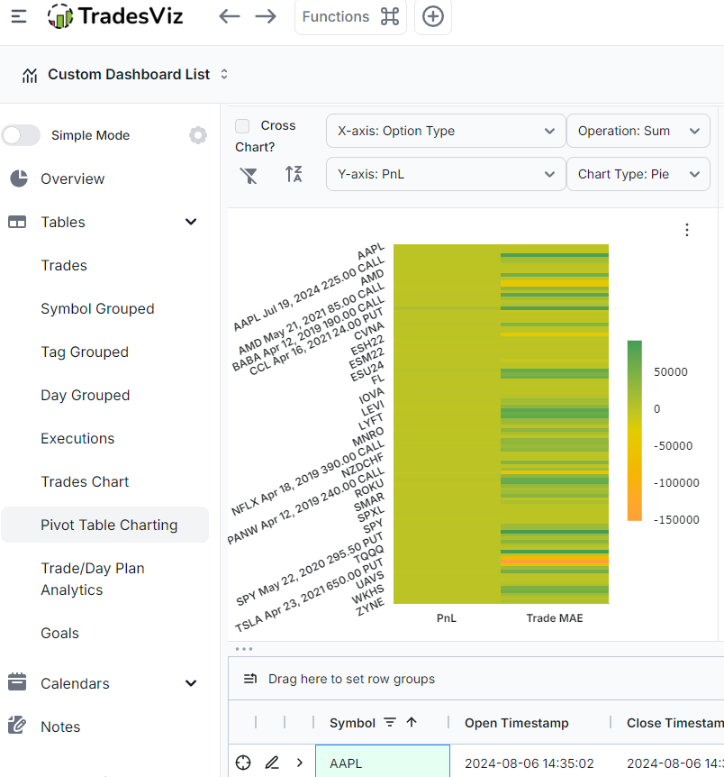
For this example, we've used the pivot grid with a few trading accounts selected to find the relation between pnl and trade MAE. Is there any particular trade where we've risked too much? Simply hovering over the dark orange spot in the above chart and checking the pnl will tell us exactly which trade. Combine this with filters in the grid, and you're almost there in answering the question of "am I risking too much? when?"
This is just one example. The use cases are plentiful :) Explore!
Waterfall
Want to see the impact of each trade on your overall performance? Build a waterfall chart of your recent trades. Each bar shows how much a single trade moved your cumulative PnL up or down. It’s a fantastic way to spot which trades are making (or breaking) your month, and whether a few bad decisions are wiping out weeks of steady gains. You may have seen this on your broker statements. It's now on TradesViz.
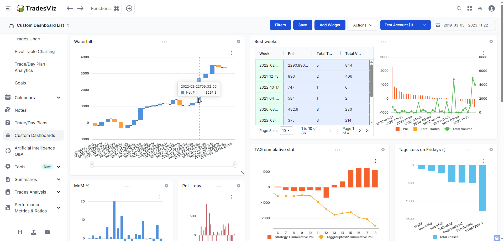
The chart in the top left corner is the waterfall chart of recent trades made with a specific tag. It was created via the AI Q&A tab and added as a custom AI widget. Each bar shows the increase/decrease visually - remember that in this case, this is NOT a cumulative chart (do not confuse!) you CAN definitely use this for a cumulative chart visualization also! Again, these are just examples of possible use-cases.
Funnel
We're back to pivot grid for this one because it makes more sense to view data aggregated in a funnel visualization. While we don't have a step 1 -> step 2 -> etc., type of data in TradesViz (it's not impossible because TradesViz as trade plans w/ custom metrics... ;)), we can use dates here.
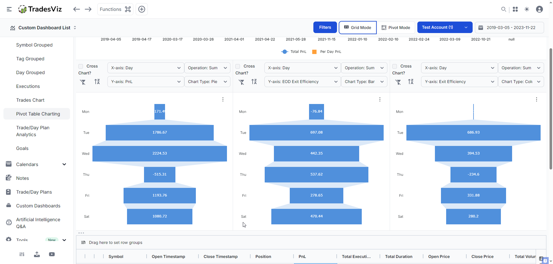
Here we have 3 (non-cross) charts in the pivot table - all with category as "Day of week" plotted against (from left to right) PnL, EOD exit efficiency, and best exit efficiency. This gives us a clear view of what happens in a week. Curious if your performance drops off as the week goes on? Are we missing more chances/opportunities as the week progresses? Check the stark contrast of what happens on Thursday - pnl is low, but EOD exit is the 2nd highest. What do you think this signifies? What if you made the same chart with the different pnl of the multi-timeframe exit? after 5 min -> after 1 hr -> after 2 hrs -> etc., ? Like we keep emphasizing, this is a treasure trove of data insights that are waiting to be uncovered by you. Each one can potentially act as a stepping stone for improving your trading.
All of these chart types, along with the 80+ stats we have *per* trade, unlock a level of flexibility and visualization that no other journal can offer. TradesViz has been leading in trade analytics visualization, and these updates, along with the synergy we've created with other features, will only strengthen the utility and value TradesViz has to offer to traders across the world. Think of your trading journal as your “game tape.” Pro athletes review every play to improve. Why should traders be any different? Each chart, each data point is a reflection of you and your actions.
We highly suggest utilizing these visualizations via the AI widgets to build custom dashboards to track and achieve your trading goals. Remember to explore different types of visualizations because the AI Q&A can be molded based on the type of result you are looking for, and once you get what you see, you can add it to your dashboard.
Have any questions, new ideas, or feature requests? Talk to us by sending us an email at [email protected]. We're always keen to hear your feedback!