Another long-term feature request from all our intraday traders - a "what if" analysis of how your performance would have been if you were in that trade for a little longer.
For a lot of traders, one of the biggest gripes they have is how to define "let winners run" and "cut losers" - these 2 terms are thrown around by a lot of educators but in reality, there is no way to know when to do these actions - it's useless advice to most traders akin to saying, just make winning trades.
So, how can we approach this problem? Let's use data. With this new exit analysis feature, we take the last execution of your trade and see where you could have exited this position going forward in time till the close of the market for that day. Note that, during this search, we have 2 conditions apply:
- To maximize profit
- To minimize risk or have the same risk level as when you did during the trade (MAE or stop-loss)
Why do we need the second condition? Because without it, it's the same as looking at a chart's low and saying you could buy there and looking at a chart's high and saying you could have sold there - while it could be a potential case in your trades, what is important is during the pursuit of maximizing profit, one should make sure not to lose the money that has already been earned or exceed the risk levels that has been set.
We have divided these visualizations into 3 sections:
- Best exit efficiency is what percentage of the best pnl did you capture in your actual trade.
- Best exit PnL is the best PnL you could have gotten by optimally placing the last execution at the same time, adhering to the max risk of the trade that is already made.
- Best exit time is the time of best PnL.
The sections covering Best exit efficiency and Best exit PnL compare the stats with the price range, volume range, trade duration, trade time, day of the week, month, year, and position of trade. As usual, all data points in all the charts are fully explorable - click on any statistic in any chart and explore the trades that make up the stats.
The interesting tabs where you can get the most actionable insights in our opinion are the best exit pnl and best exit time charts.
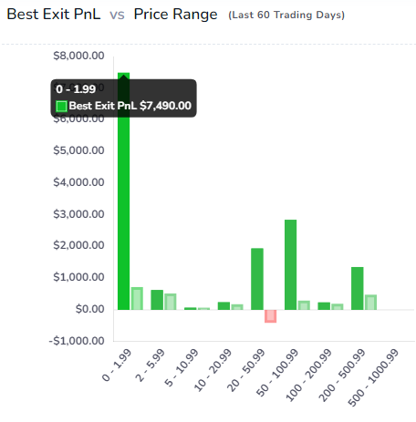
In this best pnl vs price range chart, the dark bars are the best pnl you could have had and the lighter bars are the actual pnl. We can see that the sub-$2 range is where we have left a lot of money on the table. If you are a frequent penny stock trader, you might see statistics similar to this. However, based on the stats above, the chart does show that performance in most of the other ranges is pretty close to the max PnL we could have gotten so we would only need to focus on certain outlier ranges.
Another interesting chart in the best exit time analysis is the Best Exit PnL Difference vs Best Exit Time Difference chart. The title may sound complex, but all it tells you is this: what is the pnl you missed out on compared to the time difference between the actual close time of the trade and the best exit time of the trade.
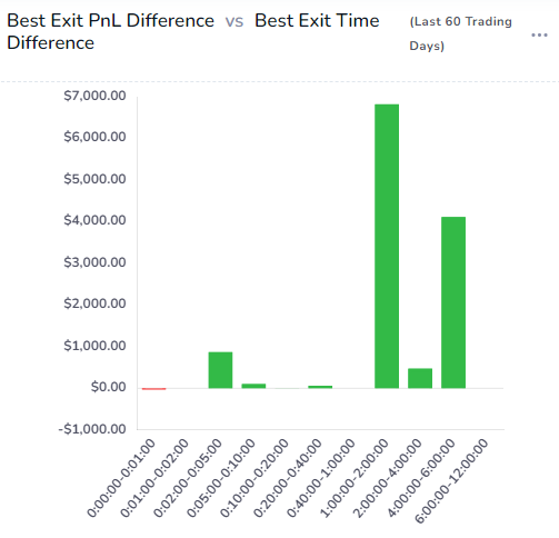
In short, here is how we can get one particular insight: If we had held our trades for 1-2 hrs longer, we would have earned a total of around $6000 in addition to our realized pnl from our trades. This is extremely useful if you just want to optimize your holding time and this can be combined with the other charts in the other sections to create the optimal entry/exit time + holding time for different price ranges, volume ranges, etc.,
As usual, all of these charts can also be added to the custom dashboard. The number of opportunities that you can create for yourself using these data-driven analyses based on your own trading + market data is invaluable to improving and fine-tuning your strategy. Please note that at the moment this feature is only available for stock, futures, and forex trades.
Note: If the charts are blank for you, you need to trigger a bulk recalculate for all your trades. To do this, go to the trades table, change the page size to 250, click select all at the top of the page, and then group apply. In the group apply popup, scroll down and select "re-calculate trades". This might take some time. Do this for all pages or contact us for help. Going forward, exit analysis will be updated for all new trades every day.
Update: Dec 2022 - Introduction of EOD Exit
We added a new type of exit analysis that is similar to the best exit. Instead of moving the last execution to the best position, we move it to the very end of the day and simulate what would have happened if you had held your position till the end of the day. You can view the dedicated blog post here: https://tradesviz.com/blog/eod-exit-analysis-charts/
We hope these features prove useful in helping you improve your trading performance! Please let us know if you have any questions or additional feature requests by emailing us at [email protected].
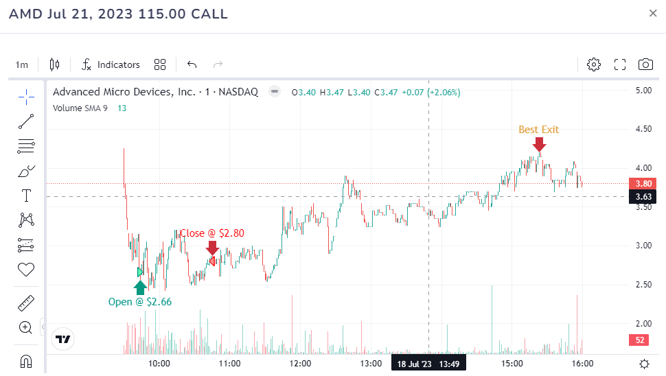
Update July 2023 - Best Exit for Options
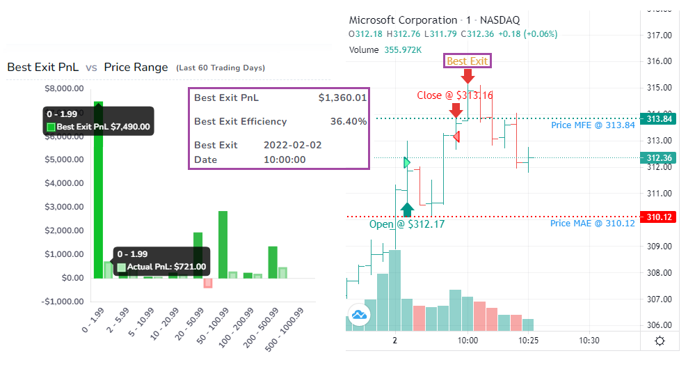
You can now generate the best exit for options (single leg trades only) by manually clicking on the Re-calculate button when on trade explore page. This is the first time an online trading journal has best exit stats for options! The best exit can be viewed on both the normal underlying chart that is shown on the trade explore page and also on the options chart:
We hope these features prove useful in helping you improve your trading performance! Please let us know if you have any questions or additional feature requests by emailing us at [email protected].