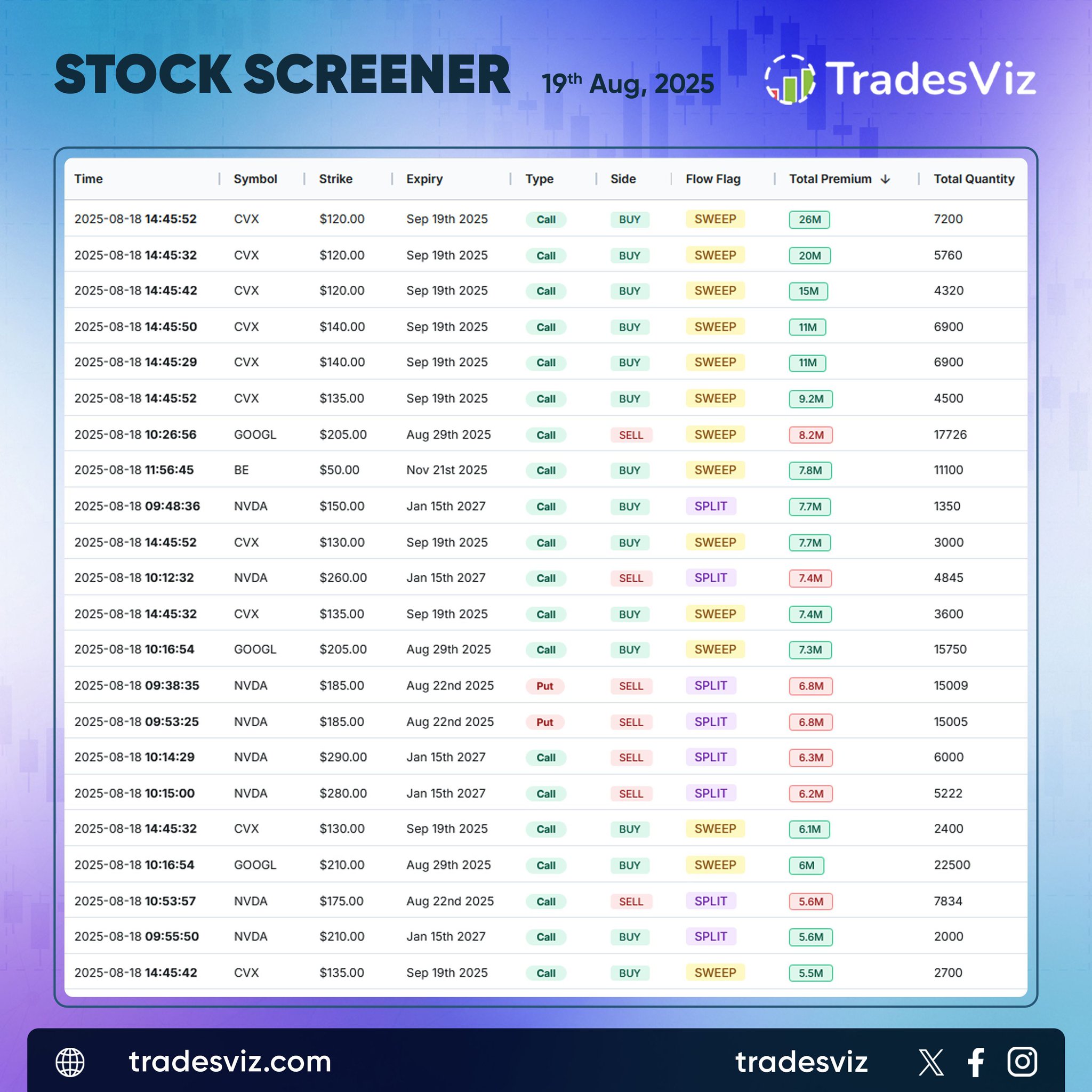
Dive into today's top options activity with big trades across tickers like: $CVX, $GOOGL, $BE, $NVDA From massive call buys and eye-catching premium sweeps, to splits on puts and calls, these flows reveal where the smart money is moving—will you follow their lead? With strike…
Big moves brewing in options! The hottest tickers for call buying in the last 3 days: $OPEN, $AMAT, $CELH, $CNQ, $EW, $CRSP, $VKTX, $ONON, $ELV, $ON Check those eye-popping percentage increases—traders are making bold bets! Don’t miss the featured chart: $CELH Watch price action…
Today's movers are making waves! Check out the tickers with continuous higher highs and 3 days of green: $TMRC, $BTAI, $MSOX, $AVAH, $CURLF, $VVPR, $CWVX, $CRWU, $ALEC, and $MENS. For those riding a 5-day upward trend, keep your eyes on: $BTAI, $MENS, $CRWU, $RIGL, $SIGA, $BLZE,…
TradesViz is the ONLY journal that supports major brokers in India 🇮🇳 along with having FULL asset-type support for ALL Indian exchanges!
View stock charts, options charts, backtest/simulator options/stocks, and more with TradesViz.
Try today. 7-day 100% free trial! ✅
Wouldn't it be nice to have everything in one place?
Your PnL calendar, an AI assistant, 100% custom stats, options data, charting, backtesting, *world's most extensive trade journaling* + more are part of TradesViz!
Do everyday planning, review, replay & anlaysis seamlessly👇
+ 1 more coming soon to TradesViz🧐
We're pushing the limits of just how much value we can provide to a WIDE range of traders from ALL over the world with just 1 TradesViz account.
🆙 Features, utility, and quality have grown MoM since 2019!
Still not on TradesViz?.😳
Try it!
Take Your Trade Journaling to the Next Level with TradesViz!
Ever wondered how your trades would perform with different stop loss or profit target settings?
Meet the Stop Loss & Profit Target Simulator—your personal trading time machine!
Rewind. Rethink. Refine. Instantly…
See Your Trading Journey Like Never Before with TradesViz!
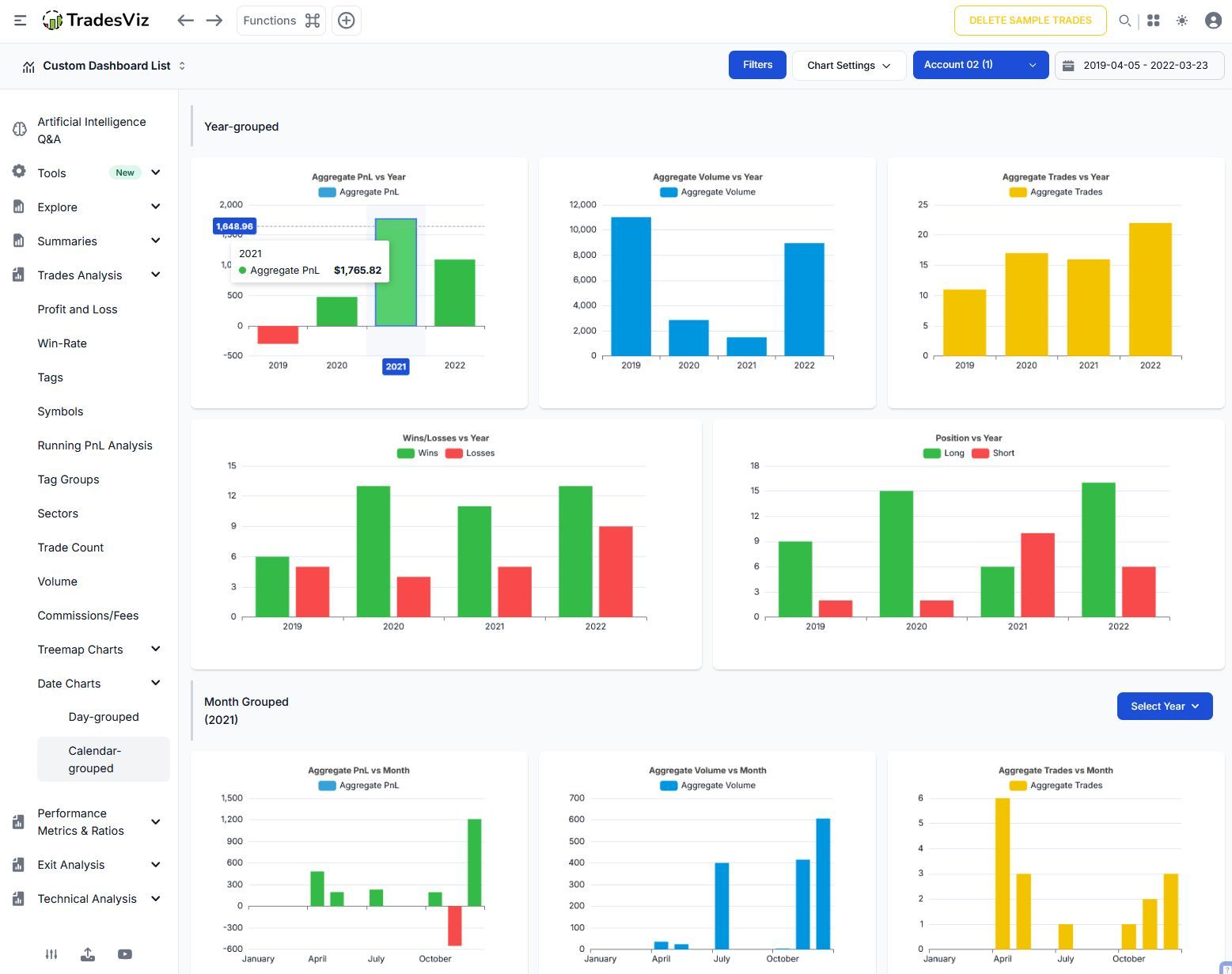
Trades Analysis > Date Charts > Day / Calender Grouped
Instantly track your growth, volume, and every trade with powerful year-by-year breakdowns.
Spot your wins, losses, and market moves at a glance—so you know exactly…
See Your Trading Journey Like Never Before with TradesViz!
Trades Analysis > Date Charts > Day / Calender Grouped
Instantly track your growth, volume, and every trade with powerful year-by-year breakdowns.
Spot your wins, losses, and market moves at a glance—so you know exactly where you shine and where to level up.
Don’t just analyze—dominate your performance and unlock your true trader potential!
Ready to master your trade journaling? The data speaks. You succeed. Only with TradesViz!