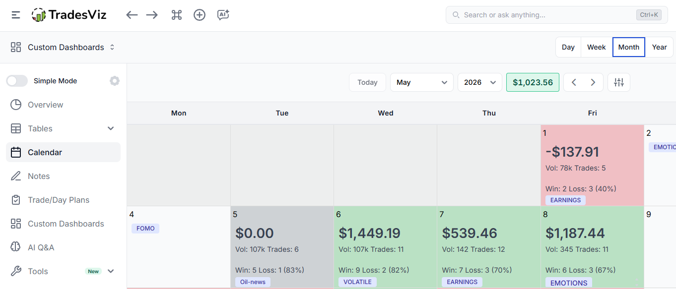
Note: Calendar tabs (yearly, monthly, weekly, daily) have been consolidated into a single tab from March 2026 onwards.
Trading calendars and visualization of your progress are very important for any trading journal. That is why we have had a lot of visualizations related to calendars and your PnL.
So far you might have used the yearly heatmap which gives you a bird's eye view of a large timeframe and the monthly view which is a more detailed view of what you did per day every day in a month.
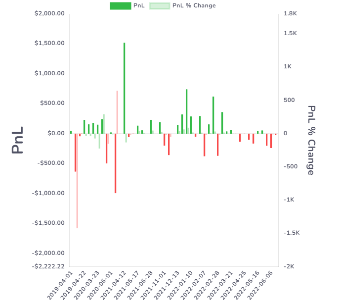
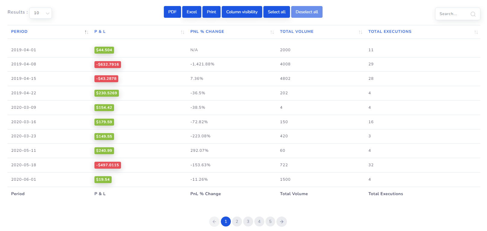
With this feature, we are giving a more granular visualization of per-week performance along with PnL % change. The % change tells you how much in % have you won or lost in the given time period. For now, weekly and monthly time periods are available.
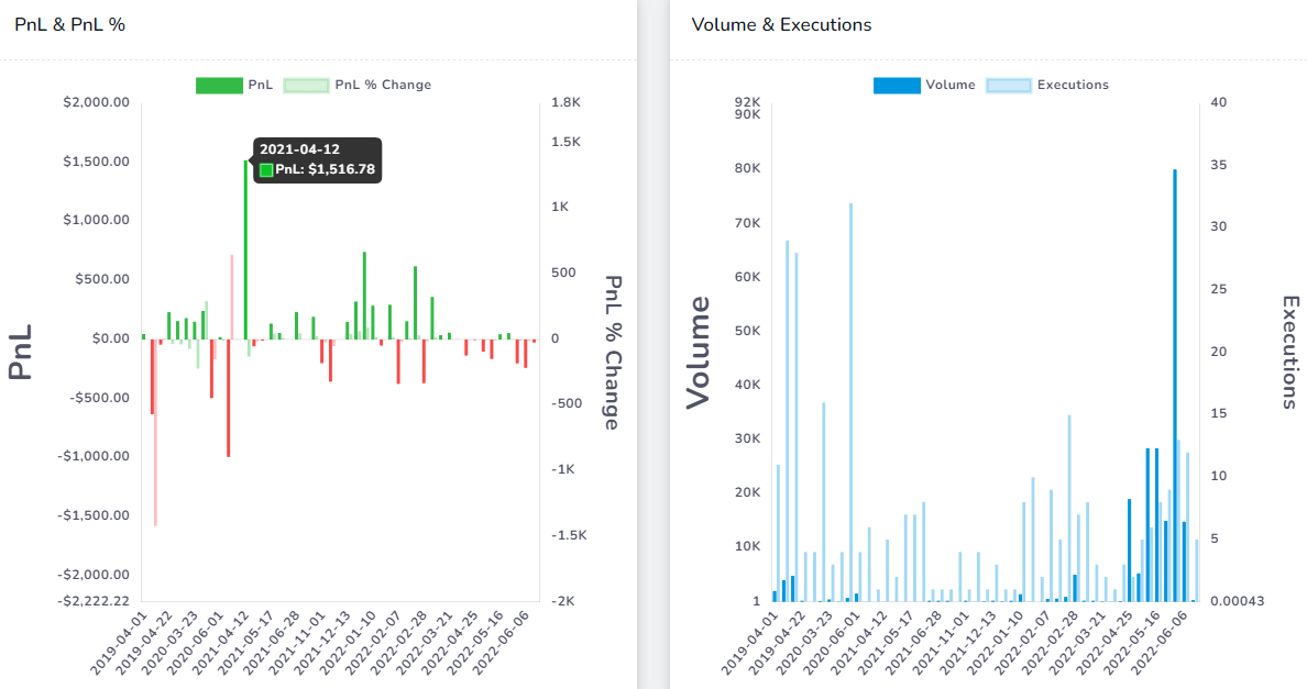
There are a total of 4 visualizations in the 2 charts you see in this tab:
- PnL
- PnL % change
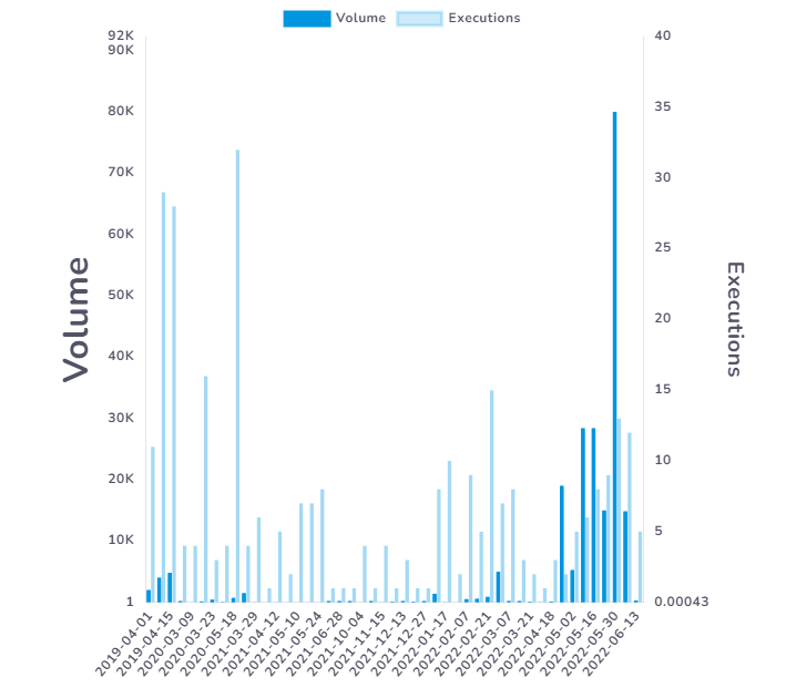
- Total executions
- Total volume
They are in pairs - PnL & PnL % will be a double bar chart and Total execution and volume will be another double bar chart.
The way to use these charts is to choose a relatively shorter calendar date filter (top right corner of your dashboard) and compare the trends of your earnings.
Moreover, we have also added a table below the charts to give you a clearer view of the data. The table is fully sortable and searchable.
That's it for now! We will try to keep improving this view to provide more info! If you have any questions or feature requests, please contact us at [email protected]!