The Trades Analysis section has remained the most visited part of TradesViz since our launch. Adding a new tab to this section requires a lot of work in terms of thinking about the most important needs of the trader.
Prioritizing the importance, the efficiency of data accessibility and also based on many recent feature requests, we have added the Trend analysis chart.
This satisfies some of the common requests like:
- Being able to view per-trade statistics (instead of date)
- PnL chart with executions as data (instead of trades)
- The trend of changes in metrics
You must have used moving averages in your trading on chart (OHLC) data. But why do we use them? it is to understand the trend of the price averaged over a period of time. Moving averages will always be the most popular and easy-to-understand trend-based indicator.
What if we applied the same to your trading performance?
The trend analysis tab answers these questions.
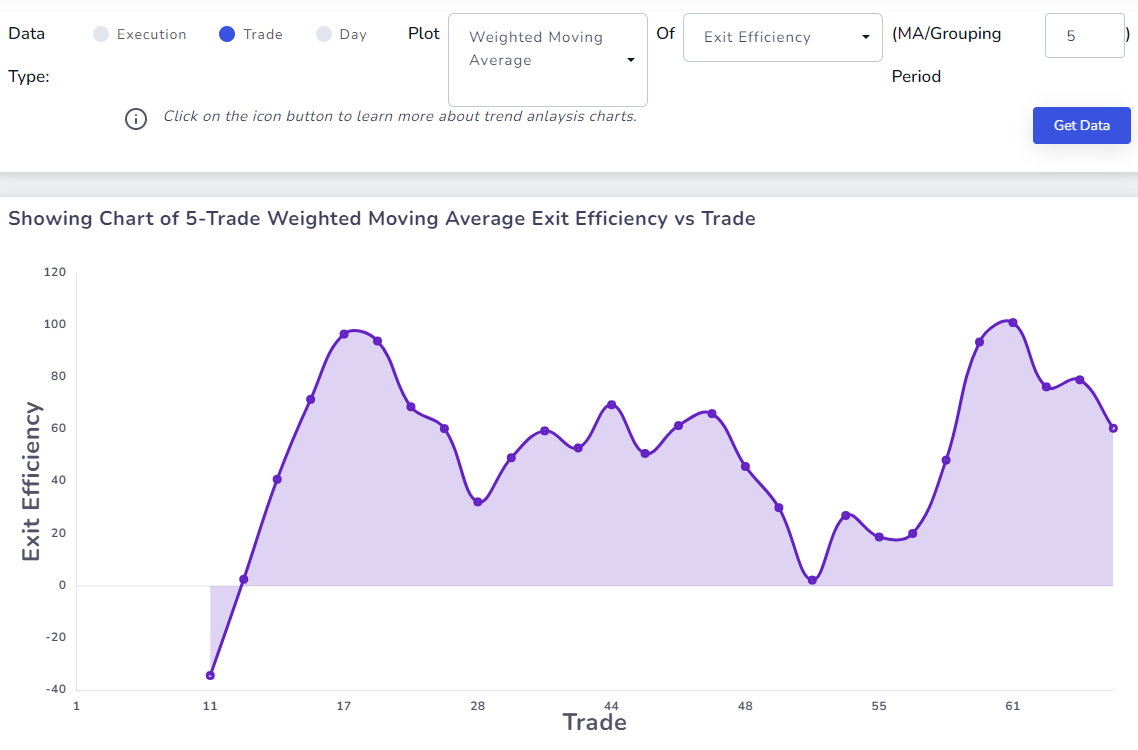
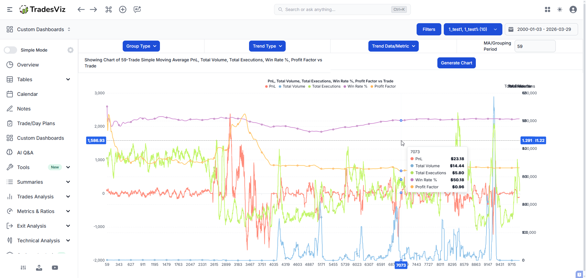
This is a very simple UI with 2 sections. The top part has the controls that you can edit and modify to get the type of chart you want and the bottom part contains the chart - simple!
You can choose from 3 types of data to visualize :
- Execution: Each data point in the chart is a single execution (ordered by oldest to most recent)
- Trade: Each data point in the chart is a single trade (ordered by oldest to most recent) (only fully closed trades are used)
- Day: Each data point is a day on which the trade was either closed fully or opened (depending on your account settings) (only fully closed trades are used)
After this, you can choose how you want the data to be grouped:
- Simple moving average (SMA)
- Exponential moving average (EMA)
- Weighted moving average (WMA)
- Minimum over a period
- Maximum over a period
- Sum (Aggregate)
- No grouping
All the grouping options except for sum and no grouping use the "MA/Grouping period" input - this is the period of the moving average or the grouping.
In case you need a refresher on the definitions of these moving averages, here is a resource you can check: https://www.investopedia.com/ask/answers/071414/whats-difference-between-moving-average-and-weighted-moving-average.asp
For example, if you wanted to view the 10-trade SMA of your R-value, you would select Trade as the data, SMA as the grouping, R-value as the metric, and input 10 as the period.
As for the period, we try to include as many metrics as there are in the trades table. This changes based on the data you choose. It's the same for both day and trade but limited for execution as there are very few per-execution metrics.
Trade/Day metrics available now:
- PnL
- Total Volume
- Total Executions
- Total Fees
- Total Commissions
- Total Commissions + Fees
- Total duration
- % Return
- Account % Return
- R-value
- Price MAE
- Price MFE
- Price MFE/MAE
- Trade MAE
- Trade MFE
- Trade MFE/MAE
- Total PnL Ticks
- PnL Per Quantity
- Total Points
- Total Ticks
- Best Exit PnL
- Best Exit R-value
- Exit Efficiency
- EOD Exit PnL
- EOD Efficiency
- EOD Exit R-value
Execution metrics available now:
- PnL
- Quantity
- Total Fees
- Total Commissions
- Total Commissions + Fees
We are open to adding new metrics! So, please do let us know your feedback at [email protected]
This chart may seem really simple and obvious but when you start exploring the types of metrics like exit efficiency, R-value etc., over a period of time, you start to uncover insights that were previously not possible to get from any charts in TradesViz. Here's an example:
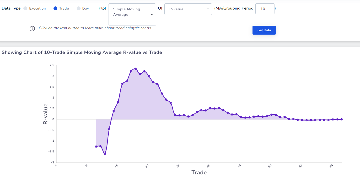
When you look at just the R-values of trades, you might not notice this. See the chart above. What do you gather from this trend? What is happening to this trader's performance? We are seeing the trend of a 10-trade average of R-values and from the first view, we can see that the R-value has slowly gone down over a period of time.
Similarly, here's another chart of the EMA of PnL/Quantity:
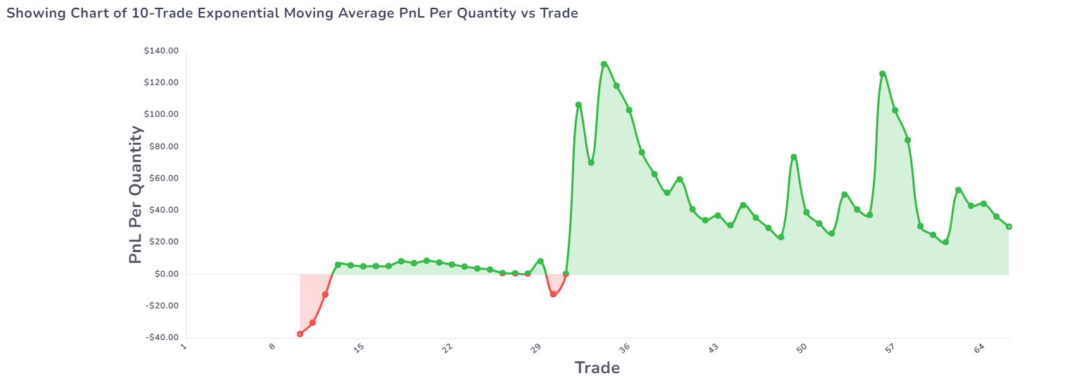
Why is there so much fluctuation? Is our risk not under control? Are we over-trading? So many questions pop up!
Combine this with the pivot grid's functionality to get answers to why these trends happen and how to improve them if they are not looking good.
We hope this serves as a useful tool to all types of traders as this is a generic feature that applies to anyone that has any trade in their TradesViz - the more data you have, the better you are able to visualize your trends!
March 2026 Update:
We have added more stats to the list:
- Win Rate %
- Profit Factor
- Win/Loss Ratio
- Avg. Winner
- Avg. Loser
- Expectancy
- Max Drawdown
- Consecutive Wins
- Consecutive Losses
April 2026 Update:
You can now view multiple trends in the same chart. This lets you find correlations and patterns in your trading history - just like how you would do technical analysis on stocks and related data.
As always, we are looking forward to hearing from you on how we can improve TradesViz. This feature was created based on a different, but overall similar feature requests we have gotten in the last few months. We are seeing more traders getting interested in exploring more stats since the launch of our AI analytics and pivot grid features. Send us your feedback, opinions, and comments to [email protected]!