The majority of the tabs in TradesViz are filled with charts - trades analysis charts, performance charts, date charts, etc., TradesViz has more chart types and combinations than any other online trade logging platform. We don't just stop there. We made every single chart fully interactive. Interactivity and chart-based features are what we will be exploring in this blog post.
Chart types
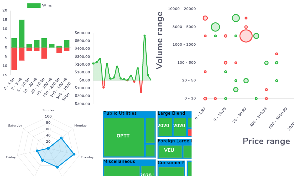
Most visualization tools just top with bar charts and possibly line charts. We do have plenty of those, but we don't stop there. We have also made use of radar charts, bubble charts, and treemaps to provide visualizations from many different perspectives. These other chart types have their own tabs - namely performance metrics tab where you will find radar charts and treemap charts and grouped compare tab where you will find bubble chart. To sum up, these are the chart types and visualizations they provide:
- Bar charts - Price/volume/other stats vs date/ranges
- Line charts - Price/volume/other stats vs date
- Bubble chart - any statistics range vs any statistics range (see further down this post for more info)
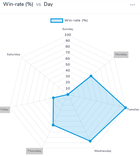
- Radar map - usually a scoring metric vs ranges
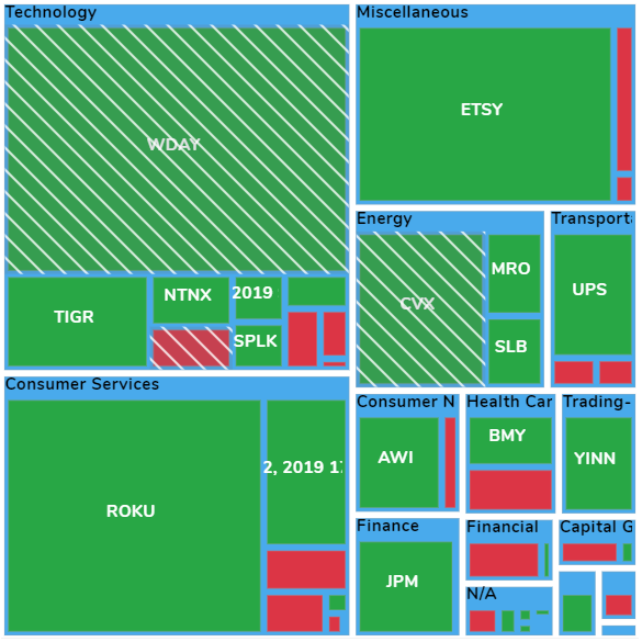
- Treemap - price/volume/no of trades vs the magnitude of the statistics
Chart groups
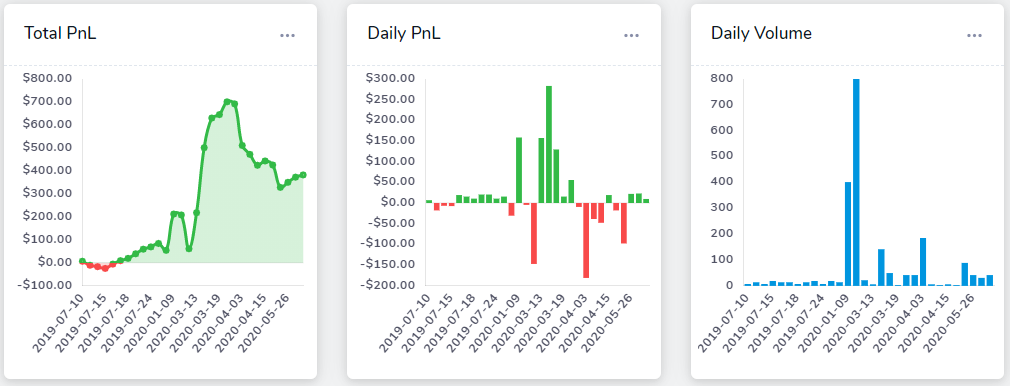
Overview (Daily statistics)
Basic bar and line charts depicting total and daily stats for pnl and volume.
Explore (Chart explore)
See down below in this blog post to know more about chart explore charts.
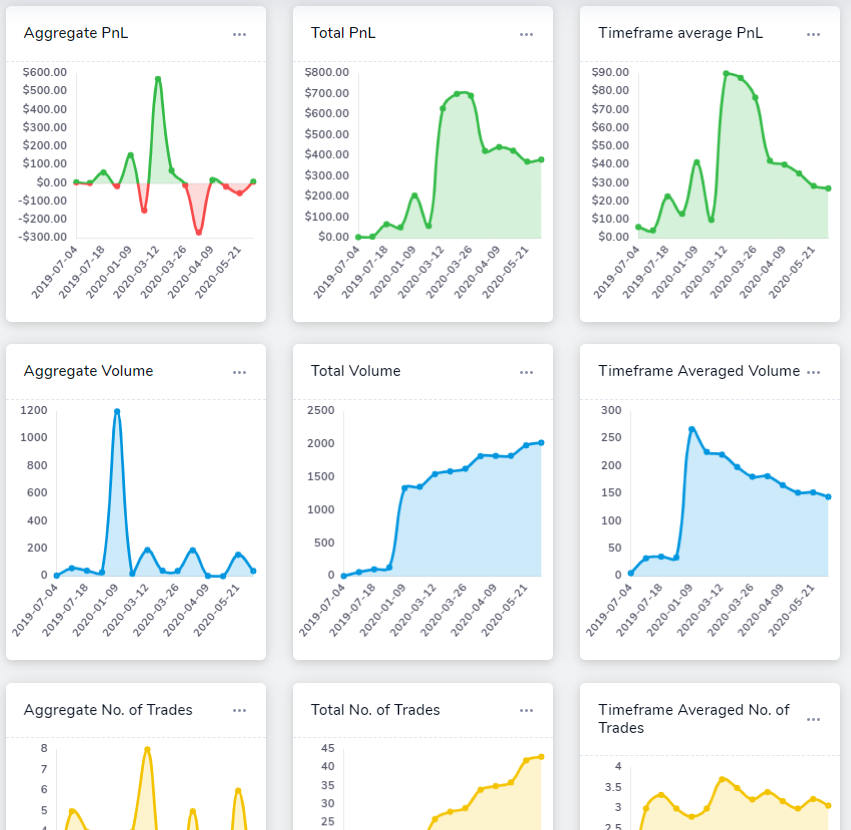
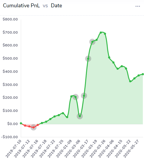
Date charts
All info about your performance with respect to date. Most of the charts are pretty common. The new chart we have added here is the timeframe average charts. What these charts show is how your PnL/Volume/No. of trades have changed over time. For example, if you have not traded in a while or if your total volume has decreased over time, these charts will be on a downward slope. It's a simple indicator of how active you have been. In the PnL version of this chart, the same concept is applicable, and it can also be interpreted in how well you are maintaining your profits - if the magnitude of average PnL earned is constantly increasing, then the graph will relatively be stable or increase depending on the rate of increase of average PnL, but if your average PnL is decreasing over time, even if the PnL (total or aggregate) is positive or negative, the timeframe average PnL will be on a downward slope.
Trades analysis charts
We expect this to be the most visited tab as it has the crux of the analysis charts in areas such as profit and loss, win rate, volume, trade count, symbols, tags, sectors, and market-based indicator charts. Out of these 9 tabs, 2 tabs - namely, the profit and loss and the win-rate tabs will have an additional insights window next to the chart. These are automatically generated useful and actionable insights that help traders quickly identify pain points and possible improvements they can make in their trading plans.
These insights automatically update whenever the refreshes if there is any change in global settings. In the future releases, we are planning to add these insights to more trade analysis charts.
This might take some time to get used to. There are a lot of charts and thus, many observations to be made and insights to be gained from it. We'll just list the charts available for each of the subsections here so that users have an idea of what to expect.
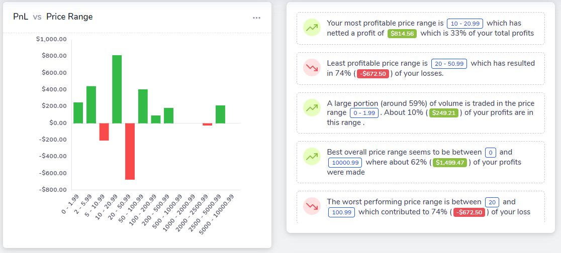
- Profit and Loss: Most essential and basic chart for trading performance analysis - PnL vs various attributes of the trade such as price range, volume range, time, day, time of day duration, etc.,
- Win-rate: Similar to the PnL charts - but instead of PnL, we have the no. of wins and losses plotted as a stacked bar chart for all the same trade attributes listed above.
- Volume: Same as above, but with volume in the y-axis.
- Trade Count: Same as above but with trades count (or no. of trades made) in as the y-axis. Don't worry if you think this is clustered. There's a reason for it. Scroll down to chart overlays section in this blog post for a way to "combine" these charts.
- Symbols: Charts with symbols plotted in the x-axis and various trade result stats like total volume, PnL, and trades count plotted in the y-axis in the sorted order of these statistics. So, you can view the top 10 symbols which you have trade the most or the bottom 10 symbols in terms of losses, etc.,
- Tags: If you have a lot of tags, you can view all statistics of all those trades grouped by tags. Very similar to the symbols charts explained above.
- Sectors: Once again, similar to the symbols and tags category above, here, we focus on the sector of the traded asset (plotted in the x-axis)
Technical analysis charts
You can now choose from 10 technical indicators and 5 markets to compare your trades with. Ever wondered if the volatility is why you're performing well or poorly? wanted to validate such market-based correlations? you can now do so with the technical analysis charts! There are 2 sub-types of technical analysis charts which we will go in detail below.
- Market-Indicator: This requires a bit of explanation as it's very different from the rest of the charts. In TradesViz, we are actively trying to combine market data along with your own trading data. Simply analyzing trades by looking at the executions data alone is not enough to get a holistic picture of what's happening when you place your trades. So, we have combined the use of technical indicators derived from EOD data and your own trading data.
The way the charts are generated here is: you select a market or a symbol you want to compare your performance with. By default, it's the SPY ETF (which is based on the S&P500 Index). Next, you can select an indicator - so far, we mostly have oscillator-based indicators only - but we will add more soon. Let's say we choose the ATR (average trading range) indicator. Now, the charts will show your PnL, volume, and no. of trades made when the symbol's indicator was between a particular range for about 10-20 different ranges. For example, in the chart below, what we can observe is: most of the trades were made when the QQQ's ADX was between 30-35 and over 42 are profitable - these small pockets of profitability can lead to finding your edge in the market or with constructing highly specific strategies.
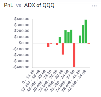
Likewise, you can look at the PnL chart that's also on the same page to see how much this has impacted your PnL. With this information, you can now start the trading day by looking for symbols that have the technical indicators in the ranges in which you are most successful in! At the moment, we only support a few US indices, but we will be adding more based on user's requests. Since we look at the "market" (i.e, SPY, GLD, etc.,) and it's technical "indicator"'s value - we have named this "Market-Indicator" charts.
- Symbol-Indicator: Like the market-indicator charts, these charts are all symbol specific. Meaning, instead of looking at the market's ATR (continuing from the example above), we look at each of your trade's symbol's ATR itself! The example below perfectly sums up the use of these charts:
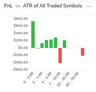
Based on this, it's very clear that trading stocks which have ATR between 1-10 yield the maximum PnL. Instead of looking at the market as a whole, you can now explore each of these data points to learn WHY you are performing well when the ATR is, say, between 10 to 20. Both market-indicator charts and the symbol-indicator charts alone should be able to help you easily pick stocks or ranges of stocks that you need to be looking at purely based on your performance.
Grouped compare charts
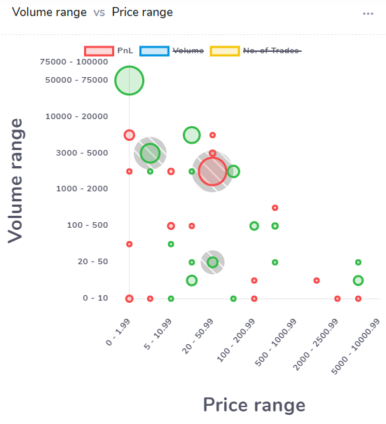
This chart is a bit different in the sense that it depends on what the user wants to plot - Both the x and y-axis are completely up to the user's choice. The user can currently choose from 13 different "classes" of data to plot form.
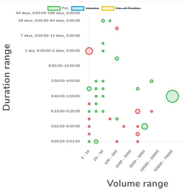
Note that these are all discrete data and not continuous like PnL - PnL data is represented by the size of the bubble. For example, In the below chart, we have plotted volume range vs duration range - this can be a bit unique at first glance. But what we're trying to find here is - how has our trading in performance been - in terms of PnL when we trade in certain volume ranges for certain duration timeframes. For example, from the chart below, we can observe that for the volume range 20-50, we have performed relatively well compared to volume range 0-10 and above 1000. Within the 20-50 range, the best performance is for the duration between 40 mins and 2 hrs. There are many many combinations you can try here. Similarly, among all the duration rages, it seems that the overall profitability is reached when the trading duration is more than 20 mins on average.
All 13 classes can be plotted against one another to get a unique view of your trading behavior - i.e, being able to identify pockets or regions of profitability can help you optimize your trading plan and stick to profitable setups better.
Performance metrics charts
This is essentially an alternative representation of some of the bar charts in the trades analysis tab. Instead of bar-style data, we take the same raw data and project it in another view. Data visualization can help understand concepts and statistics better but only repeated exposure to different forms of visualizations from different perspectives can bring about a deep understanding of the underlying concept - in our case, a user's trading behavior and patterns.
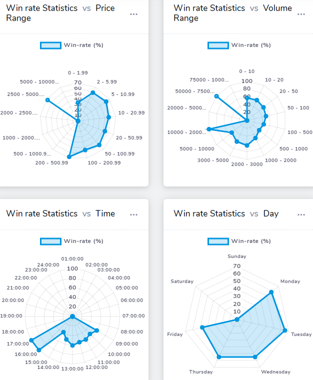
You can switch the radar char to show either win-rate or a performance metric called scaled PnL which is basically your PnL scaled between 0-100 relative to all the PnL in the chart's data bins (i.e., price ranges, volume ranges etc.) - so, this way, we are looking at the relative PnL instead of the absolute value of the PnL. This is helpful in figuring out if your performance is skewed in any particular direction - i.e, very strong in trading particular prices ranges or very weak trading on certain days, etc.,
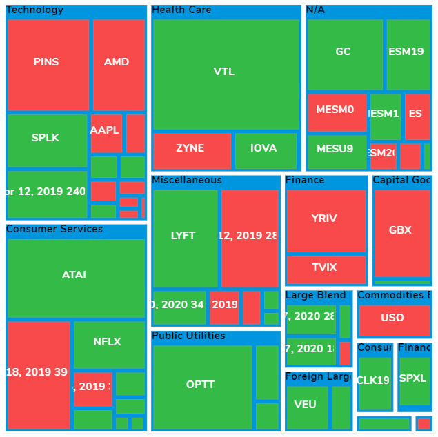
Treemaps give you a bird's eye view of your performance in terms of total volume traded, total PnL, and no. of trades - for either all your trades individually or grouped by tags or grouped by sector.
Chart interactivity
Zoom and pan
The easiest to understand - just click on an empty area in any chart and you will be able to view a magnified version of the chart which is pannable in the x-axis direction. Note that only charts that have axis can be panned - meaning, radar charts or treemaps cannot be panned in any axis.
Exploring charts
Things get a bit interesting here. Ever wonder why you have a peak or a dip in PnL on a certain date? or why your profits are far lesser in one price range compared to another?
Try clicking on a data point in any chart - a data point in a bar chart is the bars, in a line chart it's the points, etc., basically, any shape or an object inside a chart that indicates an x,y position (in charts with axis). For treemaps, every tile is a data point, for radar chart, every edge of the convex shape in the middle is a data point. When you click on any data point in any chart, a small context menu will pop up near your mouse pointer.
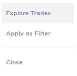
Clicking on the "Explore trades" option will redirect you to a new explore tab which we have not yet covered in the blog post series. It's the chart explore tab which will have a chart with a highlighted region and a trades table with all the trades that make up that data point.
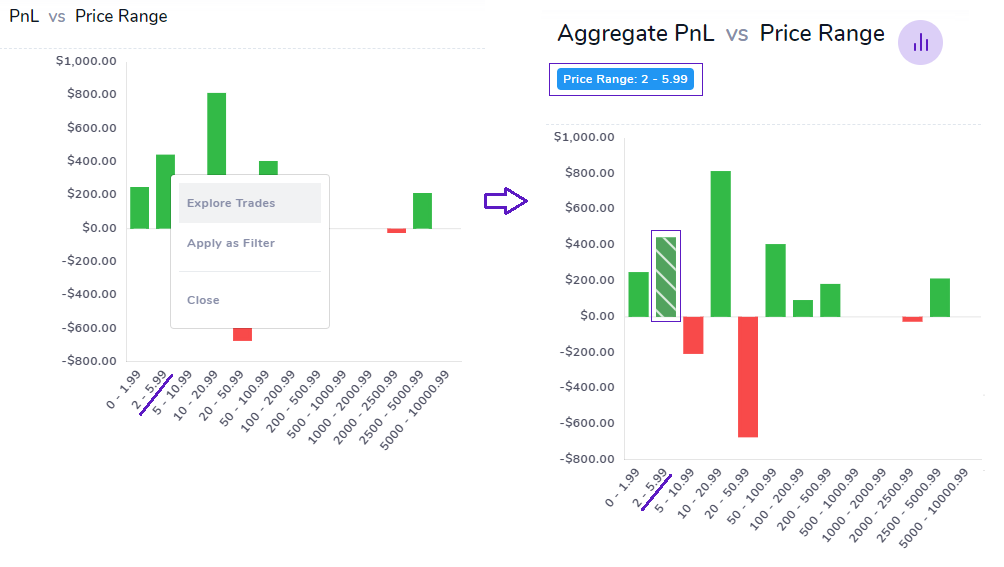 With this feature, you can exactly know what is inside or rather what makes up any data point in any chart in TradesViz. We believe that simple numbers and statistics are no longer enough to truly reflect on your past trades. For example, you could have made thousands of trades, and seeing one large green bar (plotting PnL) in a $100-$200 price range does not necessarily mean you have been consistently successful in that range. For all we know, 90% of your profits could have from less than 5% of the trades in that range. How would you know? That's why this feature exists. You can not only view a single data point but any no. of data points in a chart. Toggle your highlights by clicking again on the chart's data point in the chart explore view itself and click on "Toggle" to add more bars to the selection or click on select to just select 1 data point - the table below the chart will be updated automatically. The table is very similar to the trades table - meaning, you can expand to view trades, apply group operations to the trades that are the result of the selected data points. As we keep reiterating, this feature is highly useful and it's available for all charts in TradesViz. Below are a few examples of data points already selected in some chart types:
Applying filters
In the same context menu that appears when you click on a data point in a chart, there is another option called "Apply as Filter". What this option does is, instead of showing trades that created that data point (as in explore), it applies that data point's axis information as a global filter. For example, clicking on a PnL vs Price range chart's bar and then selecting "Apply as filter" for a particular range will show this on the top of your dashboard:
 Clicking on the check icon on the right end will apply this as a global filter - meaning, all the trades, charts, tables are shown in your dashboard now satisfy this filter of price range between 10 to 19.99. So, with the explore feature, you are able to explore depth-wise into your trades, whereas, with the global filters, you are able to explore breath-wise on your trades. Note that, any chart's data point (except for the market statistic charts) will work as a global filter. That means complex filter combinations like the one below are now possible!

Actually, even more, advanced and fine-grained configurations are possible and you even compare between groups of configurations/filter sets using the trades compare tool which has a dedicated blog post here.
With these features, TradesViz is truly an all-in-one analysis tool that allows you to deep-dive into your trade and be able to find hidden edges and you might have never realized before! This level of fine-grained comparison and filtering is not available on any other online platform - furthermore, we are still adding more features like this constantly! So, we need your help in suggesting features, and your only feedback can improve our feature set and allow us to serve traders even better! Please send us your suggestions, feedbacks, features requests at [email protected] or you can also fill in the contact form here.
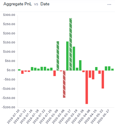
Chart overlays
Sometimes, it's interesting to look at several layers of data in the same chart - gives a new dimension and possibly more insights into your trading stats. For example, Looking at the win-rate chart, it's not clear if just having wins is having a sizeable effect on my PnL or not, well then, let's turn on a PnL overlay!
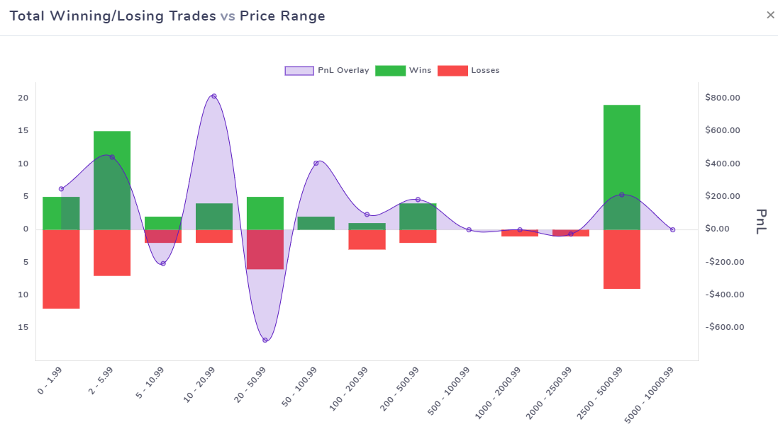 To turn on an overlay, click on the 3 dots on the top right corner of any chart and select the overlay you want. Note that overlays are not available for all charts. At the moment, overlays are only available for charts in the inner tabs - profit and loss, win-rate, volume and trades count and the overlays available are PnL, Volume, and Trades count.
From the above chart, it's evident that having a higher win-rate in duration ranges of 5 to 10 mins and 10 to 20 mins isn't really helping us in terms of PnL. But even the small amount of wins in the duration range between 1 to 2 hrs has had a significant effect in our PnL.
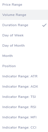
Chart ranges
Almost every tab in TradesViz which has charts in them will have a set of dropdowns. Each of these tab-specific dropdowns affects how the chart is plotted. For example, the image below shows the dropdowns which you will see when you switch to the market-indicator tab.
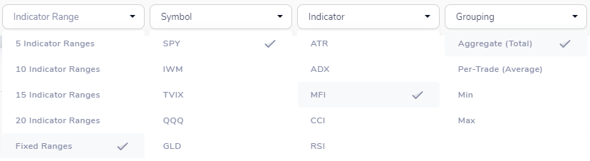
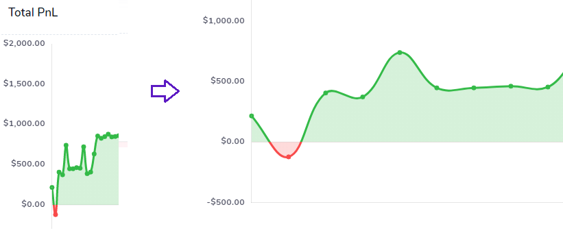
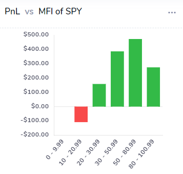
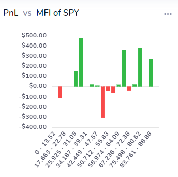
We have already explored some of the charts and how they are generated in previous sections. But now we will look at how you can change a part of how the chart is generated. The checkmarks in the image above are some of the default settings. Let's focus on the "Indicator Range" dropdown - you will see a few more "range" dropdowns - like PnL range, Volume range, etc., - all these dropdowns control only 1 aspect: the no. of x-axis data points. Meaning, if you choose "5 Indicator ranges", then the no, of indicator bins in the x-axis of the charts of this tab will be 5. Fixed ranges are pre-determined ranges - they never change. But, if you choose any other option, the way the chart is drawn itself can change quite a lot! Notice the charts below. The chart on the left is generated using the "Fixed ranges" option while the chart on the right is generated using the "20 Indicator Ranges" option. See the difference?
We have shown how adept TradesViz is at helping you pin-point your best setups and trades. Another option that completely changes the charts is the grouping dropdown. By default, to calculate the y-axis data for each class (i.e, bins of MFI range in this example) we just sum up all the trade's PnL (for this example) - which corresponds to the "Aggregate (Total)" option. But you can change this to view specific datapoints like the worst performance, best performance, etc., by changing the grouping option.
Updates: All screenshots updated with a new chart color theme. The new technical analysis trading section added as a separate tab.
We have covered quite a bit of content in this post - now it's your turn to explore TradesViz and be on your way to an informed and profitable trader!
As always, please let us know your feedback, questions, and feature requests by emailing us at [email protected] or writing to us using our contact form.