It is now possible to view 13F filings data directly from trades explore view in your TradesViz dashboard or by accessing the link here. To know more about what 13F filings are, please refer to the official sec.gov's website here: https://www.sec.gov/fast-answers/answers-form13fhtm.html. Essentially, it's a quarterly report that is required to be filed by all institutional investment managers with at least $100 million in assets under management. It reports all the stock holdings for that company in that quarter and often can be very useful in knowing what the big players in the market are doing and could possibly give some insights into what their investment plans/views are.
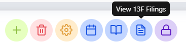
If 13F filings data is available for a particular stock/company, you will be able to see an additional icon on the trade explore title section like in the image below. Clicking on it will open the 13F filings data of that particular stock/company on a new page.
Of course, you can also select any available stock by using the symbol dropdown on the top right corner of the 13f data page.
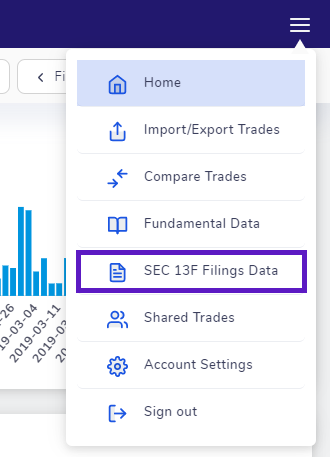
The other way to access the 13f data page is by clicking on the 3-lines icon on the top right corner of your home page and selecting "SEC 13F Filings Data"
This feature is still in beta stages meaning we are constantly improving it based on your suggestions! Let us know what you think by emailing us your feedback and opinions to [email protected]
Sections of the 13F data page
There are a total of 7 sections on the 13F page where one of the sections depends on the user's interaction with the main table. We will explore each of the sections in this post. Note that for the terminology below, we refer to all companies that file 13F filings as "company" and all stock of companies they own as "stock".
For the purposes of demonstrating the different sections, we will choose the company VANGUARD and the stock APPLE. Before we dive in, it's useful to understand where the data comes from and how we have used the data to show you visualizations.
All the data is directly taken from sec.gov's company filings page (https://www.sec.gov/edgar/searchedgar/companysearch.html). There are 2 "views" or visualizations of the data, we have on this page. The first is viewing from the perspective of the company and the second view is visualizing data from the perspective of a single stock. We'll first explore all the sections from a company's view and then from a stock's view.
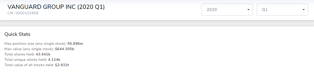
The image below shows the first section which contains just the name of the company, it's CIK number, and the year and quarter selection dropdowns. Following this, in the second section, we see some simple stats about the total quantity and value of shares held by the company. Going forward, we will add more useful information to this area.
Note that all data from this point on except for the last section is relevant only to the currently selected year and quarter!
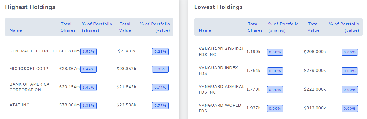
The third section contains 2 tables which show info about the total holdings of the company for the given year and quarter. It's useful to gauge what the company values or which sectors it prefers investing in.
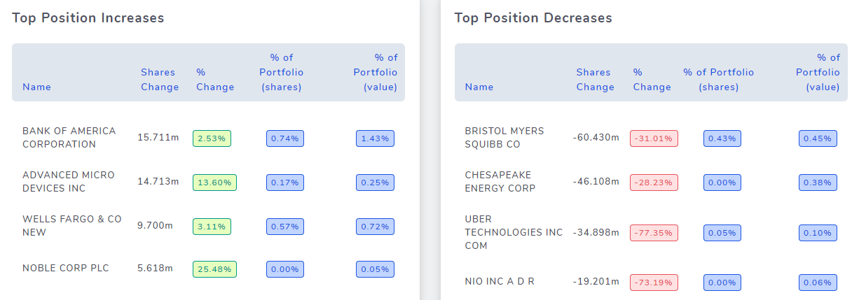
The fourth section is also very similar to the third section - it again shows 2 tables, but here, we have focused on the increases and decrease of positions between 2 consecutive quarters. For example, if we are currently viewing 2020 Q3's data, the percentages shown in this section use data from 2020 Q2 and 2020 Q3. This table is very useful in knowing if any recent trend changes caused the company to drop or increase positions in any certain stock. Large drops might mean a severe negative event or that their target has been reached. While there are many interpretations that one could get from these numbers, it's useful to combine this with fundamental data of the stock's company and other general financial news to arrive at a conclusion.
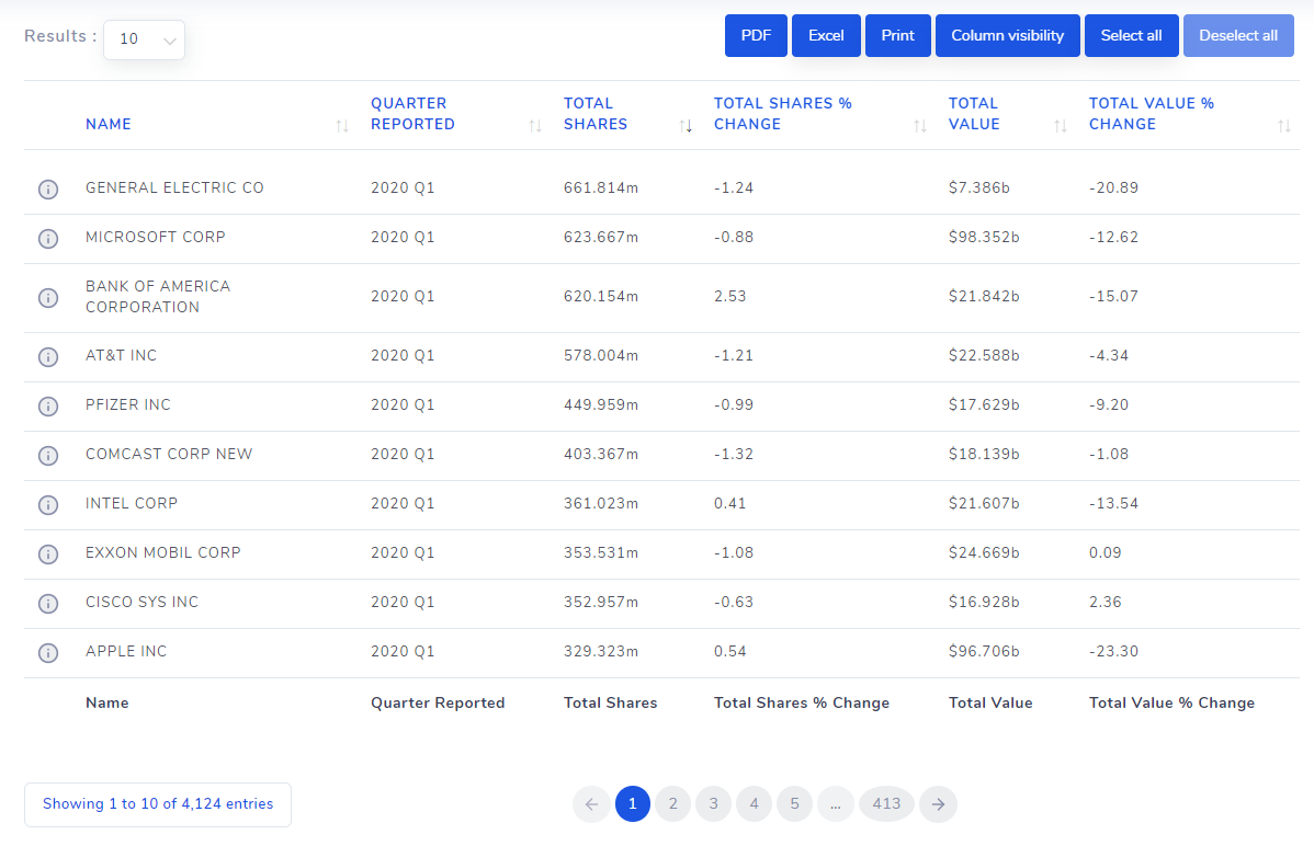
Next, in the fifth section, we have the table of all the raw data reported by that company for that year and quarter. Here, you can see the exact amount of each stock the company is holding and their % change compared to the previous quarter.
You might have noticed the 'i' icon on the left side of each row. Clicking on these 'i' icons will open a chart that plots how the position of the currently viewing company has changed for this stock historically. Concretely, since we are viewing 13F data for VANGUARD, clicking on the row that says "MICROSOFT CORP" in the Name field will open the following chart.
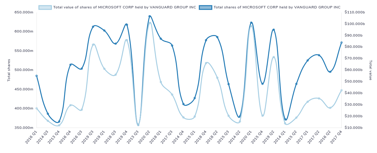
With this, you can see how the company's investment in MICROSOFT has changed historically. Both the value and the total no. of shares owned are shown in this graph. This is the sixth section which we commented earlier that is shown based on the user's action (i.e, clicking on the 'i' icon).
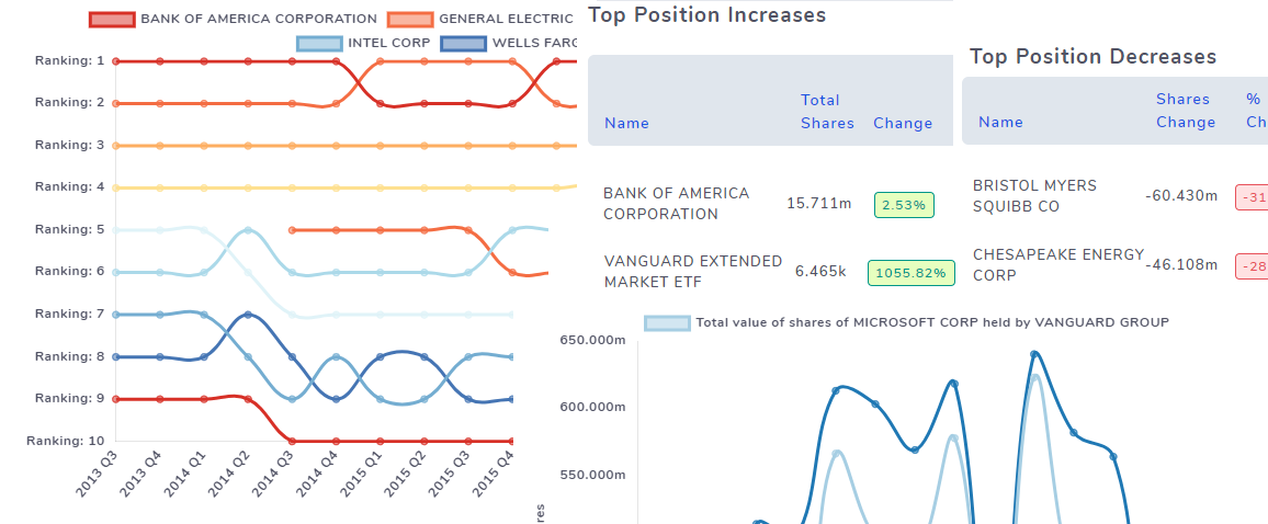
Finally, the seventh section shows the trend of holdings of stock that the company historically. It's similar to the sixth section graph we saw earlier for one particular stock, but here we see that plotted for a lot of stocks over time.
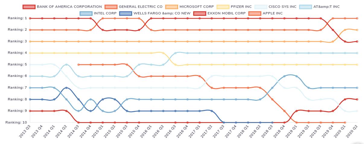
A lot of insights can be gained from this chart - for example, there is a clear downtrend of the total position of APPLE stock from 2014 to 2020 while holdings for INTEL stock have gradually increased. Insights like this can be used in the decision-making process of building or making changes of your own portfolio! We recommend combining the data you see here with the fundamentals page for each company to make more informed investment decisions.
We mentioned at the beginning of this post that you can not only visualize data from the perspective of a company which is the straightforward way when it comes to 13F filings, but you can also do it the other way - i.e, look at all the company's data from a single stocks' perspective.
The images below show the same sections as explained above but from the respective of the APPLE stock. So, with this stock as the center point, we look at what all companies have owned this stock, what were the changes in their positions historically, etc.,
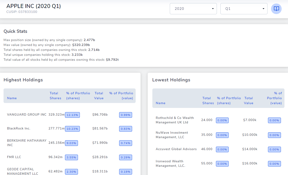
The image above shows the first few sections form the perspective of the stock APPLE and you can clearly see that the highest holdings table unlike the one we saw for VANGUARD is different because there, we see all the companies that have a lot of shares of APPLE under their management. It's another useful insight in deciding if you want to invest in any of these companies.
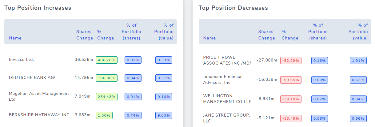
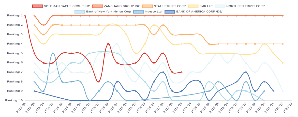
The image above shows top increases and decreases of holdings of APPLE from all the companies that have APPLE shares. Finally, the image below shows the change in the total quantity of shares among various companies that have large positions in apple historically.
With this, we have explored all the very useful insights you can get this from this feature on TradesViz. One last important thing we'd like to emphasize is that when searching for companies or stocks using the dropdown on the top right corner) it's possible that you might not always get your result just by typing in the name because there are many companies and stocks in US market and one stock's name might be very similar to another company's name. To avoid seeing too many results, we have added a filter like a feature to separate companies from stocks explicitly. Just add 'c:' as the prefix to your search query to only search for companies and 's:' to search only for stocks. Example search queries: 's:apple', 'c:vanguard'.
We hope this feature is useful to all TradesViz users. We are not only focusing on just journaling but trying to shape TradesViz as a holistic trading analysis and research platform to provide all tools a trader needs to make informed investment and trading decisions.
If you have any questions or feedback, please let us know by emailing us at [email protected].