We promised everyone a massively useful feature to everyone this year and this is just the beginning! TradesViz now has COMPLETE options flow analysis dashboard (based on historical data - not live) that can give you many actionable ideas about how to navigate the increasingly difficult markets.
This blog post will cover a gentle introduction about what options flow is, how you can use it and how TradesViz's visualizations help you navigate the market easily.
Starting off, options flow is nothing but visualizations and calculations made mostly based on the premium spent on every single options trade in the US markets. Let's break this down:
- Every single options trade in the US market is reported by OPRA (Options Price Reporting Authority)
- It is possible to get this data live and historical based - this effectively means you have access to EVERY SINGLE OPTIONS trade that happened in the US market for any given day.
- With this vast amount of data, you can do a lot of analysis and create visualizations on how traders - specifically the large traders are speculating in the market.
- There is a very common misconception here that you need to "follow the smart money" which essentially means "let's copy the trade the large traders are making and we will also make money" - we hate to break it to you - no one, absolutely no one can identity who or what is "smart money" and there are so many reasons as to why one made a particular trade. So... don't do that...never rely on just one single data point - we have repeated this point for journaling and the same applies here if you want to survive in the long term.
- Instead, focus on the "footprints", "bread crumbs" left by the larger players in the market. This can only be done on a larger timeframe - a few days to a few weeks - now, the probability is already in your favor (shorter/intraday option trades have a very high failure rate - you are essentially playing lotto every day).
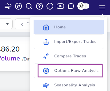
But how do you do all of this? Where to start? That is exactly why we have built the TradesViz options flow dashboard: https://tradesviz.com/optionsflow/. You can access this dashboard by clicking on the hamburger icon on the top right corner of your dashboard and by clicking on "Options flow analysis"
Now we have a basic understanding of what is options flow, how most people use them, the pitfalls, and an outline of how we can use them to our advantage.
Here is what you have to know about/get a good idea of every day:
- How are the sectors/industries in the market doing as a whole? What has changed? Where is most money going into and where is most money being diverted from?
- What are the most traded stocks and their sizes? how did it have an effect on the underlying? What are the most important expiries/strikes?
- How does the options flow look like for the past couple of days for the stocks on your watchlist? Do you see correlations? Are your strategies in agreement with each other? What does the money flow say?
- Based on the answers to the above question, what is your plan for the next week, next month, etc.,? What are you going to focus on? What are your contingency plans? What are your risk levels?
Ok, so we have an idea of where to start. Next, how to answer these questions? what to do from here? What is the plan of action?
Let's focus on the 4 groups of questions mentioned above and correlate that with the options flow dashboard in TradesViz to find our answers.
Here's the market summary dashboard on the 28th of Jan 2022:
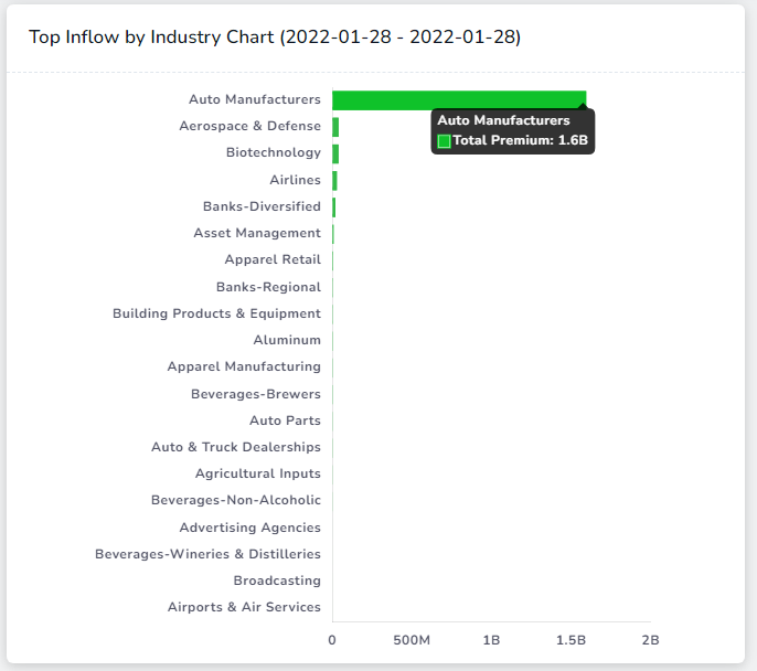
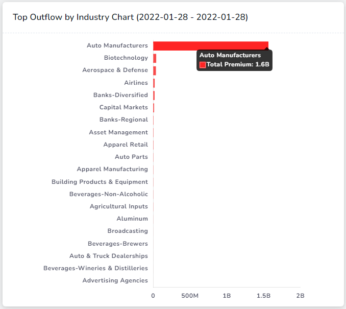
Well, if you know about current market conditions, you can pretty much guess why there is so much skew. Scroll down on the dashboard after filtering only Auto manufacturers and you immediately know the reason:
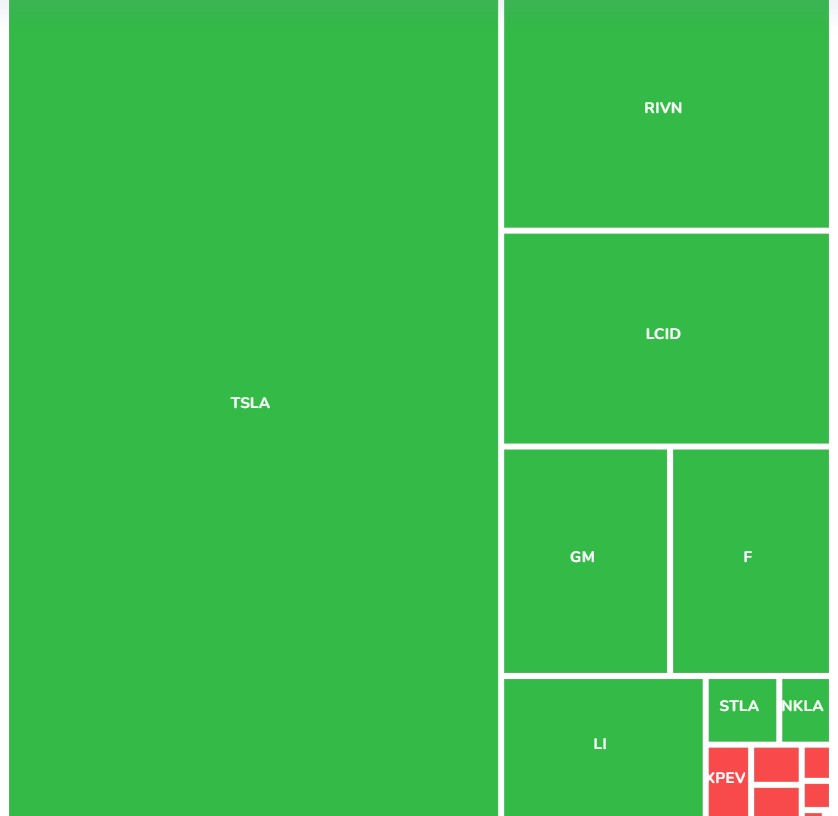
Yep. TSLA.
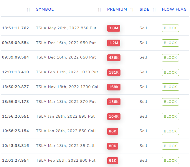
Ok, still, it might be interesting - it's definitely on everyone's watchlist. So far we have answered the question [1] above. So let's explore a bit more. Scrolling down to the very bottom, we see a list of the largest trades. Why do we need this? this can help give us an overview of the approx. strikes and expires that are probably worth watching.
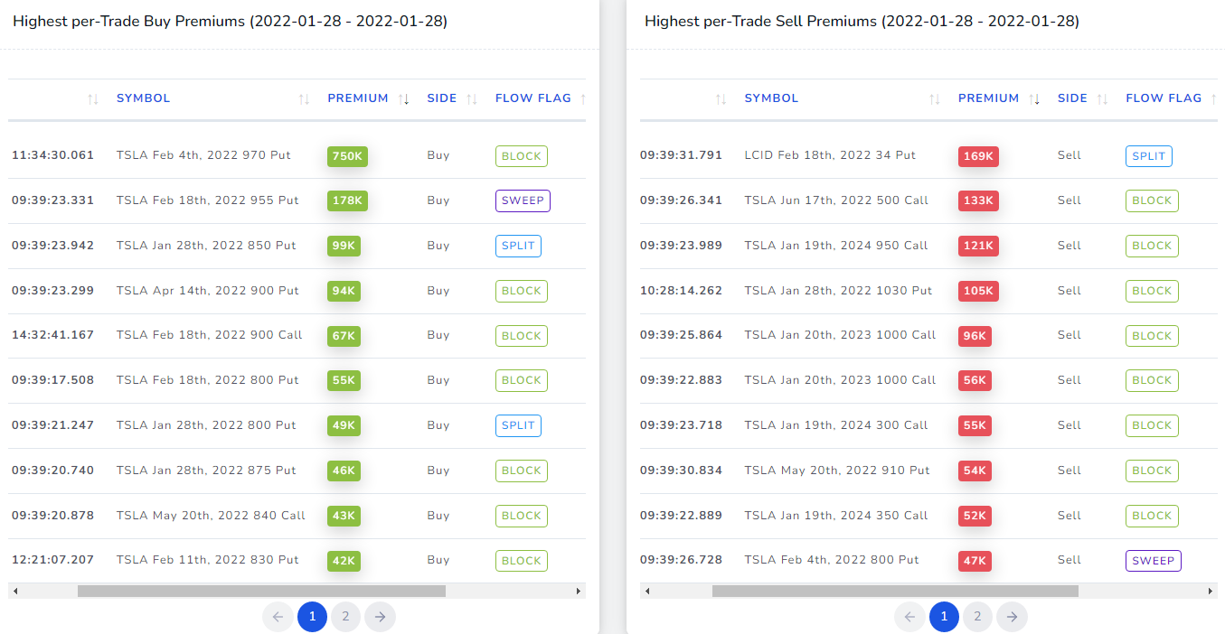
A lot of buys! You might have a few questions after seeing this table. Let us address those:
How do we know if it's a buy or a sell trade?
There are 2 ways to determine the buy/sell-side: every trade comes with an aggressor side flag which determines which side initiated the trade - this along with the comparison of the spot price of options vs the bid-ask spread can tell you about the side of the trade. Say, an option was executed at $5 and the bid-ask spread is $4.50-$4.80. For what reason would someone trade by giving outside ask price? only if the aggressor really wanted to acquire the option as fast as possible because there's no way it would sell if the selling price was $5, but on the other hand if someone places an order at $5 when the asking price itself is $4.80 - we have enough reason to believe that the initiator is from the buy-side.
What are a "Block", "Sweep" and "Split"? How are these determined? How are they useful to you?
- A block is simply a single trade with a high volume and high premium value
- Why is it helpful? useful in identifying is there was a very large buyer - single trade - this would mean it was in reaction to an event that already happened or that is going to happen
- A sweep is when a trade is split and executed across multiple exchanges at the same price within a very short span of time
- Why is this helpful? as the name implies, the trade was as many of the options they're buying or selling to be executed as fast as possible so the order is sent to many exchanges - this sometimes indicates the urgency of the trade
- A split is when a trade is split and executed within the same exchange at the same price within a very short span of time
- Why is this helpful? compare to the above trades, the split may not have a lot of significance - more research needs to be done as to whether the trade is a combination of multiple legs or not.
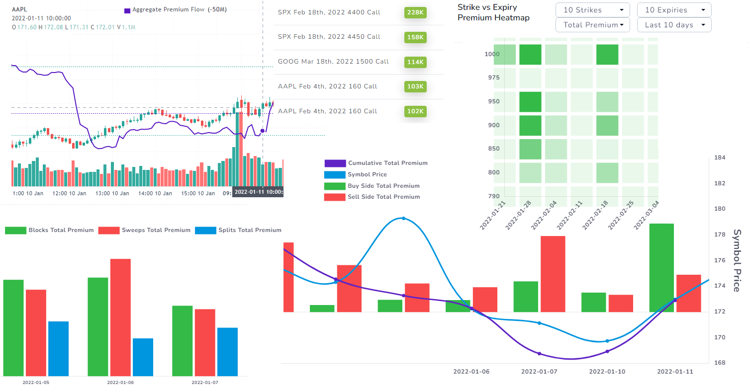
Ok, now that we have a stock in mind and want to know its longer-term perspective, what do now? We move on to the Symbol specific dashboard.
First, search for the stock you want to lookup in the top right corner and select the date you want to view. You will immediately see a chart with a purple/blue line which is simply the cumulative flow of the stock throughout the day.
What is cumulative flow? Simple: it's the rolling sum of the difference between buy trade's premiums and sell trade's premiums.
Why is this helpful? It can help you speculate the movements of the stocks using data from speculators just like you! It's as simple as that. There is no concept such as following "smart money" - you are just following the market's flow. That's it. The easiest thing you can make sure of is that you are NOT against a glaringly obvious trend.
Look at the following example of TSLA for the last 5 days:
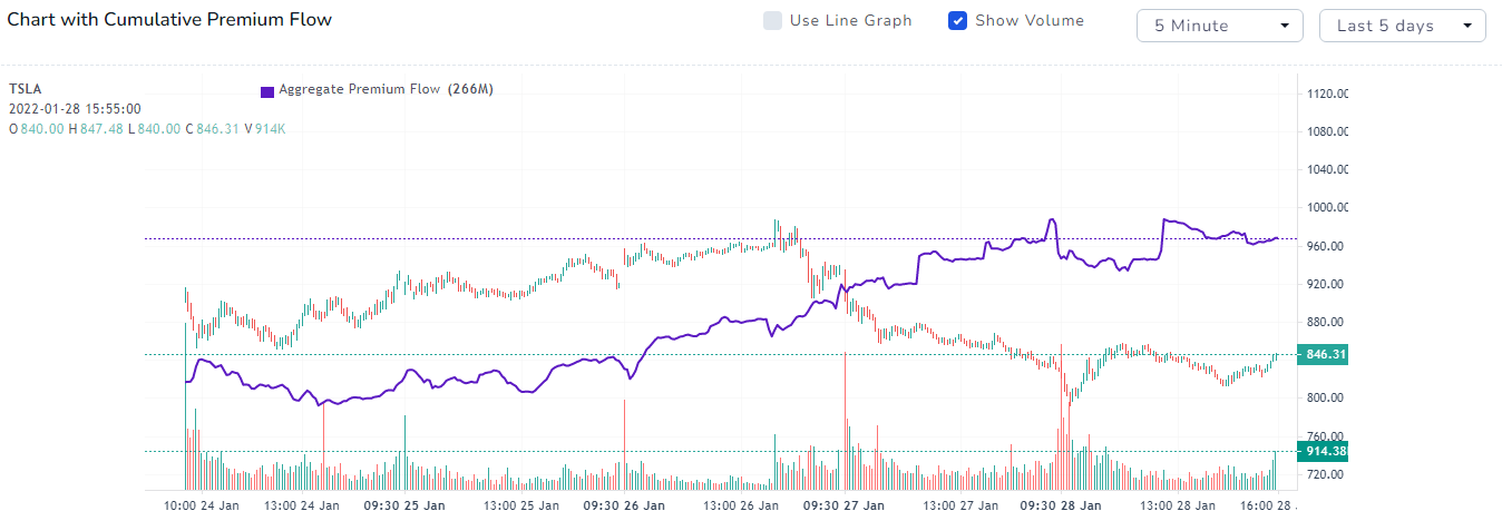
Quite interesting. Stock doing down but the cumulative flow keeps climbing with stagnation towards the end. Note that for the last week or so, the market has been very volatile! Could this be a reason for the stopping of the investors pouring more money in speculating that TSLA is going higher? Definitely, something to think about if you are going to make trades in TSLA in the coming days/weeks!
(We have now partially answered questions [2] and [3] posted at the beginning of this blog post)
Let's look at the trades made on this day:
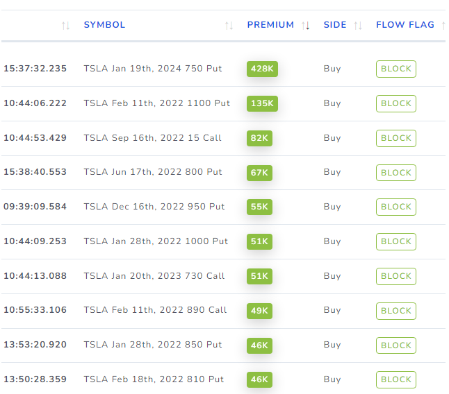
A lot of Put selling! Does this mean a lot of traders are bullish on TSLA in the mid-short term? Not necessarily.
Why? This reflects the current speculation ad sentiment of traders based on the info that is available right now. Always remember: Nothing is guaranteed and there is no free lunch in trading.
So, what can you do with this? We said in the beginning that options flow is best used for mid-short term trading. Use these insights and data to guide you into getting into relatively safe positions in the market. Don't blindly follow anything - use data, use your own intuition, try to derive your own hypothesis as to what would happen - think like a trader.
Doing this over a period of time, you will gain a very sharp sense of what data to trust when and how to effectively leverage that data in your trading.
Trading is a marathon - not a sprint - it's a skill for life. Do NOT ever depend on backbox systems or signals. We can pretty much guarantee that you will not last more than a year or two or will likely feel lost through your short journey.
Now, getting back to speculating on TSLA, we got 2 important insights: Place more importance into analyzing 600-800 strikes and a few months out expiry. How can we know if this is relevant or not? Look at the heat map!
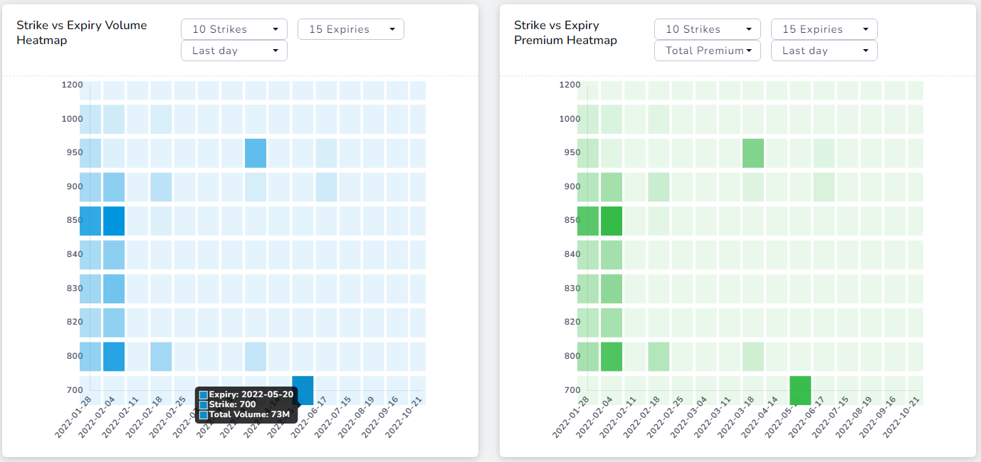
This gives us a bird's eye view of what traders are most interested in in terms of quantity of trading and premium spent. In this simple case, there does not seem to be any discrepancies between the two charts as most of the high volume pairs (strike, expiry) correspond to what we learned from the trades and the other charts in this dashboard.
At the very end of the dashboard is another visualization that you can use to add more confirmation/confidence to your long/short bias. Here's a chart that shows you the total call side premium and the put side premium over the last 30 or so days:
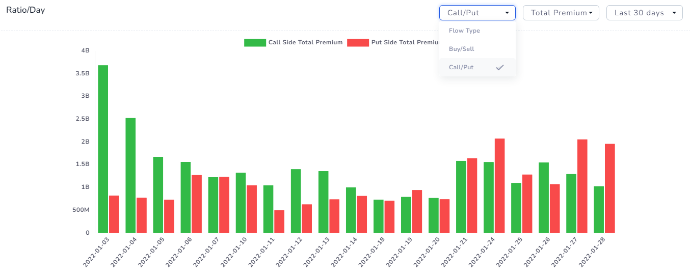
Notice the gradual shift from higher call premium numbers to higher put premium numbers. Are traders turning bearish because of a higher put premium with premiums mostly on the buy-side? or are traders preparing a longer-term bullish trend with most money going into selling puts and earning delta? or are we seeing a hedge turning sides here?
Most flow-based websites/guides would tell you to look at just one data point and make a trade based on it and we can say with a fair bit of certainty that these wrong guided traders make up most of the "90% of traders fail" statistics. That was harsh, wasn't it? But think about it. Options volume has been increasing a LOT with the influx of new retail traders pouring into options with the allure of quick money - ask yourself this: how many of these traders you personally know have been trading successfully for a long time without proper knowledge of the market and without relying on a black box, "single-point"-based information system? Most would have blown up their accounts. Because trading is hard. Options trading is even harder - without the skills to analyze the market and the tools to help you do so, you are missing out on a lot of success.
(At this point, we have fully answered questions [2] and [3] posted at the beginning of the blog and are going to answer [4] in the following section)
Ok, back to TSLA analysis - now, from the heatmap, we can kinda guess that the important points are the 2020-05-20 expiry and strikes from 700 to 850. How can we drill down on this? Use the accumulation graph like below:
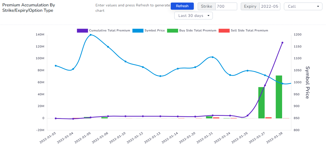
Very interesting! For clarity, the purple/violet line is the cumulative total premium and the blue line is the price of the stock - TSLA in our case. Look at the massive increase in the last buy side calls 2-3 days! Let's look at the 700 puts now:
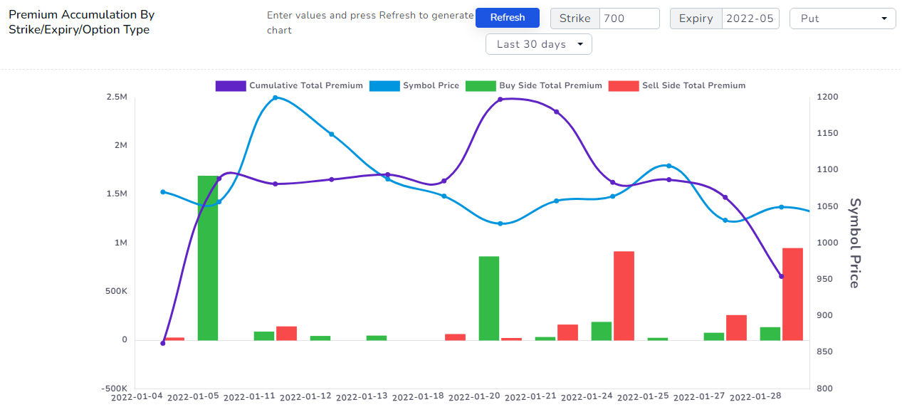
The legend remains the same. This time, the sell-side premium of puts is increasing! Does this mean we have confirmed the bullish sentiment of traders with TSLA for at least the near term? Maybe. But not so fast.
Now, if at this point, you are still reading this blog and are tired and wondering what the heck is going to happen - congratulations. You have taken the first step into becoming a successful stock speculator. It's boring... It's mostly mid-long term, the gains are slow, but steady and that is what will take you to wherever you want to be in your life - financially.
So what have we learned? That we can focus on a narrow range of strikes and expires for TSLA using which we can definitely make any plays - bullish or bearish depending on strikes/side/option type/your strategy etc., in the mid to short term. With this, we finally answer the last question [4].
How can you find other interesting trades? other interesting stocks? You can simply view the flow trades table:
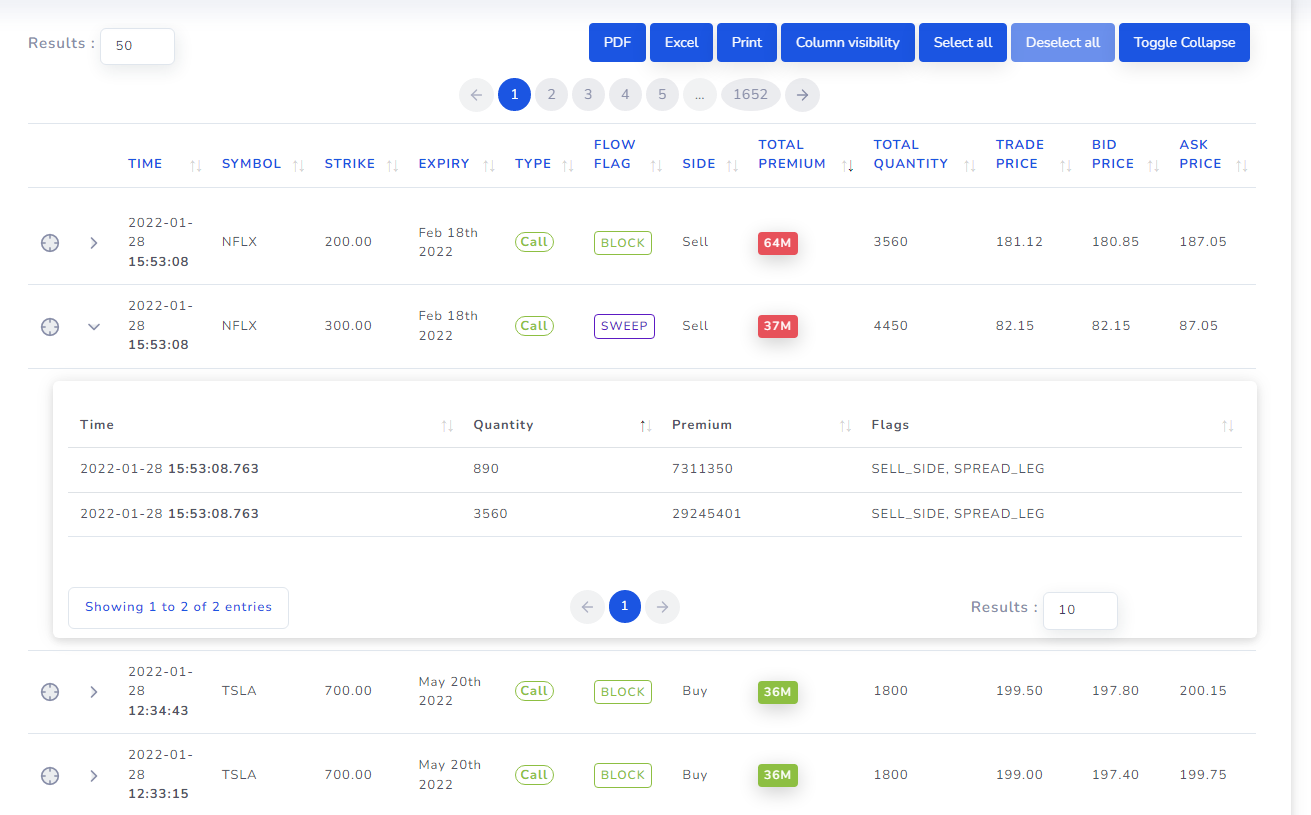
Notice that, unlike other options flow websites, we not only show you the trade but also show exactly the individual executions that make up the sweep or split. Usually, the flow table is made up of a lot of ETFs and SPX trades, but you can easily filter them out by using the exclude symbols and exclude sectors/industries filters on the right side. This should give you plenty of new trade ideas and help you with giving additional to support your existing trading ideas.
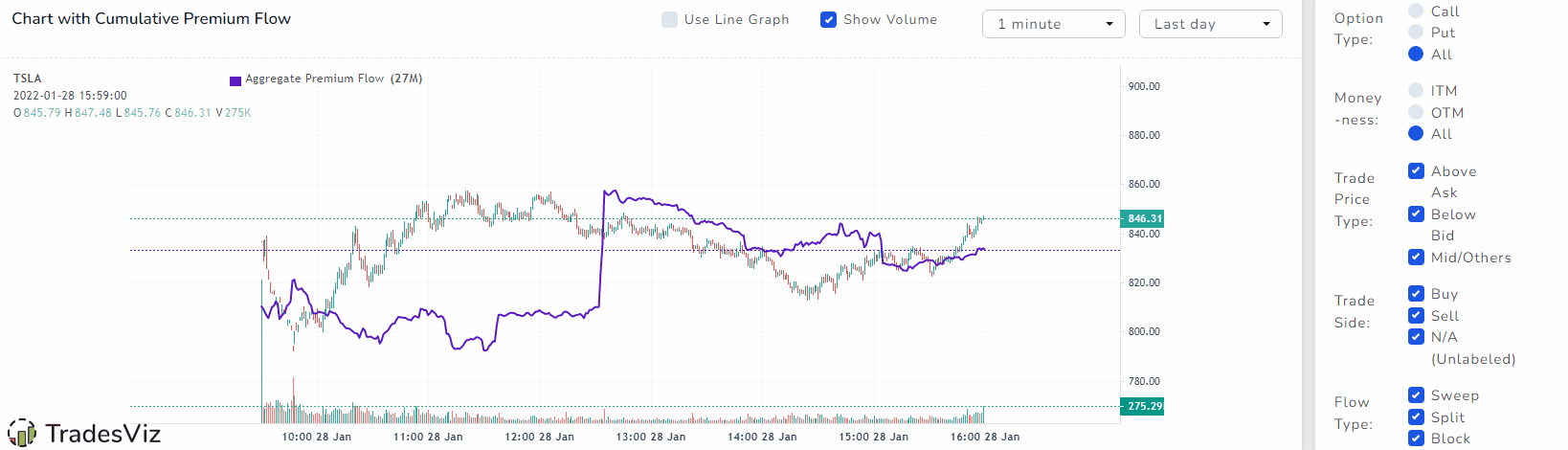
Your efforts do not stop here. This is just the beginning - every chart we showed above can be viewed for a period of over 5 days and each chart is customizable in terms of what you want to visualize. There are also plenty of filters you can use to find trends that might not immediately seem obvious.
Here's an example of trying to figure out the flow patterns of a day using simple toggles: (All filter actions update charts in real-time)
There are a lot more things you can do with this very flexible dashboard. Using this with your journal will take a little bit of effort, but with TradesViz, you now do not need any extra analysis tools as you have the entire OPRA data - or the US options data at your fingertips.
Any trade, any day, any stock, any strike any time - you can query it, learn from it and plan your trades with it. That's our vision with this feature.
We're very excited to hear your thoughts and opinions about this feature and how you are going to use it to augment your trading! Let us know by sending us an email at [email protected]. If you have any feature requests, issues with using this, how-to guides - please do not hesitate to contact us!
In the coming months, we will be integrating options flow into your journaling statistics to give you a whole new world of analysis and analytics that is actionable and can help you every single day with your trading.
If you are already a Pro member, contact us at the email mentioned above for a discount when you upgrade to the Platinum plan! All options flow features are available only in the Platinum plan.